It’s Poetry Time

Shì shíhou le

Shì shíhou le, Zhōngguórén! Shì shíhou le
Guǎngchǎng shì dàjiā de
Jiǎo shì zìjǐ de
Shì shíhou yòng jiǎo qù guǎngchǎng zuòchū xuǎnzé

Shì shíhou le, Zhōngguórén! Shì shíhou le
Gēqǔ shì dàjiā de
Hóu[lóng] shì zìjǐ de
Shì shíhou yòng hóu[lóng] chàngchū xīndǐ de gēqǔ

Shì shíhou le, Zhōngguórén! Shì shíhou le
Zhōngguó shì dàjiā de
Xuǎnzé shì zìjǐ de
Shì shíhou yòng zìjǐ xuǎnzé wèilái de Zhōngguó

—Zhū Yúfū (朱虞夫 / Zhu Yufu), recently arrested in China for just this poem

Thanks to VHM for finding the full text of this poem for me.

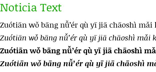
Pinyin font: Noticia Text

Since my last examination of the selection at Google Web Fonts the number of font families for Latin Extended has reached 98 [edit: May 31, 2012: 188], with one new face capable of rendering Hanyu Pinyin with tone marks: Noticia Text.

image showing the font Noticia Text in action on a Hanyu Pinyin sample text

Here are the Pinyin-friendly font faces at Google Web Fonts.

Serif

  • EB Garamond
  • Gentium Basic
  • Gentium Book Basic
  • Neuton
  • Noticia Text

Sans Serif

  • Andika
  • Ubuntu
  • Ubuntu Condensed
  • Ubuntu Mono

For future reference, the font most recently added to the Latin Extended group is Ruda [edit in May 2012: Chau Philomene One], which doesn’t support Pinyin with diacritics (except, perhaps, through combining diacritics).

See also

Pinyin font: Flexion Pro

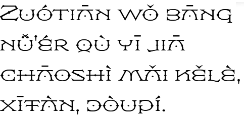
Today I’d like to introduce a highly individualistic font family that supports Hanyu Pinyin: Flexion Pro. This one, however, isn’t free.

sample of the Flexion Pro font being used for text in Hanyu Pinyin

Flexion was originally designed for the movie The DaVinci Code, which is apt, given how the main character, Robert Langdon, was named after Flexion’s designer (and ambigram specialist) John Langdon. Hal Taylor completed the font.

Here’s part of Taylor’s description:

Flexion is possibly the only symmetrical type design currently available. In keeping with John’s well-know propensity for ambigrams, many of the characters are mirrored to become other characters; the B is a reversed E, the C is reversed to become a D, G is a mirrored P, the K is a reversed N, and so on.

Of course, some of the tone marks will complicate making this work for ambigrams. But since Chinese-English bilingual ambigrams are possible, making Pinyin ambigrams, even with tone marks, shouldn’t be out of the question.

Flexion comes in four weights.

Pinyin fonts at the Open Font Library

A search for Pinyin fonts at the Open Font Library currently yields 15 font families.

Not all of those, however, really do support Hanyu Pinyin with tone marks. Here are the ones that work, though not always without problems:

And here’s a PDF of all of those Unicode Pinyin font families in action.

I’ve previously mentioned more than one of these: Pecita and the various Gentium faces. I’ll write more about the latter in another post on the work coming out of SIL.

Serif

screenshot of the serif font 'crimson' in action on a sample Pinyin text

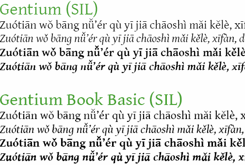
screenshot of the serif fonts 'Gentium' and 'Gentium Book' in action on a sample Pinyin text

screenshot of the serif font 'Judson' in action on a sample Pinyin text

screenshot of the serif font 'Libertinage' in action on a sample Pinyin text

screenshot of the serif font 'Wirewyrm' in action on a sample Pinyin text

Sans Serif

screenshot of the sans-serif font 'Designosaur' in action on a sample Pinyin text

screenshot of the sans-serif font 'News Cycle' in action on a sample Pinyin text

screenshot of the sans-serif  font 'Pfennig' in action on a sample Pinyin text

Monospace

screenshot of the monospace sans-serif font 'Consola Mono' in action on a sample Pinyin text

Script

screenshot of the script font 'Pecita' in action on a sample Pinyin text

Full list (including fails), for future reference:

  1. Anahi/Abbey
  2. Consola Mono
  3. Crimson
  4. Designosaur
  5. Douar Outline
  6. Futhark Adapted
  7. Gentium
  8. Judson
  9. Libertinage
  10. Logisoso
  11. News Cycle
  12. Pecita
  13. Pfennig
  14. Vegesignes
  15. WireWyrm

Google Web fonts and Pinyin — December 2011 update

When I put up my first post on Google Web fonts (Google Web fonts and Hanyu Pinyin), that site offered 252 font families, 29 of which cover at least parts of Latin Extended. Now, some three months later, the total has grown to 342 font families, with 70 of those covering at least parts of Latin Extended.

Only two of the new families, however, support Hanyu Pinyin with tone marks: Ubuntu Condensed and Ubuntu Mono. That brings the total to eight Google Web fonts that support Hanyu Pinyin: four serifs and four sans serifs.

Serif

  • EB Garamond
  • Gentium Basic
  • Gentium Book Basic
  • Neuton

Sans Serif

  • Andika
  • Ubuntu
  • Ubuntu Condensed
  • Ubuntu Mono

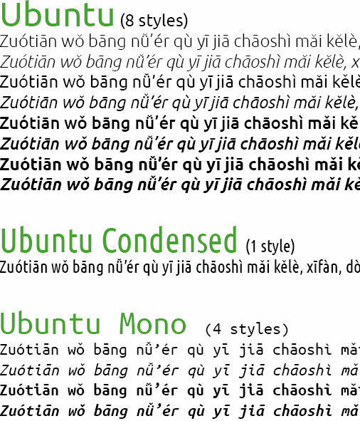
Here’s what the two new families, Ubuntu Condensed and Ubuntu Mono, look like next to the earlier Ubuntu.

example of Ubuntu, Ubuntu Condensed, and Ubuntu Mono in action on Hanyu Pinyin

For reference, here’s the total list of Latin Extended, with Pinyin-compliant fonts in bold.

Serif Faces

  1. Bitter
  2. Cardo
  3. Caudex
  4. EB Garamond
  5. Enriqueta
  6. Gentium Basic
  7. Gentium Book Basic
  8. Neuton
  9. Playfair Display
  10. Radley
  11. Sorts Mill Goudy

Sans Serif Faces

  1. Andika
  2. Anonymous Pro
  3. Anton
  4. Chango
  5. Didact Gothic
  6. Francois One
  7. Fresca
  8. Istok Web
  9. Jockey One
  10. Jura
  11. Marmelad
  12. Open Sans Condensed
  13. Open Sans
  14. Play
  15. Signika Negative
  16. Signika
  17. Tenor Sans
  18. Ubuntu
  19. Ubuntu Condensed
  20. Ubuntu Mono
  21. Varela
  22. Viga

Display Faces (all fail)

  1. Abril Fatface
  2. Arbutus
  3. Bubblegum Sans
  4. Butcherman Caps
  5. Chicle
  6. Eater Caps
  7. Forum
  8. Kelly Slab
  9. Knewave
  10. Lobster
  11. MedievalSharp
  12. Modern Antiqua
  13. Nosifer Caps
  14. Piedra
  15. Passion One
  16. Plaster
  17. Rammetto One
  18. Ribeye Marrow
  19. Ribeye
  20. Righteous
  21. Ruslan Display
  22. Stint Ultra Condensed

Handwriting Faces (all fail)

  1. Aguafina Script
  2. Aladin
  3. Devonshire
  4. Dr Sugiyama
  5. Fondamento
  6. Herr Von Muellerhoff
  7. Marck Script
  8. Miss Fajardos
  9. Miss Saint Delafield
  10. Monsieur La Doulaise
  11. Mr Bedford
  12. Mr Dafoe
  13. Mr De Haviland
  14. Mrs Sheppards
  15. Niconne
  16. Patrick Hand

Attitudes in Hong Kong toward Mandarin: survey

Mandarin is less well loved in Hong Kong than most other “icons” of China, according to the results of a survey there.

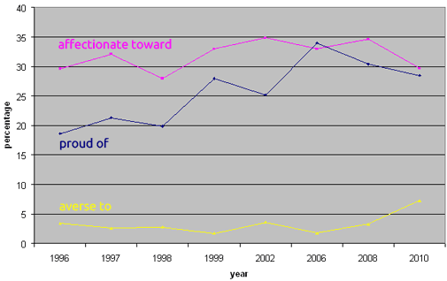
Although the percentage of those who described themselves as “averse” (kàngjù) to Mandarin is quite small (in the single digits), it has quadrupled since 2006 (1.8% to 7.3%). (I’m using the English and Mandarin terms given in the source material.)

Meanwhile, the percentage of those who are “affectionate” (qīnqiè) toward Mandarin has dropped, though not to an all-time low. And the percentage of those who are “proud” (zìháo) of Mandarin is also down, though it remains much higher than it was in 1994 when the survey began.

Affection toward, pride in, and averseness to Mandarin in Hong Kong, 1994-2010
graph showing affection toward Mandarin in the 27-35% range, pride in Mandarin rising from 19% to 34% percent but dropping since 2006, and aversion to Mandarin at around 3% until the climb to about 8% in 2010

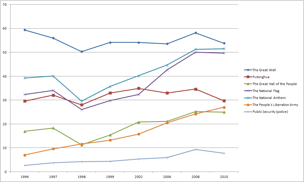
Interestingly, averseness to Mandarin has been growing, while averseness to most other mainland icons has been dropping.

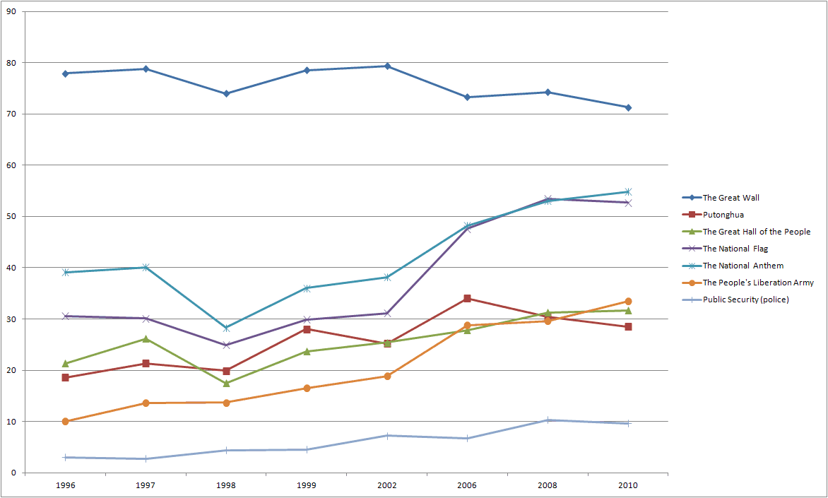
In the graphs below I have omitted some surveyed icons — Hong Kong’s regional flag/emblem, the night view of Victoria Harbor, the Legislative Council building, the Hong Kong and Shanghai Bank Building, and the Bank of China Building — to keep the graphs from getting too busy looking and because those are within Hong Kong itself.

The lines for Mandarin are in dark red. Click to enlarge the images to a useful size.

Percentage of respondents feeling “averse to” Mandarin (“Putonghua”) and other Chinese icons
graph

Percentage of respondents feeling “affectionate towards” Mandarin (“Putonghua”) and other Chinese icons
graph

Percentage of respondents feeling “proud of” Mandarin (“Putonghua”) and other Chinese icons
graph

But even though Mandarin hasn’t gained much affection recently from the people of Hong Kong, it’s still far more liked than the least popular of the PRC’s institutions: the police (gōng’ān).

sources and further reading:

Google improves its maps of Taiwan

Two years ago when Google switched to Hanyu Pinyin in its maps of Taiwan, it did a poor job … despite the welcome use of tone marks.

Here are some of the problems I noted at the time:

  • The Hanyu Pinyin is given as Bro Ken Syl La Bles. (Terrible! Also, this is a new style for Google Maps. Street names in Tongyong were styled properly: e.g., Minsheng, not Min Sheng.)
  • The names of MRT stations remain incorrectly presented. For example, what is referred to in all MRT stations and on all MRT maps as “NTU Hospital” is instead referred to in broken Pinyin as “Tái Dà Yī Yuàn” (in proper Pinyin this would be Tái-Dà Yīyuàn); and “Xindian City Hall” (or “Office” — bleah) is marked as Xīn Diàn Shì Gōng Suǒ (in proper Pinyin: “Xīndiàn Shìgōngsuǒ” or perhaps “Xīndiàn Shì Gōngsuǒ“). Most but not all MRT stations were already this incorrect way (in Hanyu Pinyin rather than Tongyong) in Google Maps.
  • Errors in romanization point to sloppy conversions. For example, an MRT station in Banqiao is labeled Xīn Bù rather than as Xīnpǔ. (埔 is one of those many Chinese characters with multiple Mandarin pronunciations.)
  • Tongyong Pinyin is still used in the names of most cities and townships (e.g., Banciao, not Banqiao).

I’m pleased to report that Google Maps has recently made substantial improvements.

First, and of fundamental importance, word parsing has finally been implemented for the most part. No more Bro Ken Syl La Bles. Hallelujah!

Here’s what this section of a map of Tainan looked like two years ago:
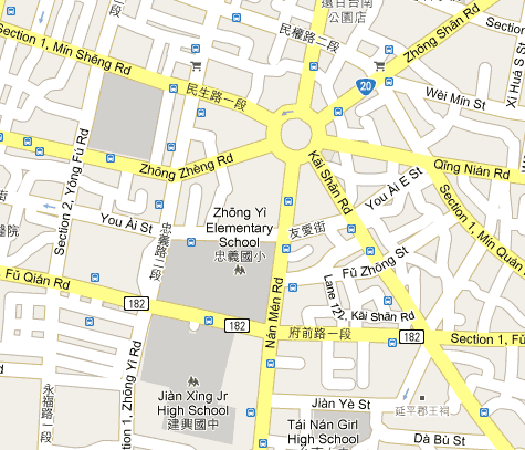
And here’s how it is now:
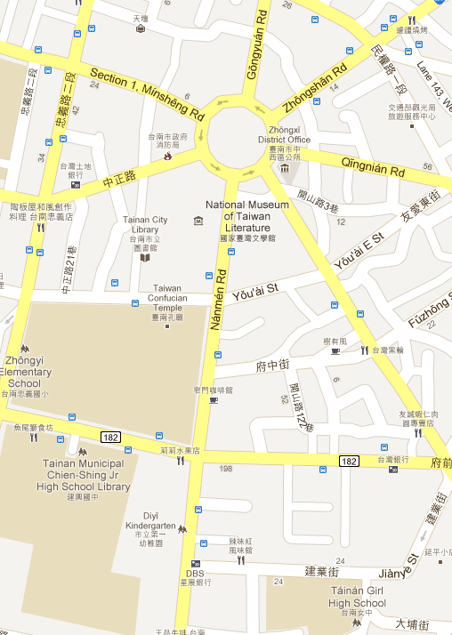
Oddly, “Jiànxīng Jr High School” has been changed to “Tainan Municipal Chien-Shing Jr High School Library” — which is wordy, misleading (library?), and in bastardized Wade-Giles (misspelled bastardized Wade-Giles, at that). And “Girl High School” still hasn’t been corrected to “Girls’ High School”. (We’ll also see that problem in the maps for Taipei.)

But for the most part things are much better, including — at last! — a correct apostrophe: Yǒu’ài St.

As these examples from Taipei show, the apostrophe isn’t just a one-off. Someone finally got this right.

Rén’ài, not Renai.
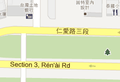
screenshot from Google Maps, showing how the correct Rén'ài (rather than the incorrect Renai) is used

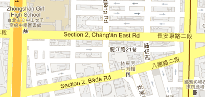
Cháng’ān, not Changan.
screenshot from Google Maps, showing how the correct Cháng'ān is used

Well, for the most part right. Here we have the correct Dà’ān (and correct Ruì’ān) but also the incorrect Daan and Ta-An. But at least the street names are correct.
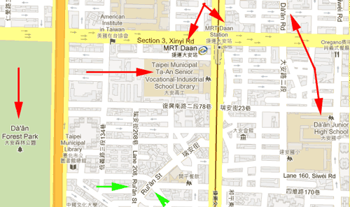
click for larger screenshot from Google Maps, showing how the correct Dà'ān (and correct Ruì'ān) is used but also the incorrect Daan and Ta-An

Second, MRT station names have been fixed … mostly. Most all MRT station names are now in the mixture of romanization and English that Taipei uses, with Google Maps also unfortunately following even the incorrect ones. A lot of this was fixed long ago. The stops along the relatively new Luzhou line, however, are all written wrong, as one long string of Pinyin.

To match the style used for other stations, this should be MRT Songjiang Nanjing, not Jieyunsongjiangnanjing.
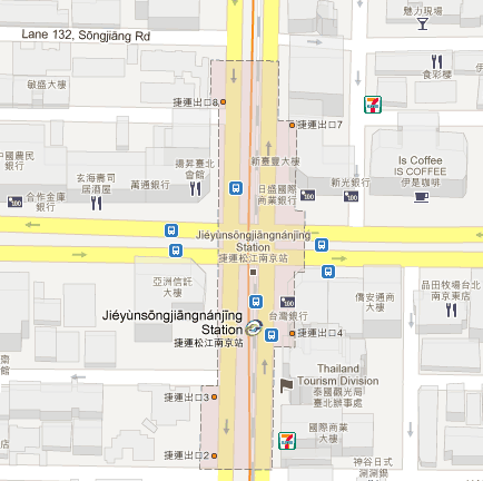
screenshot from Google Maps, showing how the Songjiang-Nanjing MRT station is labeled 'Jieyunsongjiangnanjing Station' (with tone marks)

Third, misreadings of poyinzi (pòyīnzì/破音字) have largely been corrected.

Chéngdū, not Chéng Dōu.
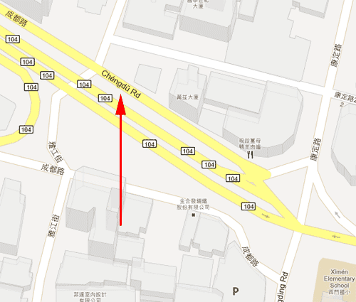
screenshot from Google Maps, showing how the correct 'Chéngdū Rd' is used

Like I said: have largely been corrected. Here we have the correct Chéngdū and Chóngqìng (rather than the previous maps’ Chéng Dōu and Zhòng Qìng) but also the incorrect Houbu instead of the correct Houpu.
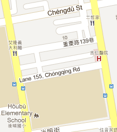
screenshot from Google Maps, showing how the correct Chóngqìng Rd and Chéngdū St are used but also how the incorrect Houbu (instead of Houpu) is shown

But at least the major ones are correct.

Unfortunately, the fourth point I raised two years ago (Tongyong Pinyin instead of Hanyu Pinyin at the district and city levels) has still not been addressed. So Google is still providing Tongyong Pinyin rather than the official Hanyu Pinyin at some levels. Most of the names in this map, for example, are distinctly in Tongyong Pinyin (e.g., Lujhou, Sinjhuang, and Banciao, rather than Luzhou, Xinzhuang, and Banqiao).
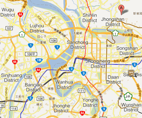
Google did go in and change the labels on some places from city to district when Taiwan revised their names; but, oddly enough, the company didn’t fix the romanization at the same time. But with any luck we won’t have to wait so long before Google finally takes care of that too.

Or perhaps we’ll have a new president who will revive Tongyong Pinyin and Google will throw out all its good work.

Zhou Youguang on NPR

Louisa Lim had a story on National Public Radio yesterday about Zhou Youguang (周有光 / Zhōu Yǒuguāng), who’s often referred to as the father of Pinyin.

Most stories in the mass media about him focus on just two things, which might be summarized as “pinyin” and “wow, he’s really old.” This story, however, draws welcome notice to some some other things about him, as the title reveals: At 105, Chinese Linguist Now A Government Critic. (There’s a link to the audio version near the top of the page. Zhou can be heard in the background speaking Mandarin — though his English is excellent.)

The article also provides a link to his blog: Bǎisuì xuérén Zhōu Yǒuguāng de bókè (百岁学人周有光的博客).

Further reading:

Hat tip to John Rohsenow.

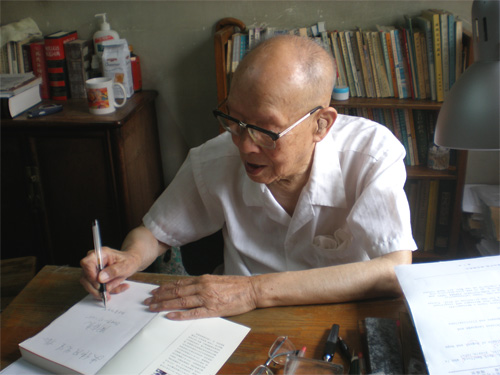
photo of Zhou Youguang signing a book for me