San Francisco will begin its own enforcement of a 2019 bill that places restrictions on the use of self-submitted Chinese names (i.e., names as written in Chinese characters), requiring that candidates prove they’ve had the names since birth or that the name has been used publicly for at least two years.
All other candidates on the ballot will be assigned transliterated names (i.e., names that use Chinese characters according to rough their having at least rough equivalents in sound in Mandarin, Cantonese, or another Sinitic language).
Since 1999, San Francisco — whose [ethnic] Chinese population is about 21.4 percent of its population as a whole — has required ballots to include the candidates’ English names and their translated or transliterated names in Chinese characters….
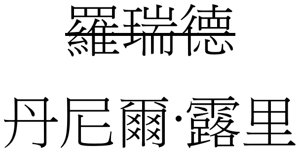
[C]andidate for mayor Daniel Lurie, “will likely be assigned a name, 丹尼爾·露里,” which “doesn’t have any meaning. It’s just an approximate pronunciation of his name in English: ‘DAN-knee-er LOO-lee.’”
Lurie had already given himself the name 羅瑞德, which means “auspicious” (瑞) and “virtue” (德), according to the [San Francisco] Standard. The Standard said this name is “widely publicized in the Chinese-speaking world,” but since he is a first-time candidate, if he can’t prove he has used the name for at least two years, it likely will not appear on the ballot in 2024.
Many established local public figures will be grandfathered in, since many will meet the two-year threshold already.
But then there’s this: San Francisco Supervisor Connie Chan, who led the push for the change, said, “Cultural appropriation does not make someone Asian…. There is no alternative definition to whether someone is Asian or not. It should be based solely on a person’s ethnicity and heritage. That’s what this law is about.”
That’s very different than a birth-name or two-year stipulation.
As real as cultural appropriation may be in some situations, wanting to base this “solely on a person’s ethnicity and heritage” seems to me problematic. I doubt Chan would argue that immigrants like herself who gain U.S. citizenship are not real Americans entitled to use Western names like “Connie.”
Then there’s the case of plenty of people whose ethnicity and heritage are not Chinese who live in Asia and have Chinese names, in many cases because they were required by government regulations. I’m one of those people. Although I’m unlikely to ever run for office in San Francisco and I’ve had my “Chinese name” a lot longer than two years, Chan doesn’t seem interested in granting any ground on this issue — at least not from what’s given in the brief quote.
source:
San Francisco targets non-Chinese candidates using Chinese names on ballots, The Hill, December 7, 2023
further reading:
SF politicians and Chinese names, Pinyin News, May 12, 2023