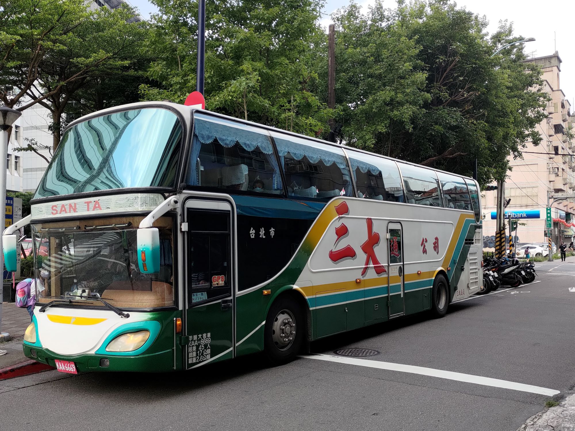
Santa’s in his bus and all’s right with the world.
Although coach buses in Taiwan often use the Gwoyeu Romatzyh romanization system, this bus uses “SAN TA” for “三大”, which is Wade-Giles.

Santa’s in his bus and all’s right with the world.
Although coach buses in Taiwan often use the Gwoyeu Romatzyh romanization system, this bus uses “SAN TA” for “三大”, which is Wade-Giles.
Recently, on my way to Wulai (just south of Taipei), I spotted an interesting sign. Normally, the combination of “interesting sign” and “Wulai” means something in a language of one of Taiwan’s Indigenous Peoples. But for today I have something different: Japanese, Taiwanese, and Mandarin. Plus another bonus sign in Japanese (I think) — but more on that later.
I wasn’t able to get a good photo of my own, so here’s one from Google Street View.
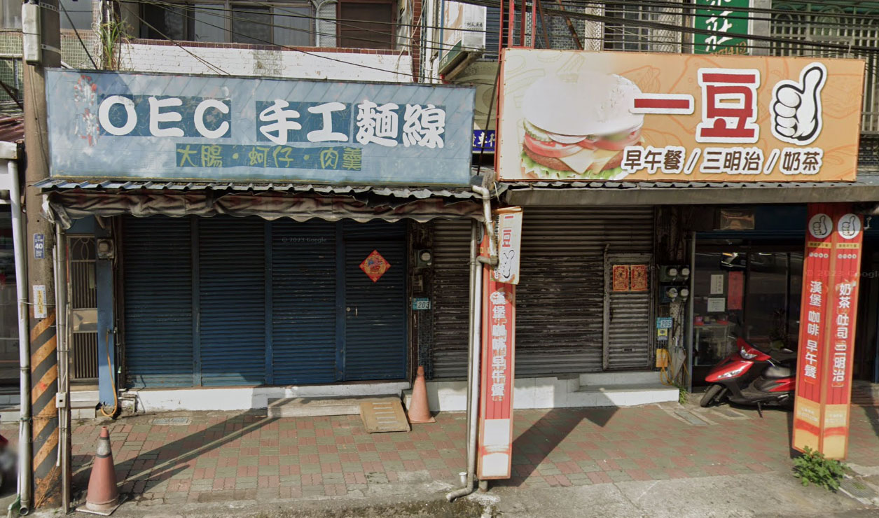
The “OEC” on the sign on the left is meant to represent Japanese “oishī” (美味しい / おいしい), which means “delicious.” Knowledge of some Japanese words is very common in Taiwan, much as knowing a few words in Spanish is common in parts of the USA.
The whole top line is “OEC 手工麵線” (OEC shǒugōng miànxiàn) = “delicious handmade noodles.” The letters on the sign work like the hyphenated combinations in William Steig’s charming C D B.
The line below the sign’s headline is also linguistically interesting.
大腸, 蚵仔, 肉羹
(intestines, oysters, meat soup)
The second word, 蚵仔, would be pronounced kezi in Mandarin. But in Taiwan it’s standard for that to be read in Taiwanese as “ô-á.” Also notable is the use of handwriting — rather rare these days — instead of a computerized font.
The brunch shop next door also has what I strongly suspect is an interesting sign: 一豆, which in Mandarin is yi dou (lit. “one bean”). Someone who knows Japanese help me out with this one.

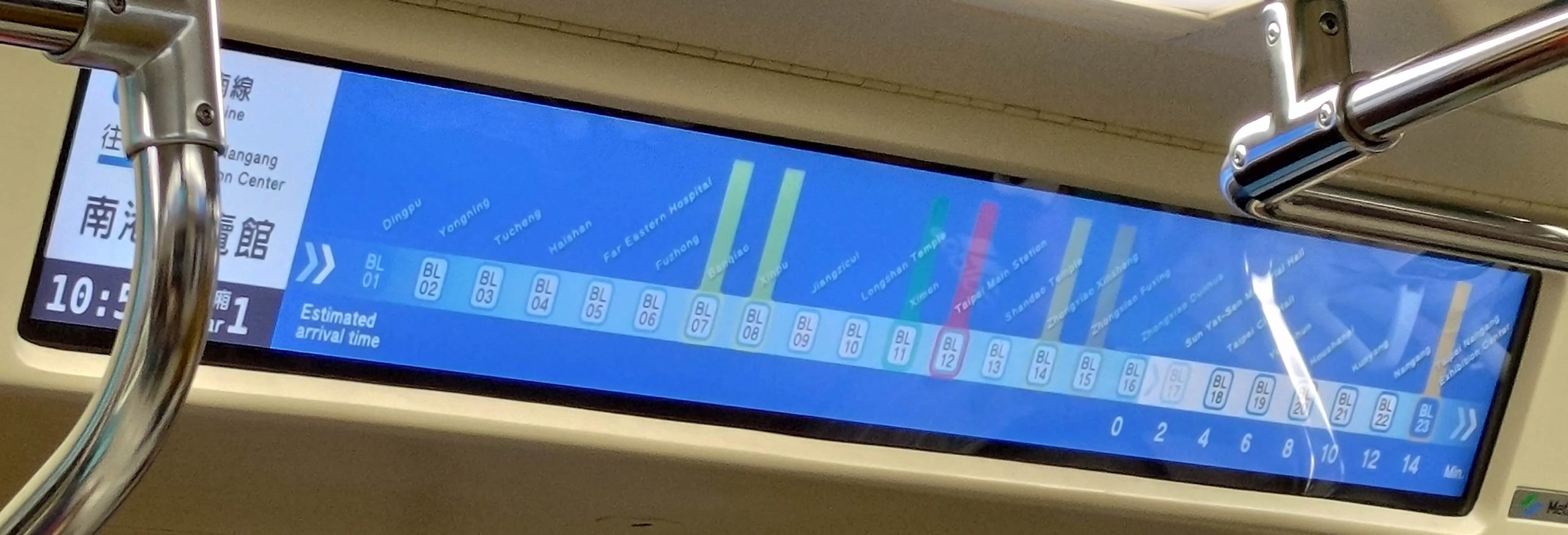
For the past few months, one can occasionally spot trains along the Taipei MRT’s blue line (aka the Ban-Nan line, for the Banqiao–Nangang line of the subway system) sporting a new style of above-door announcements. (Perhaps some of the other lines have these as well; but I’m not on them as much and haven’t spotted new signage on those yet.)
The MRT has signs above the doors to let people know what the stops are coming soon. Or at least that’s what the signs are supposed to do, what they need to do in order to help passengers. Alas, that crucial function appears to have been overlooked when designing the new signs, which are all bling-bling and little useful substance.
In fact, they’re so bad that I’m almost surprised they don’t feature cutesy cartoon characters — something that would make the disaster complete.
The photos in this post of the new signs were taken from the seat with the best vantage point of the video-screen sign. Some zoom was used to get the important part of the image to stretch from one side to the other of the photos. In short, the parts of the sign passengers need to read likely appear even smaller in real life than they may look in the photos. Of course, I could have positioned myself immediately in front of the signs and gotten better photos. But the point of signage isn’t what can be seen if one is standing close to and directly in front of it; rather, good signage needs to work for viewers from farther away and at an angle as well. So the proximity and angle represent a compromise on my part rather than the farther vantage point from which many riders will experience the signs. In other words, for many riders, the signs will look even smaller and less clear than shown in these photos.
And, as we’ll see, smaller is definitely not a good thing.
Here’s a close-up of the above sign, rotated slightly and showing the size of the text as a percentage of the screen height (approximately).

The screens themselves are large. But what about the information they need to convey? The names of the stations, the most important information, are small: just 19% of the screen height for the Chinese characters and only 6% of the screen height for the Pinyin. I suppose one could add another percentage point or even two if the descenders are counted as well rather than just the cap height. But even 8% would be utter madness! The Pinyin text is absurdly tiny — and as such is close to useless. How is anyone supposed to read that?! But there’s plenty of space on the screen to make the Pinyin larger, especially if it is given separately rather than in combination with Chinese characters at the same time.
The video screens do cycle through different information, with one screen providing station names in Pinyin and English without any Chinese characters. But it’s almost as if they’re trying to make the signage unreadable. Here’s an example:
Again, the English/Pinyin names are too small to read — needlessly so. And it doesn’t help the cause of making text large enough to read that the Taipei MRT has some needlessly wordy station names.
But there is one new feature I actually like: listing how many minutes before the next stations. (Note the numbers along the bottom right of the screen.) This is nicely done — if only one could read the names of the stations.
And still more space could be saved if those nicknumbers (e.g., “BL17”) were removed. I have yet to hear anyone ever even mentioning them, at least not in a positive way. And to think the MRT system spent NT$300 million (about US$10 million) on that!
And let’s not forget that Taiwan is projected to become a super-aged society by 2025 — which means an especially large number of people who don’t see as well as they used to. Thus, it is all the more important that the letters are large enough to be read by people with less than perfect eyesight.
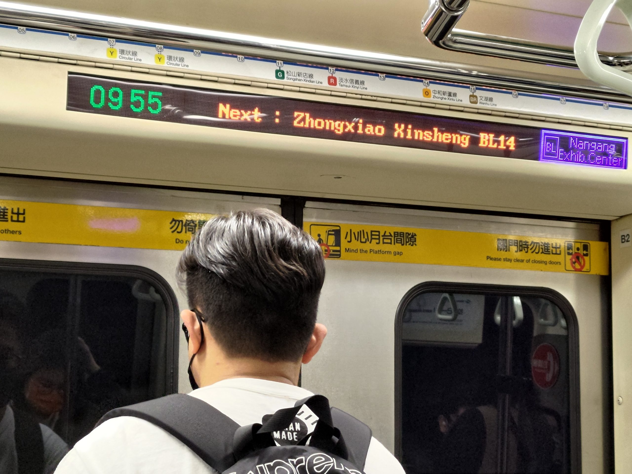
Alas, there’s more. The signs, as bad as their design is from the standpoint of the size of the text, have another significant flaw: their use of color.

Look at how the name of the next station is presented: in light-blue-gray against an off-white background. There is little contrast between the text and the background, which makes the text very difficult to read. I would have thought that this problem, like the problem of size already discussed, would have been painfully obvious to everyone involved in the design process. Yet for some reason this wasn’t corrected long ago on the drawing board but has instead made it all the way to signage on the MRT itself! That light-blue-gray against off-white makes me just livid.
Another important aspect of color for the MRT is the assignation of colors to the different transit lines. Identifying different lines by color is actually quite useful, and many people refer to the various lines by their color. So how well do the new signs handle this? If you’re familiar with Taipei, try to ignore the names and placements of the lines for the moment. Just this once — because the actual station names are so tiny and damn hard to read on these video screens, and because I’m hoping you’ll try to let your knowledge of the MRT avoid interfering with your objective judgment on this — I’m asking you to refer to the numbers for Taipei MRT stations, stupid though they are.
The lines that intersect with the blue line are marked by vertical bars of color. OK, now look at the image below and answer a few simple questions. You’ll probably have to click on the photo one or more times to achieve the extreme magnification needed to view the sign well.

Q: Which station or stations intersect with the red line?
A: BL12.
OK, that was easy. Now another.
Q: Which station or stations intersect with the green line?
A: BL11.
Simple enough. But how about these?
Q: Which station or stations intersect with the brown line?
Q: Which station or stations intersect with the orange line?
Q: Which station or stations intersect with the yellow line?

Why the MRT thinks passengers need a regular reminder of what car number they are in is beyond me. Note, too, how those numbers are larger than the station name in English/Pinyin.
The answers are, respectively, BL15 & BL23, BL14, and BL07 & BL08.
How’d you do? And could you even tell that BL15 and BL23 are supposed to be the same color, and that color is supposed to be brown?
Here’s a look at what the current/old signage looks like.
In short: By the most important measures, the old signs are better than the new ones. And they already exist, so keeping them won’t cost taxpayers and farepayers anything, unlike putting in expensive new video screens that make navigating the MRT worse.
Meanwhile, the MRT system has still not corrected errors in the Pinyin for the names of some stations.
My post about a month ago on another pun for the Year of the Rabbit was in part an excuse for me to note how common “OMG” (oh my God) has become in Taiwan. Indeed, it should be considered not just English anymore but a frequently used loan word, one that is usually written, using the Roman alphabet, as a “lettered word” in Mandarin (i.e., “OMG“). But sometimes “oh my God” shows up in Chinese characters (e.g., 喔麥尬) used as phonetic approximations of the English. And sometimes, as in today’s pun-tastic example, it appears in a mix of English and Chinese characters.

The “Oh.my.軋” store sells nougat, as one can see from the smaller sign below and to the right of the main sign: “鮮治牛軋糖” (xiān zhì niúgátáng / freshly made nougat).
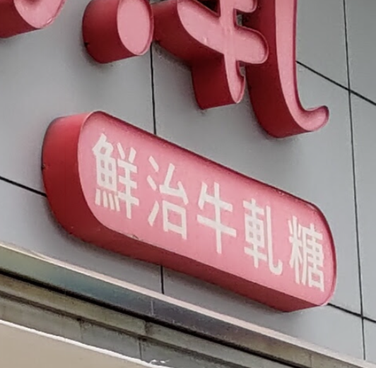
Niugatang is simply a Mandarinization of the English word nougat; it’s transcribed “牛軋糖”. Tang is the Mandarin word for sugar and thus a short form meaning candy.
The use of a stylized version of the character for niu (牛), which rhymes with English’s “oh”, inside the “Oh” of the logo also makes the sign not just Oh my ga but also niu my ga (牛.my.軋). Puns upon puns.
The “Oh.my.軋” uses the ga from niugatang as a phonetic approximation of the English word “god.”
The character “治” is also worthy of note as an example of why Chinese characters are so damn hard. The character has two main parts. The left side has 氵, which is an alternate form of “水,” which is used in writing “shuǐ” (“water”) and many other words. The right side is 台 (tái), which is used in writing the word for platform but which is most commonly seen in Taiwan used phonetically in place names: Taiwan, Taipei (Taibei), Taichung (Taizhong), Taitung (Taidong), etc. So in terms of sound, that’s a shui and a tai. But in this case the phonetic hint commonly given in Chinese characters is 台 (tái). So does that mean the character “治” is pronounced tái?
Nope. Note even close. It’s pronounced zhì. And one just has to memorize such instances.
If you’re thinking, Hmm, shui plus tai? That’s water plus platform. Maybe the character is an ideograph for a pier! Nope. Once again, not even close. That’s generally not how Chinese characters work, no matter how many BS-filled TED talks on Chinese characters, memes, and crisis-tunity claims fill the Internet.
Of course, a character used for pier would make no sense on a sign for nougat. But as we’ll see, there are other things that don’t make sense here.
As I noted above, “xiān zhì niúgátáng” means “freshly made nougat.” But the weird thing is the character being used for zhì isn’t the “right” one. The sign uses “治” rather than the proper and homophonous “製” (zhì). The character used in the sign, however, doesn’t mean “made” but is instead most often seen in terms like zhìlǐ (治理), which is the Mandarin word for manage/administer/govern. Freshly administered nougat just doesn’t have much of a ring to it. So why did the company use that? My guess — and it’s just a guess — is that they wanted to evoke “Taiwan” through the 台 (tai) part of the character. (The company’s website — which has plenty of instances of the character 製 — claims that their nougat is one of the most popular purchases by tourists from China.) My long-suffering Taiwanese wife, however, exclaims that I think too much, and she yearns for the day when I find a more traditional hobby than spotting strange signs and asking her to help me understand them.
Rough guide to pronunciation for those unfamiliar with Mandarin or Hanyu Pinyin:
Further reading listening:
Company website:
An observant reader sent in this relatively rare example in Taiwan of the use of Hanyu Pinyin with tone marks on signage
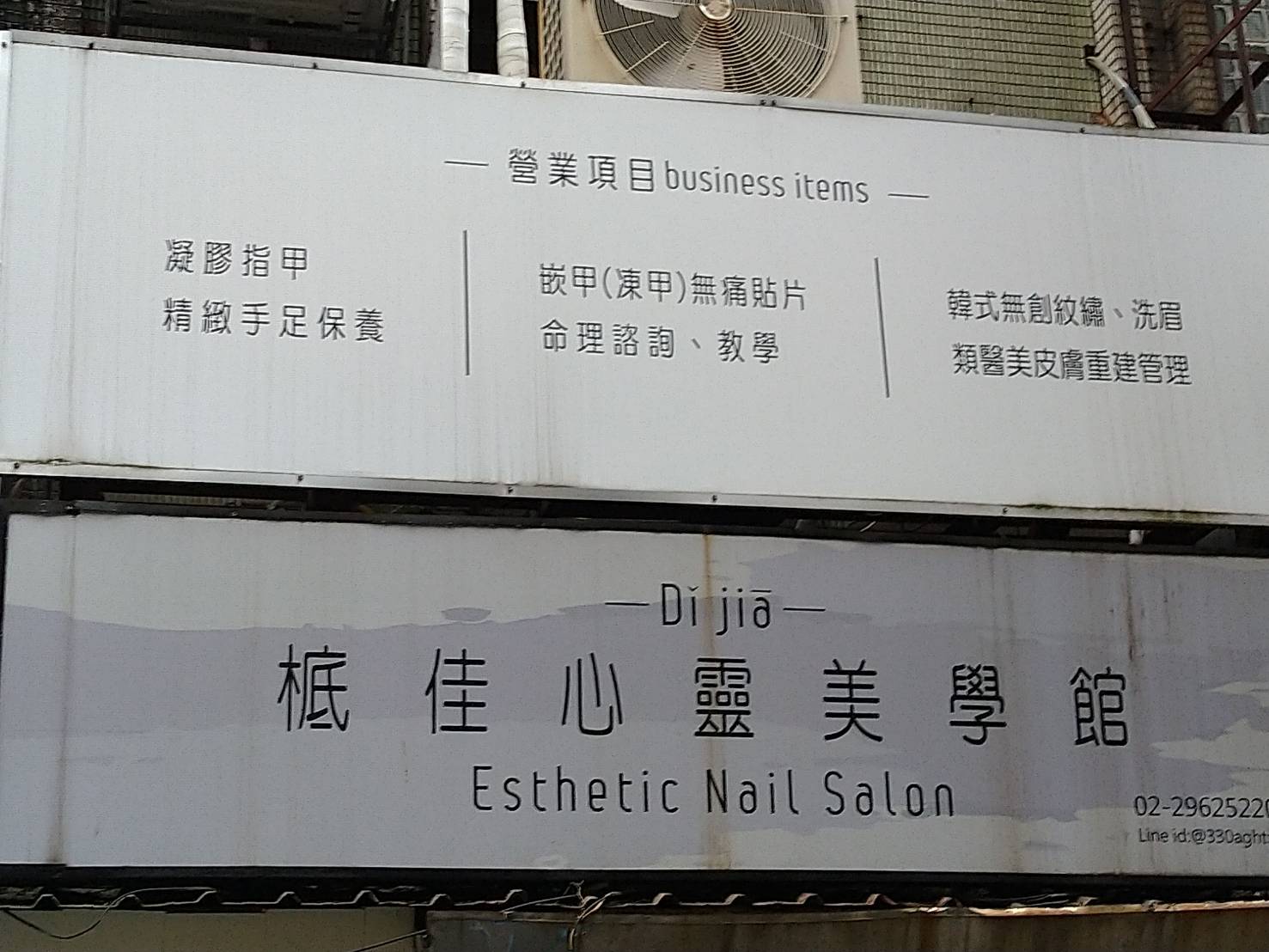
The Pinyin and especially the tone marks are a little thin, so I’ll give a closeup view:

The sign, here in aesthetic Banqiao, of course, reads:
Dǐ jiā
㭽佳心靈美學館
Esthetic Nail Salon
(Dǐ jiā xīnlíng měixué guǎn)
The Pinyin is not just “esthetic,” because most people probably don’t know the character ‘㭽’. Although they could probably take an educated guess that 㭽 is pronounced dǐ because of the 氐, that’s not the same thing as knowing for sure. So the Pinyin comes in handy even for most literate Taiwanese — if they can see it.
What’s especially surprising is that the people at the store went with Pinyin instead of zhuyin fuhao: ㄉㄧ ㄐㄧㄚ.
Pinyin News reader Channing Bartlett passed along this photo he took c. 1980 in Taipei at the corner of Jianguo North Road section 1 and Chang’an East Road section 2. As you can see, inconsistencies on Taiwan street signs weren’t restricted to matters of romanization. Here we have 建國北路一段 (Jiànguó Běi Lù yī duàn) and 長安東路二段 (Cháng’ān Dōng Lù èr duàn) — or rather “段二路東安長.”
One sign is written left to right, the other right to left.
Also, if you look closely at the characters for lu and duan, you can see that the fonts are different, likely indicating the signs are of different ages. But if one sign was replaced, why not the other? Mysterious are the ways of Taiwan street signs.
Bartlett described the experience of trying to read street signs quickly back then:
As I was on a bus barreling by, I had just a quick moment to read one. But often it took up my quick moment just to see whether it was written L to R or vice versa. The practice was inconsistent, as you can see in this photo.

Reader Jens Finke recently came across a newspaper clipping from about twenty years ago, the dark ages of Taipei’s street signs. Back then most roads in the city were identified in bastardized Wade-Giles and wildly misspelled variations thereof. Two or even more spellings for one name at the same intersection was not uncommon. (Outside of Taipei, many signs were in MPS2, which is often mistaken — including in the article below — for the Yale system.) And so the foreign community of Taiwan by and large cried out for the use of Hanyu Pinyin. But that’s not what foreigners got. Instead, Taipei Mayor Chen Shui-bian decided to go with a half-baked local invention called Tongyong Pinyin.
Really, half-baked. Incredibly, not long after street signs started to go up in this system in 1998, its creator changed it. For example, the article mentions “Zhongsiao” (“Zhongxiao” in Hanyu Pinyin). Scarcely had the paint dried on the new street signs than the spelling in the supposedly same system was changed to “Jhongsiao.” This and other changes rendered most of the new signs obsolete.
But before many signs went up in the old new system or the new new system, Chen lost his December 1998 reelection bid. His successor, Ma Ying-jeou, didn’t pursue Tongyong Pinyin. Ma even took the surprising step of asking foreigners what they wanted and took action to implement the overwhelming choice of the foreign community (both then and now): Hanyu Pinyin, though unfortunately the road to this was not without monumentally foolish detours, bad ideas, and still-unfixed errors.
In 2000, Chen was elected president. He asked his minister of education, Ovid Tzeng, to decide on a romanization system for Taiwan. After Tzeng picked Hanyu Pinyin, he was given the boot. His successor saw the writing on the wall and quickly announced his support of Tongyong Pinyin. Meanwhile, Ma, who remained mayor of Taipei, said he had no plan to change to Tongyong Pinyin. This time marks the beginning of Taiwan’s romanization wars, which raged in the first decade of the century and have still not been completely resolved.
Some readers may suspect the reporter in the article below of pulling people’s legs (e.g., “Special thanks to janitorial assistant Shaw Toe-now of the Jyii Horng Bus Company in Tainan for faxing a copy of his employer’s self-designed romanization table”). But I assure you, it would be very difficult to outdo the craziness of Taiwan’s romanization situation back in those days.
Feel free to use the comments section below if you’d like to share any recollections of Taiwan’s signage mess of the 1990s and before.
In my transcription, I’ve fixed a few typos and omitted the article’s Cyrillic system for Mandarin.

Friday, May 8, 1998It’s all Roman
By Ian Lamont
STAFF REPORTERThrow out all of the new business cards, office stationery and checkbooks that you ordered a few months back to include Taipei’s new telephone numbers. Just three months after the phone company made all the city’s phone numbers eight digits long, the Taipei City Government has decided it wants to institute a new romanization system for street signs to make the city more accessible to international visitors.
Well, at least that’s the plan. Someone in the city government’s vast bureaucracy finally figured out that the screwed-up mix of Wade-Giles and Yale (the same guys who brought you “Peking”) was not really helping anything by having foreign nationals attempting to say “Jen-ai Road” or “Kien-kwo South Road” to bewildered taxi drivers.
Not that taxi drivers won’t be any less confused by the new linguistic concoctions that will result under the new system:
“I’d like to go to Her-ping West Road, please.”
“Huh?”
“You know, Her-ping West Road. It’s on the way to Manka?”
In case you didn’t understand this little exchange, “Herping” (rhymes with “burping”) is the new Mandarin romanization for the current Hoping East/West Road, while “Manka” is the Taiwanese name for Taipei’s Wanhua neighborhood. According to the Taipei City Government, both of these names will be in common use once all the city’s street signs are replaced.
Professor Yu Boh-chuan, the Academia Sinica linguist who helped design the new system, says his way reflects the local culture while at the same time following international standards.
Currently, there is only one international standard — the hanyu pinyin system developed by China some forty years ago and now almost universally accepted as the official Mandarin romanization system by governments, universities, libraries and publishers around the world. While there are many similarities between hanyu pinyin and Taipei’s new system, there are also several glaring differences, most notably the puzzling use of the letter “r” at the end of some syllables, the omission of the palatal spirant “sh” sound in certain Mandarin words, and the inclusion of Taiwanese, Hakkanese and Aborigine place names.
Since Taipei will soon have at least three different romanization systems floating around, Weekend has decided to create a handy chart that will help readers (and potentially psychotic mail sorters) survive the sticky transition period.
As an added bonus, we’ve decided to include several other alternative spelling systems for non-Chinese speakers. Special thanks to janitorial assistant Shaw Toe-now of the Jyii Horng Bus Company in Tainan for faxing a copy of his employer’s self-designed romanization table, as well as Prof. Vladimir Torostov of the Sinitic Languages Department of Khabarovsk University in Russia for submitting a conversion table with the cyrillic spellings for Taipei street names. Dosvidanya!
Old Romanization New Romanization Mainland Jyii Horng Bus Co. Chunghsiao Zhongsiao Zhongxiao Chunggshaw Jenai Renai Renai Lenie Hsinyi/Shinyi Sinyi Xinyi Shynyii Hoping Herping Heping Huhpeeng Keelung Kelang Jilong Cheerlurng Pateh Bader Bade Patiih

Above is a directional road sign at an intersection in Taitung (Taidong), Taiwan. It reads:
財政部
南區國稅局
臺東分局
[Cáizhèngbù
Nánqū Guóshuìjú
Táidōng Fēnjú]
Taitung Branch, National Taxation
Bureau of the Southern Area,
Ministry of Finance
Although Taiwan has a lot of this sort of directional signage, I don’t think I’ve written before about why I think so many examples of it are downright awful.
Not only is the sign unnecessarily wordy, the part that receives the greatest emphasis (by appearing in large characters) is the least useful: 臺東分局. Taidong Fenju means simply “Taitung branch office.” But since the sign is in Taitung itself, mention of an office being in Taitung provides zero useful information. (It’s a safe bet that drivers will already know which part of the country they’re in and that they aren’t driving around that neighborhood looking for the Taipei office.) The same thing goes for mention of this being the office for the Nanqu (“Southern Area”).
Nor do motorists care in the least what ministry the National Taxation Bureau belongs to. They simply need to be able to comprehend quickly and easily the main point of the sign. Too much information becomes clutter, a fatal problem on signs that drivers need to be able to read and comprehend quickly and easily.
A fundamental of good signage is to keep it simple.
The sign would be much better if it read simply “國稅局 Tax Office” and had an arrow. (Also, though this would be a moot point if the line were deleted, I’d prefer 台稅局 over 臺稅局. We have Ma Ying-jeou to thank for the prevalence of 臺.)
My private word for unnecessarily wordy signs in Taiwan is “signese,” which should not be confused with the good kind of Signese.
Sorry about the poor quality of the photo. I had to quickly use a cell phone camera on zoom through a taxi windshield — not ideal.