Two-syllable Taiwanese family names

As of June 30, 2018, Taiwan had just 22,332 people with a disyllabic surname (i.e., one that takes two Chinese characters to write). They cover just 0.09% of the population — just less than one in a thousand. This is slightly less than the 0.11 percent of the population of China that has such a family name. Also, in China, by far the most common two-syllable surname is Ouyang; but in Taiwan “Zhangjian” is more seen.

Name Name total
張簡 Zhangjian 9,059
歐陽 Ouyang 7,860
范姜 Fanjiang 4,300
周黃 Zhouhuang 590
江謝 Jiangxie 523

Further reading:

Source:

  • Quánguó xìngmíng tǒngjì fēnxi (全國姓名統計分析). Department of Household Registration, Ministry of the Interior, Taiwan, 2018, p. 28.

Two-syllable Chinese family names

By far the most common two-syllable Chinese family name in China is Ouyang (NB: this should not be written Ou-yang, Ou-Yang, or Ou Yang), with it representing more than twelve times as many people as the next most common name on the list: Shangguan.

Surname Fùxìng (複姓/复姓) Number of people in China with this surname
Ouyang 欧阳 1,112,000
Shangguan 上官 88,000
Huangfu 皇甫 64,000
Linghu 令狐 55,000
Zhuge 诸葛 48,000
Situ 司徒 47,000
Sima 司马 23,000
Shentu 申屠 19,000
Xiahou 夏侯 11,000
Helan 贺兰 10,000
Wanyan 完颜 6,000

Those figures for the most common two-syllable Chinese family names (commonly called “two-character” family names) total 1.495 million, or about 1.5 million, which is not an inconsiderable number but still just a drop in the bucket compared with China’s population of some 1.41 billion. Only about one tenth of 1 percent (0.11%) of people in China have such names.

The percentage is a bit less in Taiwan. The most common doubled surname in Taiwan, however, is Zhangjian (張簡/张简), which doesn’t appear at all on the list of the most common disyllabic family names in China. In Taiwan, Ouyang is second.

Further reading:

source: 《2020 nián quánguó xìngmíng bàogào》 fābù (《二〇二〇年全国姓名报告》发布), Gōng’ānbù wǎngzhàn (公安部网站), February 2, 2021

Malaysian state moves to boost Hokkien

Penang, Malaysia, is reportedly moving to adopt the Penang dialect of the Hokkien language as a thing of “nonmaterial cultural heritage” (fēi wùzhì wénhuà yíchǎn / 非物质文化遗产).

In Taiwan, Hokkien is also known as “Taiwanese” and “Hoklo.”

The chairman of the Penang Tourism and Creative Economy Affairs Committee said that to preserve Hokkien in Penang, the government there would support a “Speak Hokkien” campaign and allocate funds to NGOs and other groups for activities promoting Hokkien. He also hopes organizations will host competitions not only in Pinyin(!) but also in speaking topolects.

Topolects are an important part of the legacy of Chinese culture, he said.

为传承说方言,确保槟城福建话得以保存和广泛使用,槟政府除了支持社团组织举办“讲福建话”运动,也拨款给乔治市世界遗产机构和非政府组织开展宣传福建话活动。

他希望更多华社组织团体,除了办汉语课程或拼音比赛,也可举办说方言比赛,让民众发现说方言之美与意义,达到Z世代也可说一口流利方言与汉语,毕竟方言也是中华文化与遗产重要部分。

Other Sinitic topolects (fangyan) could also be considered for nonmaterial cultural heritage status, he said.

Whether this really happens, and whether it will be enough to make a difference, remains to be seen. But at least it looks like someone influential in Penang is working hard to move things in the right direction.

Sources:

If you ever find yourself stuck on how to pronounce English

It’s times like this I especially miss John DeFrancis. How he would have loved this! It’s partially an example of what he dubbed “Singlish” — not Singapore English but Sino-English, the tortured attempt to use Chinese characters to write English. He details this in “The Singlish Affair,” a shaggy dog story that serves as the introduction to his essential work: The Chinese Language: Fact and Fantasy. (And I really do mean essential. If you don’t have this book yet, buy it and read it.)

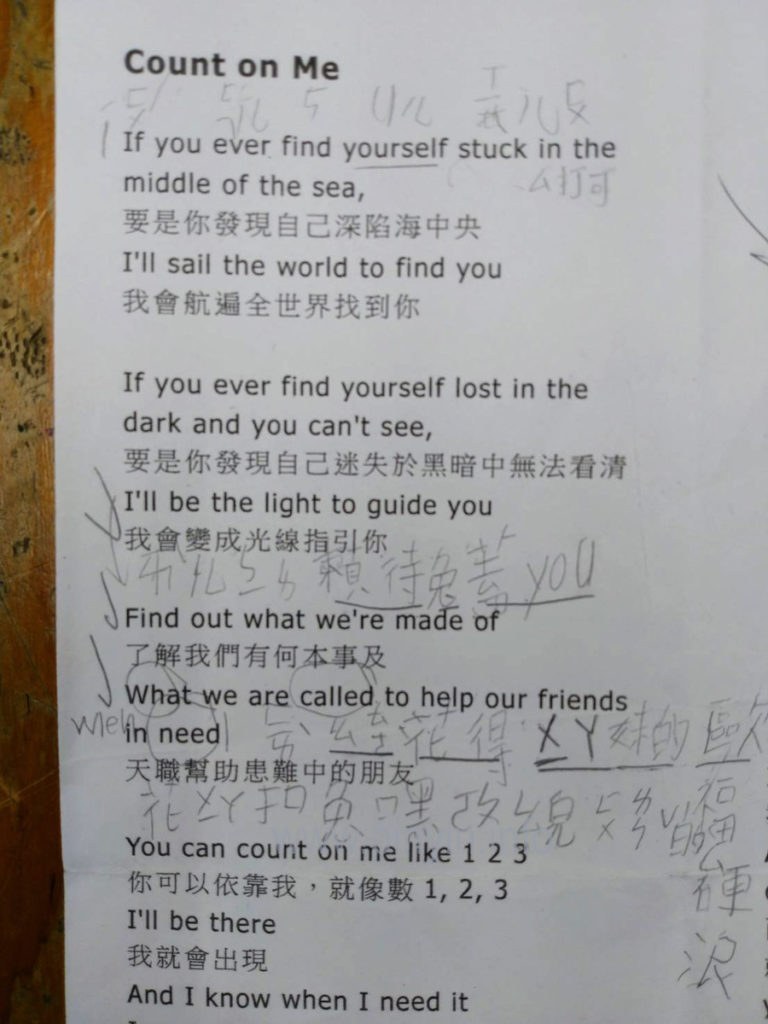
Here are some lyrics from a popular song, “Count on Me,” by Bruno Mars, with a Mandarin translation. The interesting part is that a Taiwanese third-grader has penciled in some phonetic guides for him or herself, using a combination of zhuyin fuhao (aka bopo mofo) (sometimes with tone marks!), English (as a gloss for English! and English pronunciation of some letters and numbers), and Chinese characters (albeit not always correctly written Chinese characters — not that I could do any better myself). Again, this is a Taiwanese third-grader and so is someone unlikely to know Hanyu Pinyin.

lyric sheet, as described in this post

“If you ever find yourself stuck”


If

ㄧˊㄈㄨˊ

yífú
you  
 
ever ㄟㄈㄦ ei-f’er

find

5

five
yourself Uㄦㄒㄧㄦㄈㄨ U’er xi’erfu

stuck

ㄙ打可

s-dake

“I’ll be the light to guide you.”


I’ll

ㄞㄦ

ài’er

be

ㄅㄧ

bi
the l[e]

light

賴特*

laite
to tu

guide


gai

you

you

you

“Find out what we’re made of”


Find

ㄈㄞˋ

fài

out

ㄠㄊㄜ

ao-t’e

what

花得

huade

we’re

ㄨㄧㄚ

wi’a

made

妹的

meide

of

歐福

oufu

“When we are called to help our friends in need”


What when


hua

we

ㄨㄧ

wi

are


a

called


kou

to


tu

help

嘿ㄜㄆ

hei’e-p[e]

our

ㄠㄦ

ao’er

friends

ㄈㄨㄌㄣˇ的ㄙ

fulen-de-s

in


ying

need

[?]

[?]

ChatGPT writes poetry in Pinyin, sort of

I asked ChatGPT to “write a poem in Mandarin using Pinyin.”

Its first response took the form of a sonnet:

qīngchūn yǒu tài duō de mèngxiǎng,
xīwàng yǒu yīgè xiǎng zhù de dìfāng.
yīgè rén zài huáshān shàng,
tā de mèng yǒu tèbié de chàng.

zài fēngláng zhī xiàn,
tā yòng bàozhǐ zhànwàng huāliàn.
yǒngqì bǎ dōngfēng zài shǒu,
zài yùndòng zhōng fàng sīwáng zhī hòu.

mèngzhōng yǒu tài duō de jìhuà,
yǒnggǎn bǎ tāmen dōu chéngshí huà.
yǒngyuan bùyào bèi shìjiè suǒ bǎozhòng,
zhǐyào huílái bùwàng jiùshì yīzhǒng.

qīngchūn yǒu tài duō de mèngxiǎng,
wǒmen yīqǐ xiǎng zhù zhè yīqiè de dìfāng.

That one won’t win any prizes, but the result was still much better than the one produced when I asked ChatGPT to make another:

Sì jiāo qíng yuán, xìng fú suì suì,
Chūn fēng yè sè, ruò dàng huā kāi.
Dōu shì shuāng shǒu, shuāng shǒu yī,
Xīn lián xīn shì, shuāng xīn xī.

Qīng sè yǔ tiān, yǔ zhuǎn yǔ duō,
Cǎo yuǎn shān jǐn, dōu xīng huā tuō.
Yuè liàng guāng míng, míng yǔ ruò,
Qíng qíng yǔ hǎo, yǔ zhōng yǔ.

Shēn tián yǔ sǎng, qíng hǎo yǔ,
Liàng yǔ fēn fēn, shǎn chéng yǔ.
Qīng chuān huáng hé, yǔ yíng cháo,
Chūn sè xīn róu, xìng fú mǎo.

Wēn huā yǔ chūn, yǔ xǐ xīn,
Sān yuán sì jì, yǔ zhōng shuāng.
Chūn tiān xìng fú, zhuǎn yǔ shuāng,
Qíng huā yǔ jīng, yǔ yīng huáng.

That opaque mo no syl la bic mess is infected by the spirit of Literary Sinitic, which Pinyin isn’t designed to handle.

I’m hopeful that ChatGPT will get trained properly on the rules of Hanyu Pinyin — both the short-form rules of Pinyin and the longer (and superior) work of Yin Binyong — and so will be able to produce proper Pinyin. But maybe wǒ yǒu tài duō de mèngxiǎng.

As one of my heroes, Hu Shih, wrote one hundred years ago,

Nǐ bùnéng zuò wǒ de shī,
zhèngrú wǒ bùnéng zuò nǐ de mèng

(你不能做我的詩,
正如我不能做你的夢)

NB: I should probably remind everyone, should you wish to include Chinese characters or Pinyin with tone marks in a comment, be sure to encode them first or they’ll end up scrambled here. (Not my fault. Sorry.)

Mother-effing noodles

More than sixteen years ago I wrote in some detail on how what has been dubbed China’s “national swear” (i.e., tāmā de / 他媽的 / tamade — lit. his mother’s) is sometimes rendered with one of the syllables bleeped out, especially the middle one (ma).

In today’s example, though, ma has been replaced not by an X or another symbol but by its English translation: mother, with the first syllable given in Pinyin, yielding “Ta Mother” (though, properly speaking, it should be “Ta Mother’s”; and that singular for “noodle” is a bit odd too).

I spotted the Ta Mother Noodle store in Xindian, Taiwan, from a bus about a week ago. I wasn’t able to get a good photo before the bus rounded a corner, so I’m making do with one from Google Street View. According to Google, the store has closed permanently; but at least for now, its signage lives on.

History podcast episode on loanwords

Formosa Files logo

Formosa Files, the internet’s most informative podcast on the history of Taiwan, recently focused on the topic of language and loanwords: Local Language Loanwords: A Lovely Hot Pot of Fujianese, Mandarin Chinese, Japanese, English, and More (season 3, episode 5). Lots of linguistic goodness, so give it a listen, and stick around for some of the many other episodes.

Although I, like Eryk, have never found jiayou (lit. “add oil”) much to my taste, the word has already made it past the gatekeepers and into English.

Formosa Files is also on Spotify and other popular content providers.

Further reading:

Taipei MRT’s new in-car signage sucks

photo of the new-style video screen above the door of the Taipei MRT (subway system).

For the past few months, one can occasionally spot trains along the Taipei MRT’s blue line (aka the Ban-Nan line, for the Banqiao–Nangang line of the subway system) sporting a new style of above-door announcements. (Perhaps some of the other lines have these as well; but I’m not on them as much and haven’t spotted new signage on those yet.)

The MRT has signs above the doors to let people know what the stops are coming soon. Or at least that’s what the signs are supposed to do, what they need to do in order to help passengers. Alas, that crucial function appears to have been overlooked when designing the new signs, which are all bling-bling and little useful substance.

In fact, they’re so bad that I’m almost surprised they don’t feature cutesy cartoon characters — something that would make the disaster complete.

The photos in this post of the new signs were taken from the seat with the best vantage point of the video-screen sign. Some zoom was used to get the important part of the image to stretch from one side to the other of the photos. In short, the parts of the sign passengers need to read likely appear even smaller in real life than they may look in the photos. Of course, I could have positioned myself immediately in front of the signs and gotten better photos. But the point of signage isn’t what can be seen if one is standing close to and directly in front of it; rather, good signage needs to work for viewers from farther away and at an angle as well. So the proximity and angle represent a compromise on my part rather than the farther vantage point from which many riders will experience the signs. In other words, for many riders, the signs will look even smaller and less clear than shown in these photos.

And, as we’ll see, smaller is definitely not a good thing.

Here’s a close-up of the above sign, rotated slightly and showing the size of the text as a percentage of the screen height (approximately).
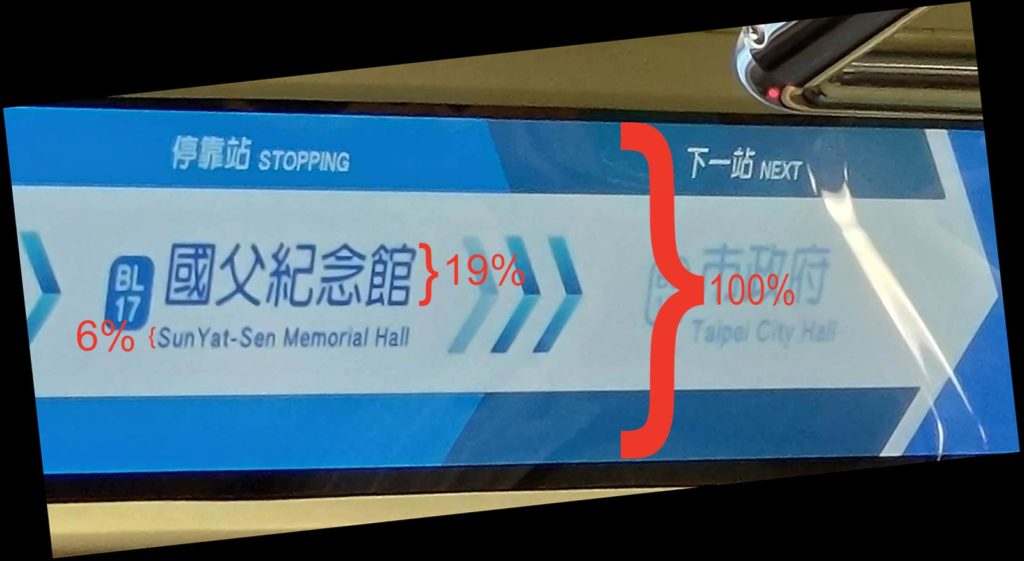
photo of the video screen with the size of the text shown as a percentage of the screen height

The screens themselves are large. But what about the information they need to convey? The names of the stations, the most important information, are small: just 19% of the screen height for the Chinese characters and only 6% of the screen height for the Pinyin. I suppose one could add another percentage point or even two if the descenders are counted as well rather than just the cap height. But even 8% would be utter madness! The Pinyin text is absurdly tiny — and as such is close to useless. How is anyone supposed to read that?! But there’s plenty of space on the screen to make the Pinyin larger, especially if it is given separately rather than in combination with Chinese characters at the same time.

The video screens do cycle through different information, with one screen providing station names in Pinyin and English without any Chinese characters. But it’s almost as if they’re trying to make the signage unreadable. Here’s an example:
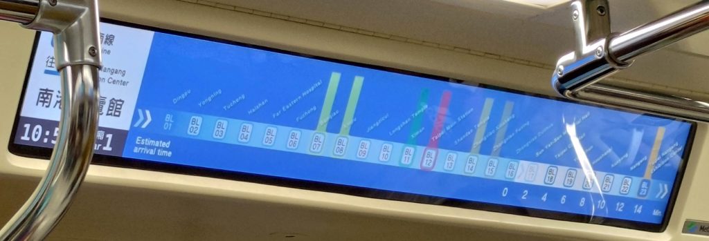
photo of a video screen on the Taipei MRT, showing the station names on the blue line in English/Pinyin in small text.

Again, the English/Pinyin names are too small to read — needlessly so. And it doesn’t help the cause of making text large enough to read that the Taipei MRT has some needlessly wordy station names.

But there is one new feature I actually like: listing how many minutes before the next stations. (Note the numbers along the bottom right of the screen.) This is nicely done — if only one could read the names of the stations.

And still more space could be saved if those nicknumbers (e.g., “BL17”) were removed. I have yet to hear anyone ever even mentioning them, at least not in a positive way. And to think the MRT system spent NT$300 million (about US$10 million) on that!

And let’s not forget that Taiwan is projected to become a super-aged society by 2025 — which means an especially large number of people who don’t see as well as they used to. Thus, it is all the more important that the letters are large enough to be read by people with less than perfect eyesight.

Alas, there’s more. The signs, as bad as their design is from the standpoint of the size of the text, have another significant flaw: their use of color.
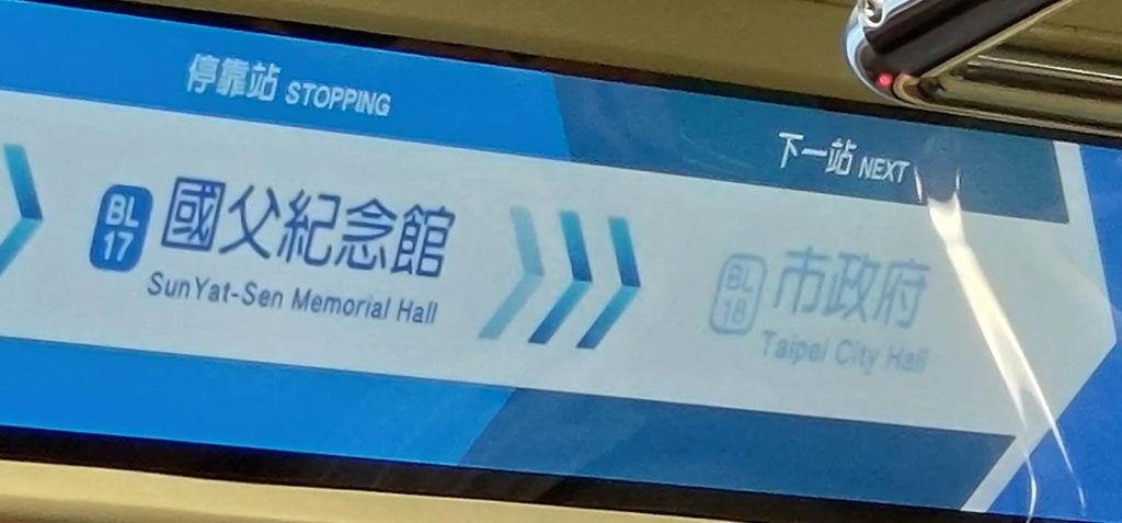
detail of the above image, as described below

Look at how the name of the next station is presented: in light-blue-gray against an off-white background. There is little contrast between the text and the background, which makes the text very difficult to read. I would have thought that this problem, like the problem of size already discussed, would have been painfully obvious to everyone involved in the design process. Yet for some reason this wasn’t corrected long ago on the drawing board but has instead made it all the way to signage on the MRT itself! That light-blue-gray against off-white makes me just livid.

Another important aspect of color for the MRT is the assignation of colors to the different transit lines. Identifying different lines by color is actually quite useful, and many people refer to the various lines by their color. So how well do the new signs handle this? If you’re familiar with Taipei, try to ignore the names and placements of the lines for the moment. Just this once — because the actual station names are so tiny and damn hard to read on these video screens, and because I’m hoping you’ll try to let your knowledge of the MRT avoid interfering with your objective judgment on this — I’m asking you to refer to the numbers for Taipei MRT stations, stupid though they are.

The lines that intersect with the blue line are marked by vertical bars of color. OK, now look at the image below and answer a few simple questions. You’ll probably have to click on the photo one or more times to achieve the extreme magnification needed to view the sign well.

photo of video-screen signage above the door of a car on the Taipei MRT's blue line, this one showing stop names in Chinese characters and with colored lines to show different line transfer points

Q: Which station or stations intersect with the red line?

A: BL12.

OK, that was easy. Now another.

Q: Which station or stations intersect with the green line?

A: BL11.

Simple enough. But how about these?

Q: Which station or stations intersect with the brown line?
Q: Which station or stations intersect with the orange line?
Q: Which station or stations intersect with the yellow line?

Why the MRT thinks passengers need a regular reminder of what car number they are in is beyond me. Note, too, how those numbers are larger than the station name in English/Pinyin.

The answers are, respectively, BL15 & BL23, BL14, and BL07 & BL08.

How’d you do? And could you even tell that BL15 and BL23 are supposed to be the same color, and that color is supposed to be brown?

Here’s a look at what the current/old signage looks like.
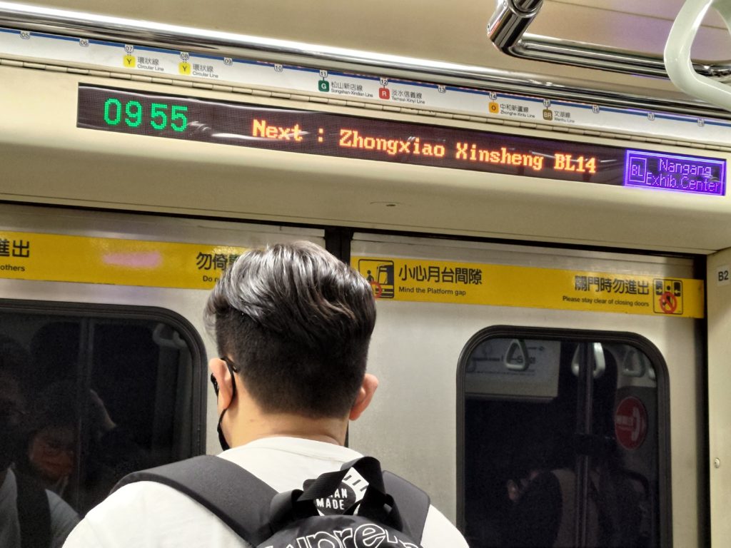
Next : Zhongxiao Xinsheng BL14

  • The style is basic but effective.
  • The letters are large enough to read.
  • The space before the colon is wrong.
  • The contrast between the color of the text and the color of the background is strong, making the text easy to read.
  • The addition of “BL14” is an unfortunate distraction (sometimes less is more); but it’s nothing that the new signs don’t repeat.

In short: By the most important measures, the old signs are better than the new ones. And they already exist, so keeping them won’t cost taxpayers and farepayers anything, unlike putting in expensive new video screens that make navigating the MRT worse.

Meanwhile, the MRT system has still not corrected errors in the Pinyin for the names of some stations.