important book on Pinyin to be excerpted on this site

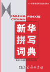
cover image for the bookXīnhuá Pīnxiě Cídiǎn (《新华拼写词典》 / 《新華拼寫詞典》), is the second of Yin Binyong’s two books on Pinyin orthography. The first, Chinese Romanization: Pronunciation and Orthography, is in English and Mandarin; much of it is already available here on Pinyin.Info.

Although Xinhua Pinxie Cidian is only in Mandarin, the large number of examples makes it easy to get the point even if you may not read Mandarin in Chinese characters very well.

This week I will begin posting some excerpts from this invaluable work. What’s more, I have made a version in traditional Chinese characters, which I hope that readers in Taiwan, Hong Kong, and elsewhere will take advantage of. So those not used to reading simplified Chinese characters will have a choice (which is more than the government of Taiwan is providing these days).

I’m extremely happy to be able to bring you this information and wish to acknowledge the generosity of the Commercial Press. Stay tuned.

Taoyuan International Airport to adopt new style for signs

Taoyuan International Airport (or “Taiwan Taoyuan International Airport” as it is called in Taiwan’s official Chinglish form) will be replacing its signage, adopting a new color scheme and typeface.

Currently, the signs in the airport have a black background and yellow or white letters.

The new signs will be modeled after those in the Hong Kong International Airport, with white letters on a blue background. But signs for facilities such as restrooms and restaurants will have white letters on a dark red background. (Perhaps like these?)

Taiwan will also duplicate Hong Kong’s choice of font face: Fang Song (fǎng-Sòngtǐ / 仿宋體). One of the reasons for this is that some Chinese characters — such as for yuán (園) and guó (國) — appear similar if viewed from a distance, according to the president of the Taoyuan International Airport Corp. “Passengers can clearly see the words on the [new] signs even if they view them from 30 meters away,” he added.

The new signs will start to go up in August, with the change scheduled to be complete by the end of 2012.

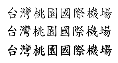
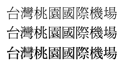
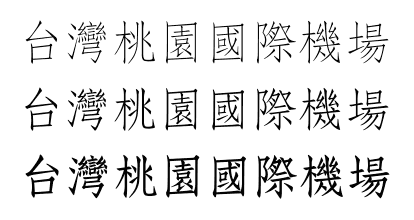
I’ve made some samples (which, by the way, contain both 園 and 國) in three typefaces to help illustrate the look of Fang Song. Sorry not to have the right color scheme.

DF Fang Song:
sample of the typeface in three weights, with the text of '台灣桃園國際機場'

DF Kai Sho:
sample of the typeface in three weights, with the text of '台灣桃園國際機場'

DF Ming:
sample of the typeface in three weights, with the text of '台灣桃園國際機場'

sources

stories:

font samples:

additional material:

By the way, the contrast between the traditional and simplified versions of the of fǎng-Sòngtǐ (仿宋體 / 仿宋体) is a good illustration that to the untrained eye the conversion from one system to another is not necessarily self apparent.

vs.