Taoyuan International Airport (or “Taiwan Taoyuan International Airport” as it is called in Taiwan’s official Chinglish form) will be replacing its signage, adopting a new color scheme and typeface.
Currently, the signs in the airport have a black background and yellow or white letters.
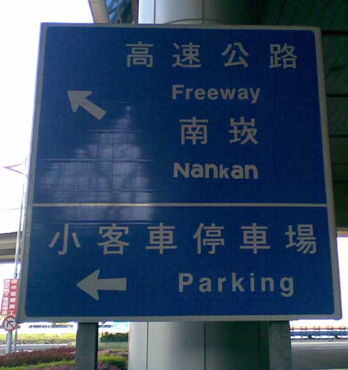
The new signs will be modeled after those in the Hong Kong International Airport, with white letters on a blue background. But signs for facilities such as restrooms and restaurants will have white letters on a dark red background. (Perhaps like these?)
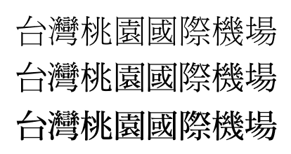
Taiwan will also duplicate Hong Kong’s choice of font face: Fang Song (fǎng-Sòngtǐ / 仿宋體). One of the reasons for this is that some Chinese characters — such as for yuán (園) and guó (國) — appear similar if viewed from a distance, according to the president of the Taoyuan International Airport Corp. “Passengers can clearly see the words on the [new] signs even if they view them from 30 meters away,” he added.
The new signs will start to go up in August, with the change scheduled to be complete by the end of 2012.
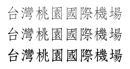
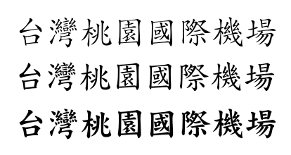
I’ve made some samples (which, by the way, contain both 園 and 國) in three typefaces to help illustrate the look of Fang Song. Sorry not to have the right color scheme.
DF Fang Song:

DF Kai Sho:

DF Ming:

sources
stories:
- Taoyuan international airport to get new signs, Taipei Times, June 20, 2011
- Táoyuán jīchǎng zhǐbiāo — zìtǐ yánsè gēngxīn (桃機指標 字體顏色更新), Liberty Times, June 18, 2011
- Táoyuán jīchǎng biāo zhì gǎizào — bǎozhèng bùzài wùshàsha (桃機標誌改造 保證不再霧煞煞), CNA, June 17, 2011
font samples:
- DF Ming Traditional Chinese Font Family, DynaComware
- DF Kai Sho Traditional Chinese Font Family, DynaComware
- DF Fang Song Traditional Chinese Font Family, DynaComware
additional material:
- some photos of signs at the Hong Kong airport (But age unknown, so these might be outdated.)
- comparison of Ming, Kai, and Fang Song at Birdtrack Press
By the way, the contrast between the traditional and simplified versions of the tǐ of fǎng-Sòngtǐ (仿宋體 / 仿宋体) is a good illustration that to the untrained eye the conversion from one system to another is not necessarily self apparent.
體 vs. 体

