Prevalence of single-syllable Chinese given names

How common are single-syllable Chinese given names — names that take just one Chinese character to write?

Much less common than they were in the 1980s and 1990s. The downward trend is not likely to change, because China wants to avoid being a place filled with the equivalent of John no-middle-name Smiths.

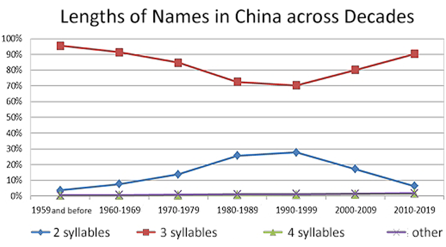
The proportion of two-character names (i.e., a single-syllable family name plus a single-syllable given name) in China increased from 7.6% in the 1960s to peak at 27.6% in the 1990s. But the figure has now fallen to just 6.3%.

Although some of the three-character names will be those of people with two-character family names and single-syllable given names (as opposed to single-syllable family names and two-syllable given names), the figure is statistically insignificant, as only 0.11% of people in China have two-character family names and only about 6.3% of them will have single-syllable given names (or only about one person in fifteen thousand).

Although in the chart below the number of people with names totaling four or more characters/syllables is small (and largely within minority groups), such names have been on the increase, growing from from just 0.3% and 0.4%, respectively, in the 1950s to 1.6% and 1.7%, respectively, at present.

My translation of a graph from the PRC government, showing the popularity of two-syllable given names in China being high in the 1980s and 1990s and lower before and since then.

Source: Ministry of Public Security Household Administration Research Center System. Translation of labels by Pinyin.info.

In Taiwan, single-syllable given names are much less common than in China. Also, in Taiwan the majority of those with single-syllable given names are female; I don’t know if that tendency exists in China as well, but I suspect that it does.

Source: 《2020 nián quánguó xìngmíng bàogào》 fābù (《二〇二〇年全国姓名报告》发布), Gōng’ānbù wǎngzhàn (公安部网站), February 2, 2021

Further reading: 85 percent of Han in China have two-syllable given names: report, Pinyin News, August 10, 2008

Thanks to Qin-Hong Anderson for her input.

Two-syllable Taiwanese family names

As of June 30, 2018, Taiwan had just 22,332 people with a disyllabic surname (i.e., one that takes two Chinese characters to write). They cover just 0.09% of the population — just less than one in a thousand. This is slightly less than the 0.11 percent of the population of China that has such a family name. Also, in China, by far the most common two-syllable surname is Ouyang; but in Taiwan “Zhangjian” is more seen.

Name Name total
張簡 Zhangjian 9,059
歐陽 Ouyang 7,860
范姜 Fanjiang 4,300
周黃 Zhouhuang 590
江謝 Jiangxie 523

Further reading:

Source:

  • Quánguó xìngmíng tǒngjì fēnxi (全國姓名統計分析). Department of Household Registration, Ministry of the Interior, Taiwan, 2018, p. 28.

Two-syllable Chinese family names

By far the most common two-syllable Chinese family name in China is Ouyang (NB: this should not be written Ou-yang, Ou-Yang, or Ou Yang), with it representing more than twelve times as many people as the next most common name on the list: Shangguan.

Surname Fùxìng (複姓/复姓) Number of people in China with this surname
Ouyang 欧阳 1,112,000
Shangguan 上官 88,000
Huangfu 皇甫 64,000
Linghu 令狐 55,000
Zhuge 诸葛 48,000
Situ 司徒 47,000
Sima 司马 23,000
Shentu 申屠 19,000
Xiahou 夏侯 11,000
Helan 贺兰 10,000
Wanyan 完颜 6,000

Those figures for the most common two-syllable Chinese family names (commonly called “two-character” family names) total 1.495 million, or about 1.5 million, which is not an inconsiderable number but still just a drop in the bucket compared with China’s population of some 1.41 billion. Only about one tenth of 1 percent (0.11%) of people in China have such names.

The percentage is a bit less in Taiwan. The most common doubled surname in Taiwan, however, is Zhangjian (張簡/张简), which doesn’t appear at all on the list of the most common disyllabic family names in China. In Taiwan, Ouyang is second.

Further reading:

source: 《2020 nián quánguó xìngmíng bàogào》 fābù (《二〇二〇年全国姓名报告》发布), Gōng’ānbù wǎngzhàn (公安部网站), February 2, 2021

SF politicians and Chinese names

Wednesday’s San Francisco Standard has a good (and nicely referenced and illustrated) piece by Han Li on politicians in SF/Jiujinshan choosing Chinese names as a way to appeal to the significant slice of those in the community who can read them. Such names are now receiving a lot more attention from politicians than before.

The article notes the important distinction between Western names that have simply been transcribed approximately into Chinese characters, which tend to sound a bit weird and run on too long, and “authentic” names (quote marks in the original), which sound like something an actual Chinese person might have (e.g., three characters, with the “family” name coming first).

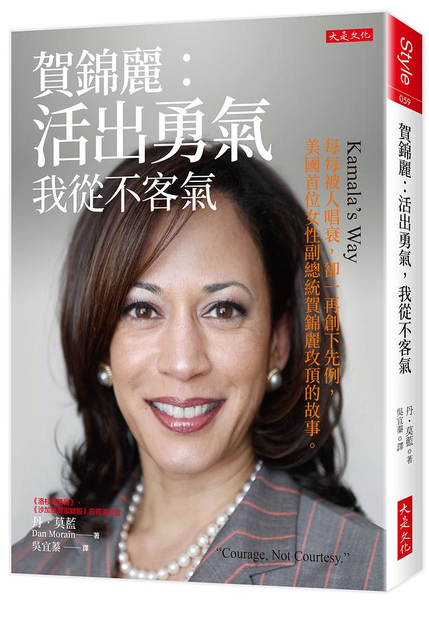
Li credits now vice president Kamala Harris with starting the trend of local politicians seeking authentic- and favorable-sounding names when she first ran for San Francisco district attorney in 2003.

Harris ditched the transliteration-based name 哈里斯 (“ha lay si”) and chose 賀錦麗 (“ho gum lai”) instead. To Cantonese speakers’ ears, the new appellation had a more celebratory and positive ring (the surname Ho, 賀, means “celebrate”), while Gum-Lai has a feminine quality (錦麗 means “beautiful”).

One of the things I especially like about the piece is how it gives primacy to Cantonese for most names, reflecting the situation on the ground.

Some rules govern the selection of names.

  • Candidates who do not already have a Chinese name can have the Department of Elections provide one.
  • The submitted names have to be in traditional Chinese characters.
  • The names cannot be the same as those of historic figures or celebrities, and they cannot lead to ambiguity or become too promotional. (So I guess 高富帥/Gāo Fùshuài wouldn’t pass muster.)

And additional rules may be coming into place.

In 2019, Assemblymember Evan Low authored legislation to regulate Chinese translations on California’s statewide ballots. The law mandates that candidates use transliteration-based names unless they can prove that they were born with a character-based name or have been using such an “authentic” style Chinese name for at least two years.

San Francisco’s Department of Elections has rules that slightly differ from Low’s legislation and has insisted his law doesn’t apply to local races, which means candidates do not need to prove that two-year usage. The City Attorney’s Office didn’t respond to a request for comment.

Supervisor Connie Chan, an immigrant from Hong Kong, said she’s considering actions on the board to implement Low’s bill at the local level.

Source:
Han Li. “To Court SF Voters, Politicians Give Themselves Flowery Chinese Names.” San Francisco Standard, May 10, 2023.

cover of a book about Kamala Harris, giving her Chinese name (as discussed in the post)

Why is the ROC govt trying to make Taiwanese look like Singaporeans?

Names of people in Taiwan have had a default format for many decades. For example:

  • Lee Teng-hui
  • Chen Shui-bian
  • Ma Ying-jeou
  • Tsai Ing-wen

The similarity, however, is not in use of a single romanization system. None of those names share the exact same romanization system or combination of systems:

  • Lee (common phonetic spelling) Teng-hui (Wade-Giles)
  • Chen Shui-bian (Hanyu Pinyin!)
  • Ma Ying (Wade-Giles, probably) jeou (Gwoyeu Romatzyh)
  • Tsai (bastardized Wade-Giles) Ing (ad hoc spelling) wen (Wade-Giles, probably)

But, different as those people are and different as the romanization systems used are, all of those names share an obvious pattern that marks them as belonging to someone in Taiwan: the hyphen joining the two parts of the given name, and the use of a lowercase letter for the second part of the given name.

Around twenty years ago, during Taiwan’s romanization wars (when President Chen wanted to impose Tongyong Pinyin upon Taiwan and a great many foreigners and others reacted with dismay and disgust), a popular claim of the Tongyong supporters was, “If Taiwanese use Hanyu Pinyin for their names, no one will be able to tell Taiwanese from Chinese anymore.”

This, however, was, like most claims of Tongyong supporters, not true. (It was also pretty funny, given that the most powerful supporter of Tongyong Pinyin was Chen Shui-bian, whose name is unambiguously Hanyu Pinyin but whom no even remotely knowledgeable person would ever mistake for someone from the PRC). The style used for names in China is “Familyname Givenname” (no hyphen). All Taiwanese have to do to keep their names distinct is to preserve the hyphen (assuming they even desire to use Hanyu Pinyin, which is not now nor has ever been required here for personal names).

This is easy:

  • PRC vs. TAIWAN
  • Li Denghui vs. Li Deng-hui
  • Chen Shuibian vs. Chen Shui-bian
  • Ma Yingjiu vs. Ma Ying-jiu
  • Cai Yingwen vs. Cai Ying-wen

But a few years back the government of Taiwan announced that it would be issuing a new style of the national ID card. Based on the mock-ups the government supplied, these cards would include romanization (yea!), but romanization in a very un-Taiwanese style (argh!).

mock-up of two possible styles for Taiwan's new national ID card

What’s especially odd, though, is that the romanization clearly follows the style of names in Singapore, not Taiwan.

Here, for example, are the names of some prominent Singaporeans:

  • Lee Kuan Yew
  • Goh Chok Tong
  • Lee Hsien Loong

Again, the standard pattern for Singaporean names is easy to discern … and clearly distinct from the standard pattern of names in Taiwan.

Why is the government doing this? Switching from Taiwan style to Singapore style makes no sense — not historically, not practically (separating given names makes it harder to tell what’s the family name and what’s the given name), and not politically.

And why on earth is “林” being romanized on the card as “LING” rather than as “LIN”, and “森” as “SHENG” rather than as “SEN”? Typos in not one but both of the only two personal names given do not inspire confidence.

Her name should be given, in descending order of preference, as
CHEN Xiao-lin
Chen Xiao-lin
or CHEN XIAO-LIN
not CHEN XIAO LING.

I had been hopeful that the cards and their new style had simply been killed off and so the problem had been effectively eliminated years ago. But according to a recent Taiwan News story, the “eID scheme is halted but not scrapped.” So this nonsense might still happen.

The only good thing I have to say about the Pinyin on the mock-ups (other than its existence) is that it is at least not prohibitively tiny, which is a common problem.

By the way, hyphens can appear in some names in Hanyu Pinyin — but not in the way many people may first guess. Two-syllable family names are written solid, not hyphenated (e.g., Ouyang and Sima, not Ou-yang and Si-ma). Rather, hyphens exist in standard names in China in Hanyu Pinyin in cases where someone decides to adopt her spouse’s name but also preserve her maiden name. So, if a Ms. Wang marries a Mr. Li but wants to have both names, she becomes Ms. Wang-Li (or Ms. Li-Wang).

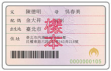
Here’s what Taiwan’s national ID cards look like presently:
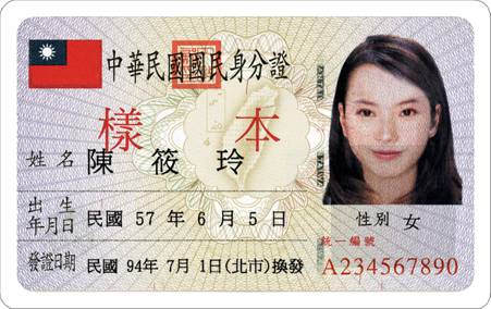
Taiwan national ID card -- front

Taiwan national ID card -- back

Further reading:
Contractor seeks NT$526 million in compensation for Taiwan’s halted digital ID plan. Taiwan News, May 8, 2023.

If you ever find yourself stuck on how to pronounce English

It’s times like this I especially miss John DeFrancis. How he would have loved this! It’s partially an example of what he dubbed “Singlish” — not Singapore English but Sino-English, the tortured attempt to use Chinese characters to write English. He details this in “The Singlish Affair,” a shaggy dog story that serves as the introduction to his essential work: The Chinese Language: Fact and Fantasy. (And I really do mean essential. If you don’t have this book yet, buy it and read it.)

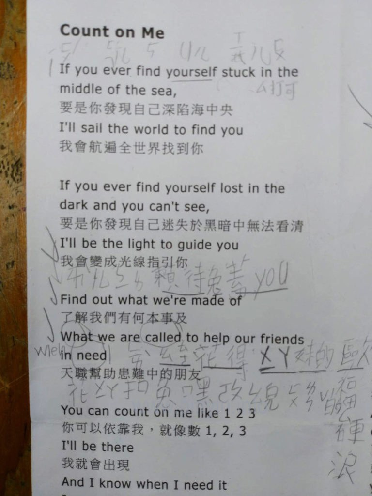
Here are some lyrics from a popular song, “Count on Me,” by Bruno Mars, with a Mandarin translation. The interesting part is that a Taiwanese third-grader has penciled in some phonetic guides for him or herself, using a combination of zhuyin fuhao (aka bopo mofo) (sometimes with tone marks!), English (as a gloss for English! and English pronunciation of some letters and numbers), and Chinese characters (albeit not always correctly written Chinese characters — not that I could do any better myself). Again, this is a Taiwanese third-grader and so is someone unlikely to know Hanyu Pinyin.

lyric sheet, as described in this post

“If you ever find yourself stuck”


If

ㄧˊㄈㄨˊ

yífú
you  
 
ever ㄟㄈㄦ ei-f’er

find

5

five
yourself Uㄦㄒㄧㄦㄈㄨ U’er xi’erfu

stuck

ㄙ打可

s-dake

“I’ll be the light to guide you.”


I’ll

ㄞㄦ

ài’er

be

ㄅㄧ

bi
the l[e]

light

賴特*

laite
to tu

guide


gai

you

you

you

“Find out what we’re made of”


Find

ㄈㄞˋ

fài

out

ㄠㄊㄜ

ao-t’e

what

花得

huade

we’re

ㄨㄧㄚ

wi’a

made

妹的

meide

of

歐福

oufu

“When we are called to help our friends in need”


What when


hua

we

ㄨㄧ

wi

are


a

called


kou

to


tu

help

嘿ㄜㄆ

hei’e-p[e]

our

ㄠㄦ

ao’er

friends

ㄈㄨㄌㄣˇ的ㄙ

fulen-de-s

in


ying

need

[?]

[?]

ChatGPT writes poetry in Pinyin, sort of

I asked ChatGPT to “write a poem in Mandarin using Pinyin.”

Its first response took the form of a sonnet:

qīngchūn yǒu tài duō de mèngxiǎng,
xīwàng yǒu yīgè xiǎng zhù de dìfāng.
yīgè rén zài huáshān shàng,
tā de mèng yǒu tèbié de chàng.

zài fēngláng zhī xiàn,
tā yòng bàozhǐ zhànwàng huāliàn.
yǒngqì bǎ dōngfēng zài shǒu,
zài yùndòng zhōng fàng sīwáng zhī hòu.

mèngzhōng yǒu tài duō de jìhuà,
yǒnggǎn bǎ tāmen dōu chéngshí huà.
yǒngyuan bùyào bèi shìjiè suǒ bǎozhòng,
zhǐyào huílái bùwàng jiùshì yīzhǒng.

qīngchūn yǒu tài duō de mèngxiǎng,
wǒmen yīqǐ xiǎng zhù zhè yīqiè de dìfāng.

That one won’t win any prizes, but the result was still much better than the one produced when I asked ChatGPT to make another:

Sì jiāo qíng yuán, xìng fú suì suì,
Chūn fēng yè sè, ruò dàng huā kāi.
Dōu shì shuāng shǒu, shuāng shǒu yī,
Xīn lián xīn shì, shuāng xīn xī.

Qīng sè yǔ tiān, yǔ zhuǎn yǔ duō,
Cǎo yuǎn shān jǐn, dōu xīng huā tuō.
Yuè liàng guāng míng, míng yǔ ruò,
Qíng qíng yǔ hǎo, yǔ zhōng yǔ.

Shēn tián yǔ sǎng, qíng hǎo yǔ,
Liàng yǔ fēn fēn, shǎn chéng yǔ.
Qīng chuān huáng hé, yǔ yíng cháo,
Chūn sè xīn róu, xìng fú mǎo.

Wēn huā yǔ chūn, yǔ xǐ xīn,
Sān yuán sì jì, yǔ zhōng shuāng.
Chūn tiān xìng fú, zhuǎn yǔ shuāng,
Qíng huā yǔ jīng, yǔ yīng huáng.

That opaque mo no syl la bic mess is infected by the spirit of Literary Sinitic, which Pinyin isn’t designed to handle.

I’m hopeful that ChatGPT will get trained properly on the rules of Hanyu Pinyin — both the short-form rules of Pinyin and the longer (and superior) work of Yin Binyong — and so will be able to produce proper Pinyin. But maybe wǒ yǒu tài duō de mèngxiǎng.

As one of my heroes, Hu Shih, wrote one hundred years ago,

Nǐ bùnéng zuò wǒ de shī,
zhèngrú wǒ bùnéng zuò nǐ de mèng

(你不能做我的詩,
正如我不能做你的夢)

NB: I should probably remind everyone, should you wish to include Chinese characters or Pinyin with tone marks in a comment, be sure to encode them first or they’ll end up scrambled here. (Not my fault. Sorry.)

Taipei MRT’s new in-car signage sucks

photo of the new-style video screen above the door of the Taipei MRT (subway system).

For the past few months, one can occasionally spot trains along the Taipei MRT’s blue line (aka the Ban-Nan line, for the Banqiao–Nangang line of the subway system) sporting a new style of above-door announcements. (Perhaps some of the other lines have these as well; but I’m not on them as much and haven’t spotted new signage on those yet.)

The MRT has signs above the doors to let people know what the stops are coming soon. Or at least that’s what the signs are supposed to do, what they need to do in order to help passengers. Alas, that crucial function appears to have been overlooked when designing the new signs, which are all bling-bling and little useful substance.

In fact, they’re so bad that I’m almost surprised they don’t feature cutesy cartoon characters — something that would make the disaster complete.

The photos in this post of the new signs were taken from the seat with the best vantage point of the video-screen sign. Some zoom was used to get the important part of the image to stretch from one side to the other of the photos. In short, the parts of the sign passengers need to read likely appear even smaller in real life than they may look in the photos. Of course, I could have positioned myself immediately in front of the signs and gotten better photos. But the point of signage isn’t what can be seen if one is standing close to and directly in front of it; rather, good signage needs to work for viewers from farther away and at an angle as well. So the proximity and angle represent a compromise on my part rather than the farther vantage point from which many riders will experience the signs. In other words, for many riders, the signs will look even smaller and less clear than shown in these photos.

And, as we’ll see, smaller is definitely not a good thing.

Here’s a close-up of the above sign, rotated slightly and showing the size of the text as a percentage of the screen height (approximately).

photo of the video screen with the size of the text shown as a percentage of the screen height

The screens themselves are large. But what about the information they need to convey? The names of the stations, the most important information, are small: just 19% of the screen height for the Chinese characters and only 6% of the screen height for the Pinyin. I suppose one could add another percentage point or even two if the descenders are counted as well rather than just the cap height. But even 8% would be utter madness! The Pinyin text is absurdly tiny — and as such is close to useless. How is anyone supposed to read that?! But there’s plenty of space on the screen to make the Pinyin larger, especially if it is given separately rather than in combination with Chinese characters at the same time.

The video screens do cycle through different information, with one screen providing station names in Pinyin and English without any Chinese characters. But it’s almost as if they’re trying to make the signage unreadable. Here’s an example:

photo of a video screen on the Taipei MRT, showing the station names on the blue line in English/Pinyin in small text.

Again, the English/Pinyin names are too small to read — needlessly so. And it doesn’t help the cause of making text large enough to read that the Taipei MRT has some needlessly wordy station names.

But there is one new feature I actually like: listing how many minutes before the next stations. (Note the numbers along the bottom right of the screen.) This is nicely done — if only one could read the names of the stations.

And still more space could be saved if those nicknumbers (e.g., “BL17”) were removed. I have yet to hear anyone ever even mentioning them, at least not in a positive way. And to think the MRT system spent NT$300 million (about US$10 million) on that!

And let’s not forget that Taiwan is projected to become a super-aged society by 2025 — which means an especially large number of people who don’t see as well as they used to. Thus, it is all the more important that the letters are large enough to be read by people with less than perfect eyesight.

Alas, there’s more. The signs, as bad as their design is from the standpoint of the size of the text, have another significant flaw: their use of color.

detail of the above image, as described below

Look at how the name of the next station is presented: in light-blue-gray against an off-white background. There is little contrast between the text and the background, which makes the text very difficult to read. I would have thought that this problem, like the problem of size already discussed, would have been painfully obvious to everyone involved in the design process. Yet for some reason this wasn’t corrected long ago on the drawing board but has instead made it all the way to signage on the MRT itself! That light-blue-gray against off-white makes me just livid.

Another important aspect of color for the MRT is the assignation of colors to the different transit lines. Identifying different lines by color is actually quite useful, and many people refer to the various lines by their color. So how well do the new signs handle this? If you’re familiar with Taipei, try to ignore the names and placements of the lines for the moment. Just this once — because the actual station names are so tiny and damn hard to read on these video screens, and because I’m hoping you’ll try to let your knowledge of the MRT avoid interfering with your objective judgment on this — I’m asking you to refer to the numbers for Taipei MRT stations, stupid though they are.

The lines that intersect with the blue line are marked by vertical bars of color. OK, now look at the image below and answer a few simple questions. You’ll probably have to click on the photo one or more times to achieve the extreme magnification needed to view the sign well.

photo of video-screen signage above the door of a car on the Taipei MRT's blue line, this one showing stop names in Chinese characters and with colored lines to show different line transfer points

Q: Which station or stations intersect with the red line?

A: BL12.

OK, that was easy. Now another.

Q: Which station or stations intersect with the green line?

A: BL11.

Simple enough. But how about these?

Q: Which station or stations intersect with the brown line?
Q: Which station or stations intersect with the orange line?
Q: Which station or stations intersect with the yellow line?

Why the MRT thinks passengers need a regular reminder of what car number they are in is beyond me. Note, too, how those numbers are larger than the station name in English/Pinyin.

The answers are, respectively, BL15 & BL23, BL14, and BL07 & BL08.

How’d you do? And could you even tell that BL15 and BL23 are supposed to be the same color, and that color is supposed to be brown?

Here’s a look at what the current/old signage looks like.

Next : Zhongxiao Xinsheng BL14

  • The style is basic but effective.
  • The letters are large enough to read.
  • The space before the colon is wrong.
  • The contrast between the color of the text and the color of the background is strong, making the text easy to read.
  • The addition of “BL14” is an unfortunate distraction (sometimes less is more); but it’s nothing that the new signs don’t repeat.

In short: By the most important measures, the old signs are better than the new ones. And they already exist, so keeping them won’t cost taxpayers and farepayers anything, unlike putting in expensive new video screens that make navigating the MRT worse.

Meanwhile, the MRT system has still not corrected errors in the Pinyin for the names of some stations.