ChatGPT writes poetry in Pinyin, sort of

I asked ChatGPT to “write a poem in Mandarin using Pinyin.”

Its first response took the form of a sonnet:

qīngchūn yǒu tài duō de mèngxiǎng,
xīwàng yǒu yīgè xiǎng zhù de dìfāng.
yīgè rén zài huáshān shàng,
tā de mèng yǒu tèbié de chàng.

zài fēngláng zhī xiàn,
tā yòng bàozhǐ zhànwàng huāliàn.
yǒngqì bǎ dōngfēng zài shǒu,
zài yùndòng zhōng fàng sīwáng zhī hòu.

mèngzhōng yǒu tài duō de jìhuà,
yǒnggǎn bǎ tāmen dōu chéngshí huà.
yǒngyuan bùyào bèi shìjiè suǒ bǎozhòng,
zhǐyào huílái bùwàng jiùshì yīzhǒng.

qīngchūn yǒu tài duō de mèngxiǎng,
wǒmen yīqǐ xiǎng zhù zhè yīqiè de dìfāng.

That one won’t win any prizes, but the result was still much better than the one produced when I asked ChatGPT to make another:

Sì jiāo qíng yuán, xìng fú suì suì,
Chūn fēng yè sè, ruò dàng huā kāi.
Dōu shì shuāng shǒu, shuāng shǒu yī,
Xīn lián xīn shì, shuāng xīn xī.

Qīng sè yǔ tiān, yǔ zhuǎn yǔ duō,
Cǎo yuǎn shān jǐn, dōu xīng huā tuō.
Yuè liàng guāng míng, míng yǔ ruò,
Qíng qíng yǔ hǎo, yǔ zhōng yǔ.

Shēn tián yǔ sǎng, qíng hǎo yǔ,
Liàng yǔ fēn fēn, shǎn chéng yǔ.
Qīng chuān huáng hé, yǔ yíng cháo,
Chūn sè xīn róu, xìng fú mǎo.

Wēn huā yǔ chūn, yǔ xǐ xīn,
Sān yuán sì jì, yǔ zhōng shuāng.
Chūn tiān xìng fú, zhuǎn yǔ shuāng,
Qíng huā yǔ jīng, yǔ yīng huáng.

That opaque mo no syl la bic mess is infected by the spirit of Literary Sinitic, which Pinyin isn’t designed to handle.

I’m hopeful that ChatGPT will get trained properly on the rules of Hanyu Pinyin — both the short-form rules of Pinyin and the longer (and superior) work of Yin Binyong — and so will be able to produce proper Pinyin. But maybe wǒ yǒu tài duō de mèngxiǎng.

As one of my heroes, Hu Shih, wrote one hundred years ago,

Nǐ bùnéng zuò wǒ de shī,
zhèngrú wǒ bùnéng zuò nǐ de mèng

(你不能做我的詩,
正如我不能做你的夢)

NB: I should probably remind everyone, should you wish to include Chinese characters or Pinyin with tone marks in a comment, be sure to encode them first or they’ll end up scrambled here. (Not my fault. Sorry.)

Taipei MRT’s new in-car signage sucks

photo of the new-style video screen above the door of the Taipei MRT (subway system).

For the past few months, one can occasionally spot trains along the Taipei MRT’s blue line (aka the Ban-Nan line, for the Banqiao–Nangang line of the subway system) sporting a new style of above-door announcements. (Perhaps some of the other lines have these as well; but I’m not on them as much and haven’t spotted new signage on those yet.)

The MRT has signs above the doors to let people know what the stops are coming soon. Or at least that’s what the signs are supposed to do, what they need to do in order to help passengers. Alas, that crucial function appears to have been overlooked when designing the new signs, which are all bling-bling and little useful substance.

In fact, they’re so bad that I’m almost surprised they don’t feature cutesy cartoon characters — something that would make the disaster complete.

The photos in this post of the new signs were taken from the seat with the best vantage point of the video-screen sign. Some zoom was used to get the important part of the image to stretch from one side to the other of the photos. In short, the parts of the sign passengers need to read likely appear even smaller in real life than they may look in the photos. Of course, I could have positioned myself immediately in front of the signs and gotten better photos. But the point of signage isn’t what can be seen if one is standing close to and directly in front of it; rather, good signage needs to work for viewers from farther away and at an angle as well. So the proximity and angle represent a compromise on my part rather than the farther vantage point from which many riders will experience the signs. In other words, for many riders, the signs will look even smaller and less clear than shown in these photos.

And, as we’ll see, smaller is definitely not a good thing.

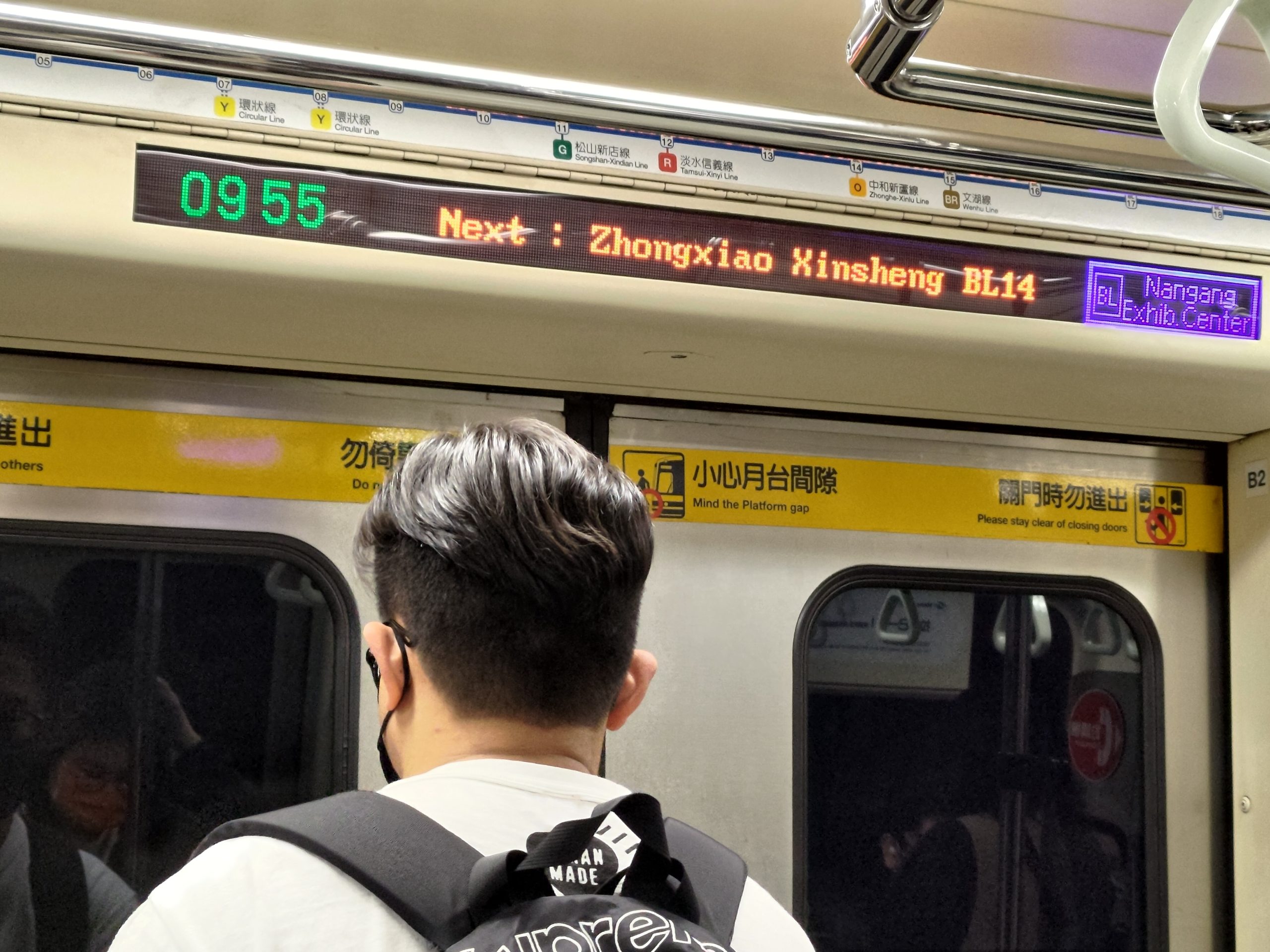
Here’s a close-up of the above sign, rotated slightly and showing the size of the text as a percentage of the screen height (approximately).

photo of the video screen with the size of the text shown as a percentage of the screen height

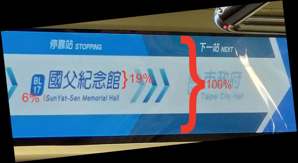
The screens themselves are large. But what about the information they need to convey? The names of the stations, the most important information, are small: just 19% of the screen height for the Chinese characters and only 6% of the screen height for the Pinyin. I suppose one could add another percentage point or even two if the descenders are counted as well rather than just the cap height. But even 8% would be utter madness! The Pinyin text is absurdly tiny — and as such is close to useless. How is anyone supposed to read that?! But there’s plenty of space on the screen to make the Pinyin larger, especially if it is given separately rather than in combination with Chinese characters at the same time.

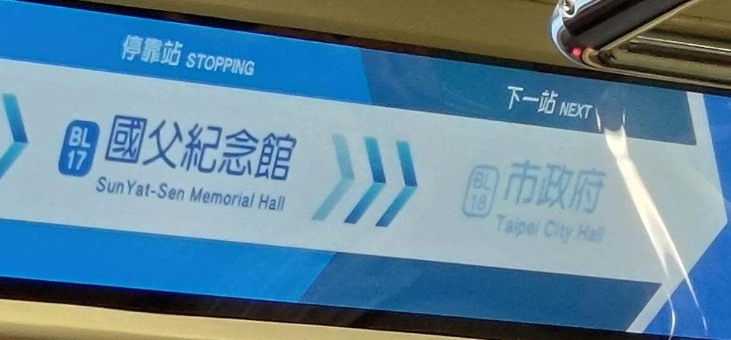
The video screens do cycle through different information, with one screen providing station names in Pinyin and English without any Chinese characters. But it’s almost as if they’re trying to make the signage unreadable. Here’s an example:

photo of a video screen on the Taipei MRT, showing the station names on the blue line in English/Pinyin in small text.

Again, the English/Pinyin names are too small to read — needlessly so. And it doesn’t help the cause of making text large enough to read that the Taipei MRT has some needlessly wordy station names.

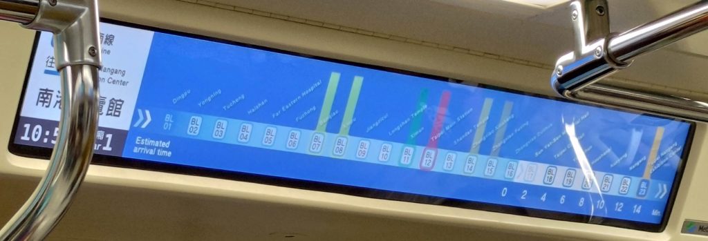
But there is one new feature I actually like: listing how many minutes before the next stations. (Note the numbers along the bottom right of the screen.) This is nicely done — if only one could read the names of the stations.

And still more space could be saved if those nicknumbers (e.g., “BL17”) were removed. I have yet to hear anyone ever even mentioning them, at least not in a positive way. And to think the MRT system spent NT$300 million (about US$10 million) on that!

And let’s not forget that Taiwan is projected to become a super-aged society by 2025 — which means an especially large number of people who don’t see as well as they used to. Thus, it is all the more important that the letters are large enough to be read by people with less than perfect eyesight.

Alas, there’s more. The signs, as bad as their design is from the standpoint of the size of the text, have another significant flaw: their use of color.

detail of the above image, as described below

Look at how the name of the next station is presented: in light-blue-gray against an off-white background. There is little contrast between the text and the background, which makes the text very difficult to read. I would have thought that this problem, like the problem of size already discussed, would have been painfully obvious to everyone involved in the design process. Yet for some reason this wasn’t corrected long ago on the drawing board but has instead made it all the way to signage on the MRT itself! That light-blue-gray against off-white makes me just livid.

Another important aspect of color for the MRT is the assignation of colors to the different transit lines. Identifying different lines by color is actually quite useful, and many people refer to the various lines by their color. So how well do the new signs handle this? If you’re familiar with Taipei, try to ignore the names and placements of the lines for the moment. Just this once — because the actual station names are so tiny and damn hard to read on these video screens, and because I’m hoping you’ll try to let your knowledge of the MRT avoid interfering with your objective judgment on this — I’m asking you to refer to the numbers for Taipei MRT stations, stupid though they are.

The lines that intersect with the blue line are marked by vertical bars of color. OK, now look at the image below and answer a few simple questions. You’ll probably have to click on the photo one or more times to achieve the extreme magnification needed to view the sign well.

photo of video-screen signage above the door of a car on the Taipei MRT's blue line, this one showing stop names in Chinese characters and with colored lines to show different line transfer points

Q: Which station or stations intersect with the red line?

A: BL12.

OK, that was easy. Now another.

Q: Which station or stations intersect with the green line?

A: BL11.

Simple enough. But how about these?

Q: Which station or stations intersect with the brown line?
Q: Which station or stations intersect with the orange line?
Q: Which station or stations intersect with the yellow line?

Why the MRT thinks passengers need a regular reminder of what car number they are in is beyond me. Note, too, how those numbers are larger than the station name in English/Pinyin.

The answers are, respectively, BL15 & BL23, BL14, and BL07 & BL08.

How’d you do? And could you even tell that BL15 and BL23 are supposed to be the same color, and that color is supposed to be brown?

Here’s a look at what the current/old signage looks like.

Next : Zhongxiao Xinsheng BL14

  • The style is basic but effective.
  • The letters are large enough to read.
  • The space before the colon is wrong.
  • The contrast between the color of the text and the color of the background is strong, making the text easy to read.
  • The addition of “BL14” is an unfortunate distraction (sometimes less is more); but it’s nothing that the new signs don’t repeat.

In short: By the most important measures, the old signs are better than the new ones. And they already exist, so keeping them won’t cost taxpayers and farepayers anything, unlike putting in expensive new video screens that make navigating the MRT worse.

Meanwhile, the MRT system has still not corrected errors in the Pinyin for the names of some stations.

OMG, it’s nougat

My post about a month ago on another pun for the Year of the Rabbit was in part an excuse for me to note how common “OMG” (oh my God) has become in Taiwan. Indeed, it should be considered not just English anymore but a frequently used loan word, one that is usually written, using the Roman alphabet, as a “lettered word” in Mandarin (i.e., “OMG“). But sometimes “oh my God” shows up in Chinese characters (e.g., 喔麥尬) used as phonetic approximations of the English. And sometimes, as in today’s pun-tastic example, it appears in a mix of English and Chinese characters.

Sign above a storefront reading 'Oh.my.軋', with a 'niu' character (牛) written inside the 'O'.

Oh.my.軋

The “Oh.my.軋” store sells nougat, as one can see from the smaller sign below and to the right of the main sign: “鮮治牛軋糖” (xiān zhì niúgátáng / freshly made nougat).

sign detail, showing 'xian zhi niugatang' in Chinese characters, with the second character being strange, as described in this post

Niugatang is simply a Mandarinization of the English word nougat; it’s transcribed “牛軋糖”. Tang is the Mandarin word for sugar and thus a short form meaning candy.

The use of a stylized version of the character for niu (牛), which rhymes with English’s “oh”, inside the “Oh” of the logo also makes the sign not just Oh my ga but also niu my ga (牛.my.軋). Puns upon puns.

The “Oh.my.軋” uses the ga from niugatang as a phonetic approximation of the English word “god.”

The character “治” is also worthy of note as an example of why Chinese characters are so damn hard. The character has two main parts. The left side has 氵, which is an alternate form of “水,” which is used in writing “shuǐ” (“water”) and many other words. The right side is 台 (tái), which is used in writing the word for platform but which is most commonly seen in Taiwan used phonetically in place names: Taiwan, Taipei (Taibei), Taichung (Taizhong), Taitung (Taidong), etc. So in terms of sound, that’s a shui and a tai. But in this case the phonetic hint commonly given in Chinese characters is 台 (tái). So does that mean the character “治” is pronounced tái?

Nope. Note even close. It’s pronounced zhì. And one just has to memorize such instances.

If you’re thinking, Hmm, shui plus tai? That’s water plus platform. Maybe the character is an ideograph for a pier! Nope. Once again, not even close. That’s generally not how Chinese characters work, no matter how many BS-filled TED talks on Chinese characters, memes, and crisis-tunity claims fill the Internet.

Of course, a character used for pier would make no sense on a sign for nougat. But as we’ll see, there are other things that don’t make sense here.

As I noted above, “xiān zhì niúgátáng” means “freshly made nougat.” But the weird thing is the character being used for zhì isn’t the “right” one. The sign uses “治” rather than the proper and homophonous “製” (zhì). The character used in the sign, however, doesn’t mean “made” but is instead most often seen in terms like zhìlǐ (治理), which is the Mandarin word for manage/administer/govern. Freshly administered nougat just doesn’t have much of a ring to it. So why did the company use that? My guess — and it’s just a guess — is that they wanted to evoke “Taiwan” through the 台 (tai) part of the character. (The company’s website — which has plenty of instances of the character 製 — claims that their nougat is one of the most popular purchases by tourists from China.) My long-suffering Taiwanese wife, however, exclaims that I think too much, and she yearns for the day when I find a more traditional hobby than spotting strange signs and asking her to help me understand them.

Rough guide to pronunciation for those unfamiliar with Mandarin or Hanyu Pinyin:

  • niu. Imagine the yo in Rocky Balboa’s cry of Yo, Adrian! or Dion’s “Yo, Frankie“; then stick an n in front of it.
  • ga. Say the word god, but drop the d.
  • tang. With the a as in father, not as in the English word sing/sang/sung.
  • zhi. Say the word jerk, but leave off the rk. Some people would keep in the r; but that’s not really a Taiwan thing — except perhaps on International Talk Like a Beijinger Pirate Day.

Further reading listening:

  • Gratuitous yo-free Dion link, because Dion is the man! (of course!): “If I Should Fall Behind,” written by Bruce Springsteen.

Company website:

Microsoft Translator and Pinyin

screenshot of the text described in the post, as treated by Microsoft Translator

If supplied with the following,

談中國的“語”和“文”的問題,我覺得最好能先了解一下在中國通用的語言。中國的主要語言有哪些?為甚麼我說這個,而不說那個?因為環境?因為被強迫?因為我愛這個語言?因為有必要?因為這個語言很重要?也想想什麼是中國人的共同語言。用一個共同語言有必要嗎?為什麼?別的漢語的去向會怎麼樣?如果你使用中國的共同語言普通話,你了解這個語言的語法(比如“的, 得, 地“ 和“了” 的不同用法)嗎? 知道這個語言的基本音節(不包括聲調)只有408個嗎?

Microsoft Translator produces the following Hanyu Pinyin:

tán zhōngguóde “yǔ” hé “wén”dewèntí, wǒjuéde zuìhǎo néng xiānliǎojiě yì xiàzài zhōngguó tōngyòng de yǔyán。 zhōngguóde zhǔyào yǔyán yǒu nǎxiē? wèishénme wǒshuō zhège ,érbùshuōnàgè? yīnwéi huánjìng? yīnwéi bèi qiǎngpò? yīnwéi wǒài zhège yǔyán? yīnwéi yǒubìyào? yīnwéi zhège yǔyán hěnzhòngyào? yě xiǎngxiǎng shénmeshì zhōngguórén de gòngtóngyǔyán。 yòng yígè gòngtóngyǔyán yǒubìyào ma? wèishénme? biéde hànyǔ de qùxiàng huì zěnmeyàng? rúguǒnǐ shǐyòng zhōngguóde gòngtóngyǔyán pǔtōnghuà , nǐ liǎojiě zhège yǔyán de yǔfǎ ( bǐrú “de,dé, de ”hé“le” de bùtóng yòngfǎ )ma? zhīdào zhège yǔyán de jīběn yīnjié (bùbāokuòshēngtiáo) zhǐyǒu 408gèma?

This has a number of obvious problems:

  • failure to capitalize the first letter in a sentence
  • failure to capitalize proper nouns (e.g., “zhongguo” should be “Zhongguo”) (Here is how to handle proper nouns in Pinyin.)
  • frequent appending of “de” to the word before it (Here is how to handle de in Pinyin.)
  • incorrect punctuation, e.g., commas, periods, parentheses, and question marks were not converted from their double-width (i.e., Chinese character) forms to regular roman forms (“,。?()” should appear instead as “,.?()”)
  • incorrect word parsing (sometimes)

In short: Thumbs-down for now. But it might not take too much work for Microsoft to make this significantly better.

Japan likely to regulate pronunciations of personal names

“No, no, no. It’s spelled ‘Raymond Luxury Yacht,’ but it’s pronounced ‘Throatwobbler Mangrove.’” — Monty Python’s Flying Circus

On February 17, Japan’s Legislative Council presented the country’s justice minister with an outline that would mandate that any kanji in names of newborns entered in official family registers include phonetic readings in kana. It would also restrict some readings.

Readings would also be added to names already in registers.

The changes would likely be enforced starting in the 2024 fiscal year (April 1, 2024, to March 31, 2025).

From a news article:

Currently, family registers do not have a field to indicate phonetic readings. After the law revision, family registers will include phonetic readings of kanji in kana characters.

According to the outlines, certain restrictions will be set on “colorful names” whose phonetic readings in kana characters deviate from the original meanings of the kanji characters.

Not only will newborn babies have pronunciations of their names entered in their family registers, but children and adults whose names already appear in family registers will be allowed to add phonetic readings.

Such people will be allowed to register different readings from ones already in their resident registers — records that are distinct from family registers — but the Justice Ministry calls for careful consideration when registering name readings in family registers.

The government plans to submit the revision bill during the current ordinary Diet session, aiming for it to be enforced in fiscal 2024.

The outlines say that “phonetic readings generally accepted as names” will be allowed in family registers.

A supplementary document to the outlines also calls for flexible management of the new system, given the historical and cultural reality that there have been some phonetic readings that are used only for names.

However, the government plans not to accept phonetic readings of names “that would confuse society.”

Examples of this restriction include readings with a meaning opposite to the kanji’s meaning, those that are difficult to distinguish from misreadings or misspellings, and those with no relation to the meaning of the kanji….

Discriminatory and obscene phonetic readings of names will not be accepted. Nor will names of characters from comics, anime and other fictitious works that would cause discomfort if used as the names of real people.

As current family registers do not have a section to indicate phonetic readings of names, people listed in Japanese family registers do not officially have phonetic reading of names under the Family Register Law.

In contrast, phonetic readings are written on resident registers. However, according to the ministry, those phonetics readings are not legally official but exist for administrative convenience. Currently, phonetic readings on birth registrations are used for resident registration purposes, but not for family registers.

After the law revision goes into force, kana characters for phonetic readings in birth registrations of newborns will also be used in family registers. Those who already have family registers can submit phonetic reading of their names to municipalities within one year after the revised law goes into force.

In particular, people with concerns such as the frequent mispronunciation of their names by others may find it necessary to have their resident registers revised to include the desired phonetic readings of their names. However, as changing the submitted names will require permission from a family court, the ministry urges careful consideration in deciding the name readings to be submitted.

For those who do not submit phonetic readings of names within one year after the enforcement of the revision, the official phonetic reading will be decided based on readings indicated in resident registers after municipal mayors send notifications to their respective residents.

I’m still wondering about the “cause discomfort” part. Discomfort to whom? How?

Japan to add romanization to names on My Number cards

The Japanese government has reportedly decided to add romanization for names on My Number cards, starting next year (2024). My Number cards — also known as Individual Number cards (or kojin bangō kādo / 個人番号カード) are a form of national ID.

Here’s basically what they look like now (without a space for romanization):
blank My Number card

But I haven’t been able to find any more specific information yet.

I wrote the authorities with My Number cards for clarification. I wanted to know what romanization system My Number Cards will use: Hepburn, Kunrei-shiki, or something else? Or will people be able to choose any system they want or to choose from a list of government-approved systems?

I also requested links to any articles/announcements about this in English or Japanese.

Unfortunately, the person who politely responded did not have any information about this beyond what I submitted.

Source: one small mention at the end of this article: Pronunciation of Japanese Personal Names to be Regulated by Planned Law Revision, Japan News (from the Yomiuri Shimbun), February 18, 2023.

Tone marks on Taiwan store sign’s Pinyin

An observant reader sent in this relatively rare example in Taiwan of the use of Hanyu Pinyin with tone marks on signage

sign above the 'Di jia Esthetic Nail Salon'

The Pinyin and especially the tone marks are a little thin, so I’ll give a closeup view:

The sign, here in aesthetic Banqiao, of course, reads:

Dǐ jiā
㭽佳心靈美學館
Esthetic Nail Salon

(Dǐ jiā xīnlíng měixué guǎn)

The Pinyin is not just “esthetic,” because most people probably don’t know the character ‘㭽’. Although they could probably take an educated guess that 㭽 is pronounced dǐ because of the 氐, that’s not the same thing as knowing for sure. So the Pinyin comes in handy even for most literate Taiwanese — if they can see it.

What’s especially surprising is that the people at the store went with Pinyin instead of zhuyin fuhao: ㄉㄧ ㄐㄧㄚ.

Chunghwa, Chunghua, Zhonghua

My previous post on postage stamps with Bopomofo (Zhuyin fuhao) mentioned Taiwan’s postal service, Chunghwa Post, which is terrifically efficient at delivering mail but which made an odd choice in romanization in its English name however many years ago . The Mandarin is Zhōnghuá Yóuzhèng in Hanyu Pinyin. But the post office spells its name

Chunghwa

logo for Chunghwa Post Co., Ltd

Chung is clearly Wade-Giles. (It probably would be bastardized Wade-Giles; but in this case chung rather than ch’ung is correct – so, luck of the draw.) Yet hwa does not exist in Wade-Giles, which uses hua. So where is that hwa coming from? The only system that uses hwa and has been official in Taiwan is Gwoyeu Romatzyh.

The Yale system, devised by George Kennedy, also uses hwa; but despite occasional confusion by reporters and others, Taiwan has never used the Yale system. Instead, what many people mistakenly believe is Yale is instead MPS2.

I’m afraid, though, that I don’t have a definitive answer for how Taiwan ended up with the portmanteau spelling of Chunghwa. I suspect that what happened is that the initial intention was to go with the country’s official romanization system, which, way back when, was Gwoyeu Romatzyh (“GR” for short), even if you wouldn’t know that from signage or maps or just about anything but long-distance buses. But using GR would have yielded Jonghwa, which would likely struck people accustomed to seeing 中 romanized as chung as “looking weird” (even though chung is hardly an intuitive spelling for native speakers of English for what is zhong in Hanyu Pinyin). So they kept the chung but then went ahead with hwa, which is not so different than Wade-Giles’s hua. At least that’s my guess, based on having followed romanization in Taiwan for decades.

The odd choice of Chunghwa is not limited to just the postal system. The main telephone system uses it as well: Chunghwa Telecom.

logo for Chunghwa Telecom

If Taiwan ever gets a broader rectification of names under which the Republic of China (Zhōnghuá Mínguó) — not to be confused with the People’s Republic of China (Zhōnghuá Rénmín Gònghéguó) — is simply called “Taiwan,” that would likely remove the issue. The spelling of Taiwan is certainly standard and the same across most romanization systems – with the notable exception of Gwoyeu Romatzyh, which would give us Tairuan. (GR’s fuunny sperlinqs strike again!)