Brasserie is a Pinyin-friendly script font. It’s free for personal use and US$11 for commercial use.


Brasserie is a Pinyin-friendly script font. It’s free for personal use and US$11 for commercial use.

Some of the Pinyin-friendly font families I provide examples of on this blog are fun but not exactly the sort of thing you’d want to use in a book or other serious project. Others, though, are solid examples of the subtle and exacting art of type design. Today’s entry belongs in the latter group.
Brill — a Leiden-based publisher of work in the humanities, social sciences, law, and science — has released “the Brill,” a new font family designed to support the Latin and Greek scripts “to the fullest extent possible.” IPA and the Slavic parts of the Cyrillic range are also covered. This can handle the needs of just about any romanized script, including Hanyu Pinyin.
As someone with Brill explained to me:
Instead of limiting the fonts’ character set to known characters and character-plus-diacritic combinations, we chose a dynamic model in which, using OpenType GPOS features, any base character can carry any diacritic above or below it, and in which diacritics can be stacked as well—not forgetting all the precomposed characters that are already present in the Unicode Standard, of course. Finally, a huge assortment of punctuation marks, editorial marks, and other symbols known to occur in Brill publications were added to the spec.
In total, the Brill contains more than 5,100 characters. And that already immense range can be extended through combining diacritics, as noted above.
Even better, the Brill is free for non-commercial use. You can download it after agreeing to the End User License Agreement license. (See the bottom of that page and then the bottom of the page that follows.)
The Brill is available now in roman and italic styles. Bold and bold italic versions will be released later this year, probably before July.
The Brill is considerably different than Brill Online, which has been available for some time and was aimed at helping users of Brill’s online reference works. Brill Online is based on v. 1.00 of the Gentium family of fonts. The glyph set was extended to support some very rare characters, such as Aegean numbers. “In essence it became a hybrid Latin-Greek-Cyrillic-IPA and ‘pi’ font family.”
Thanks to Lin Ai of Zhongweb.net for the heads up that this had been released, and to Dominique de Roo and Pim Rietbroek of Brill for patiently helping me with my questions.
Last week, on the same day President Ma Ying-jeou accepted the resignation of a minister who made some drunken lewd remarks at a wěiyá (year-end office party), Ma was joking to the media about blow jobs.
Classy.
But it was all for a good cause, of course. You see, the Mandarin expression chuī lǎba, when not referring to the literal playing of a trumpet, is usually taken in Taiwan to refer to a blow job. But in China, Ma explained, chuī lǎba means the same thing as the idiom pāi mǎpì (pat/kiss the horse’s ass — i.e., flatter). And now that we have the handy-dandy Zhōnghuá Yǔwén Zhīshikù (Chinese Language Database), which Ma was announcing, we can look up how Mandarin differs in Taiwan and China, and thus not get tripped up by such misunderstandings. Or at least that’s supposed to be the idea.
The database, which is the result of cross-strait cooperation, can be accessed via two sites: one in Taiwan, the other in China.
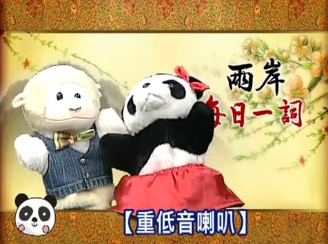
It’s clear that a lot of money has been spent on this. For example, many entries are accompanied by well-documented, precise explanations by distinguished lexicographers. Ha! Just kidding! Many entries are really accompanied by videos — some two hundred of them — of cutesy puppets gabbing about cross-strait differences in Mandarin expressions. But if there’s a video in there of the panda in the skirt explaining to the sheep in the vest that a useful skill for getting ahead in Chinese society is chuī lǎba, I haven’t found it yet. Will NMA will take up the challenge?

Much of the site emphasizes not so much language as Chinese characters. For example, another expensively produced video feeds the ideographic myth by showing off obscure Hanzi, such as the one for chěng.
WARNING: The screenshot below links to a video that contains scenes with intense wawa-ing and thus may not be suitable for anyone who thinks it’s not really cute for grown women to try to sound like they’re only thwee-and-a-half years old.
In a welcome bit of synchronicity, Victor Mair posted on Language Log earlier the same week on the unpredictability of Chinese character formation and pronunciation, briefly discussing just such patterns of duplication, triplication, etc.
Mair notes:
Most of these characters are of relatively low frequency and, except for a few of them, neither their meanings nor their pronunciations are known by persons of average literacy.
Many more such characters consisting or two, three, or four repetitions of the same character exist, and their sounds and meanings are in most cases equally or more opaque.
The Hanzi for chěng (which looks like 馬馬馬 run together as one character) in the video above is sufficiently obscure that it likely won’t be shown correctly in many browsers on most systems when written in real text: 𩧢. But never fear: It’s already in Unicode and so should be appearing one of these years in a massively bloated system font.
Further reinforcing the impression that the focus is on Chinese characters, Liú Zhàoxuán, who is the head of the association in charge of the project on the Taiwan side, equated traditional Chinese characters with Chinese culture itself and declared that getting the masses in China to recognize them is an important mission. (Liu really needs to read Lü Shuxiang’s “Comparing Chinese Characters and a Chinese Spelling Script — an evening conversation on the reform of Chinese characters.”)
Then he went on about how Chinese characters are a great system because, supposedly, they have a one-to-one correspondence with language that other scripts cannot match and people can know what they mean by looking at them (!) and that they therefore have a high degree of artistic quality (gāodù de yìshùxìng). Basically, the person in charge of this project seems to have a bad case of the Like Wow syndrome, which is not a reassuring trait for someone in charge of producing a dictionary.
The same cooperation that built the Web sites led to a new book, Liǎng’àn Měirì Yī Cí (《兩岸每日一詞》 / Roughly: Cross-Strait Term-a-Day Book), which was also touted at the press conference.
The book contains Hanyu Pinyin, as well as zhuyin fuhao. But, alas, the book makes the Pinyin look ugly and fails completely at the first rule of Pinyin: use word parsing. (In the online images from the book, such as the one below, all of the words are se pa ra ted in to syl la bles.)
The Web site also has ugly Pinyin, with the CSS file for the Taiwan site calling for Pinyin to be shown in SimSun, which is one of the fonts it’s better not to use for Pinyin. But the word parsing on the Web site is at least not always wrong. Here are a few examples.
Still, my general impression from this is that we should not expect the forthcoming cross-strait dictionary to be very good.
Further reading:
The highly useful and Pinyin-friendly Linux Libertine has a companion font family: Linux Biolinum.
Biolinum is designed for emphasis, e.g. of titles. You can also use it for short passages of text. For longer texts a serif font such as the Libertine should be used for readability. The Biolinum has the same vertical metrics and visual weight as the Libertine, so that it fits perfectly to the Libertine and can be also used for emphasizing within the body text.
Linux Biolinum Capitals and Linux Biolinum Keyboard don’t presently work with Pinyin. But the other styles do, as this sample of Linux Biolinum with Pinyin text shows.
If you need a font for Pinyin graffiti, one possible choice is MarkerScript, which is donationware. The dots over the i’s can resemble tone marks even when they’re not; but with the material best suited to this sort of font there’s probably not much chance that people won’t know just what you mean.
For those who want their Pinyin pixelated — for example, to help reproduce the look of text on an old mobile phone — there’s PixelPlay, which is free.
![]()
Text source: I very want your deceitful surface, Pinyin News, October 13, 2005.
Here’s a new book I made for fun: Pīnyīn Dòngwùyuán (4.3 MB PDF).
It goes through the letters of the alphabet: A is for ānchun, B is for bānmǎ, C is for chángjǐnglù, etc., all the way through Z, which is for zhāngyú.
But X is not for xióngmāo. I’m sick of pandas. Let’s let some other animals have some time in the spotlight.
Although technically speaking the Pinyin alphabet is the same as that for English, I prefer to go with A–Z, minus V but plus Ü.
O and R were the tricky ones to find animals for.
Perhaps some teachers will print this out and hang it up in their classrooms. Or kids could use it as a coloring book. You have my permission to do just about anything you like with this — other than sell it or add Chinese characters. (The world already has plenty of material in Hanzi, but not nearly enough in Pinyin.)
I made sure to include multiples of some common morphemes (e.g., bānmǎ, hǎimǎ, and mǎ; èyú and zhāngyú; hǎimǎ and hǎi’ōu; niú, wōniú, and xīniú), which I hope will be useful.
For fonts, I used the Linux Libertine family.
This took me far longer to make than I thought it would, so I hope some people enjoy it or at least find it interesting.
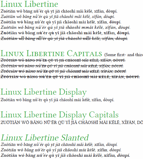
 Linux Libertine is perhaps most familiar as the font used in the Wikipedia logo. This surprisingly large font family also works well with Hanyu Pinyin, though a few adjustments need to be made before all of the fonts in this family work as they should with Pinyin texts.
Here’s how those working on Linux Libertine describe it:
We work on a versatile font family. It is designed to give you an alternative for fonts like T*mes New Roman. We’re creating free software and publish our fonts under terms of the GPL and OFL. Please have a look at the paragraph concerning the license.
It is our aim to support the many western languages and provide many special characters. Our fonts cover the codepages of Western Latin, Greek, Cyrillic (with their specific enhancements), Hebrew, IPA and many more. Furthermore, typographical features such as ligatures, small capitals, different number styles, scientific symbols, etc. are implemented in this font. Linux Libertine thus contains more than 2000 characters.
Here’s what it looks like with Pinyin. (Click to view a PDF, which is much clearer.)


All in all: Not bad.