How common are single-syllable given names in Taiwan? (I suppose most people would phrase the question differently as “How common are one-character given names in Taiwan?”)
The answer: not common at all.
In 2018 (the most recent year for which I could find such figures), just 1.67 percent (394,220) of Taiwan’s approximately 23.6 million people had a single-syllable given name (dānmíng/單名/单名) — in other words, a given name that takes only one Chinese character to write).
These figures come from the Ministry of the Interior’s Department of Household Registration and should thus be considered authoritative.
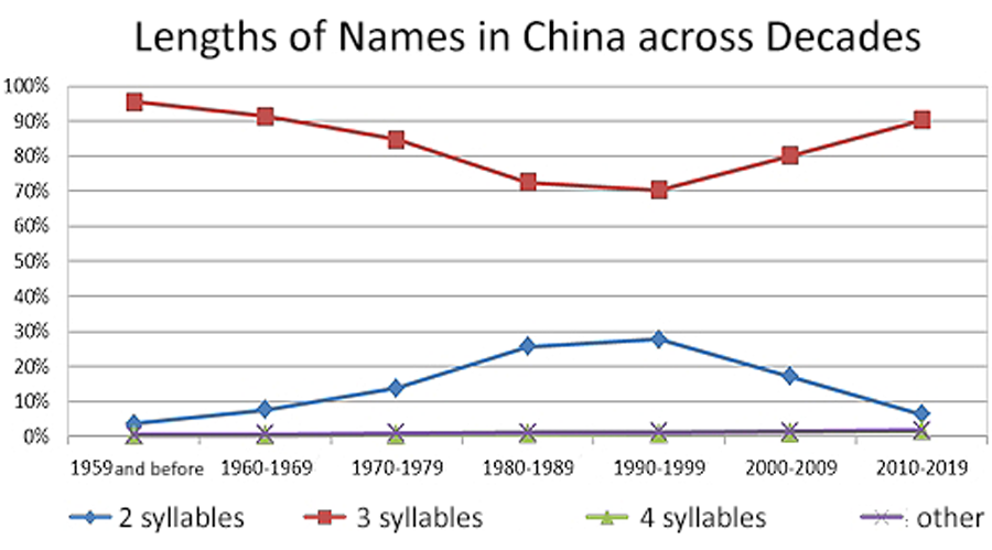
In China, however, single-syllable given names are several times more common than in Taiwan.
In Taiwan, single-syllable names are more common among women than among men, with females holding 232,853 such names, compared with just 161,367 males (59% and 41%, respectively).
Here are the top ten single-Chinese-character names, in declining order of popularity, for each sex. I am including the spelling in Wade-Giles, even though I don’t recommend using that system, because that is what is commonly seen in Taiwan — albeit without apostrophes or umlauts.
Most popular single-syllable names for boys
| |
Chinese Character |
Wade-Giles |
Pinyin (w Tone Mark) |
Pinyin (w/o Tone Mark) |
| 1 |
傑 |
Chieh |
Jié |
Jie |
| 2 |
杰 |
Chieh |
Jié |
Jie |
| 3 |
毅 |
I |
Yì |
Yi |
| 4 |
明 |
Ming |
Míng |
Ming |
| 5 |
翔 |
Hsiang |
Xiáng |
Xiang |
| 6 |
平 |
P’ing |
Píng |
Ping |
| 7 |
偉 |
Wei |
Wěi |
Wei |
| 8 |
靖 |
Ching |
Jìng |
Jing |
| 9 |
威 |
Wei |
Wēi |
Wei |
| 10 |
皓 |
Hao |
Hào |
Hao |
Note that the first and second most popular single-syllable boys names are the same, not just in sound but in meaning; they differ only in the character used to write them, with the “simplified” form taking second place. Do not be confused by this into thinking that Taiwanese use the PRC’s so-called simplified Chinese characters; they don’t. Rather, what’s going on is that Taiwanese are using forms that have been around for a very long while and which were later adopted by China’s script reformers as official. (For example, both 臺 and 台 — two ways of writing tai — are commonly seen in Taiwan.)
Most popular single-syllable names for girls
| |
Chinese Character |
Wade-Giles |
Pinyin (w Tone Mark) |
Pinyin (w/o Tone Mark) |
| 1 |
敏 |
Min |
Mǐn |
Min |
| 2 |
梅 |
Mei |
Méi |
Mei |
| 3 |
雪 |
Hsüeh |
Xuě |
Xue |
| 4 |
滿 |
Man |
Mǎn |
Man |
| 5 |
玉 |
Yü |
Yù |
Yu |
| 6 |
美 |
Mei |
Měi |
Mei |
| 7 |
靜 |
Ching |
Jìng |
Jing |
| 8 |
薇 |
Wei |
Wēi |
Wei |
| 9 |
婷 |
T’ing |
Tíng |
Ting |
| 10 |
秀 |
Hsiu |
Xiù |
Xiu |
None of the girls’ names share meanings or are homophonous (note differences in tone).
I feel I should stress that these names in isolation are rare (less than 2 percent!). Thus, they would probably make poor choices if you want to name a character in a novel with one of these. Instead, you should look to my posts on the most common family names in Taiwan and the most common given names in Taiwan.
In this post, “Taiwanese” refers to the people of Taiwan, not the language. Here, I give only Mandarin forms, out of familiarity, not preference.
Source: Quánguó xìngmíng tǒngjì fēnxi (全國姓名統計分析). Department of Household Registration, Ministry of the Interior, Taiwan, 2018, pp. 60-63.
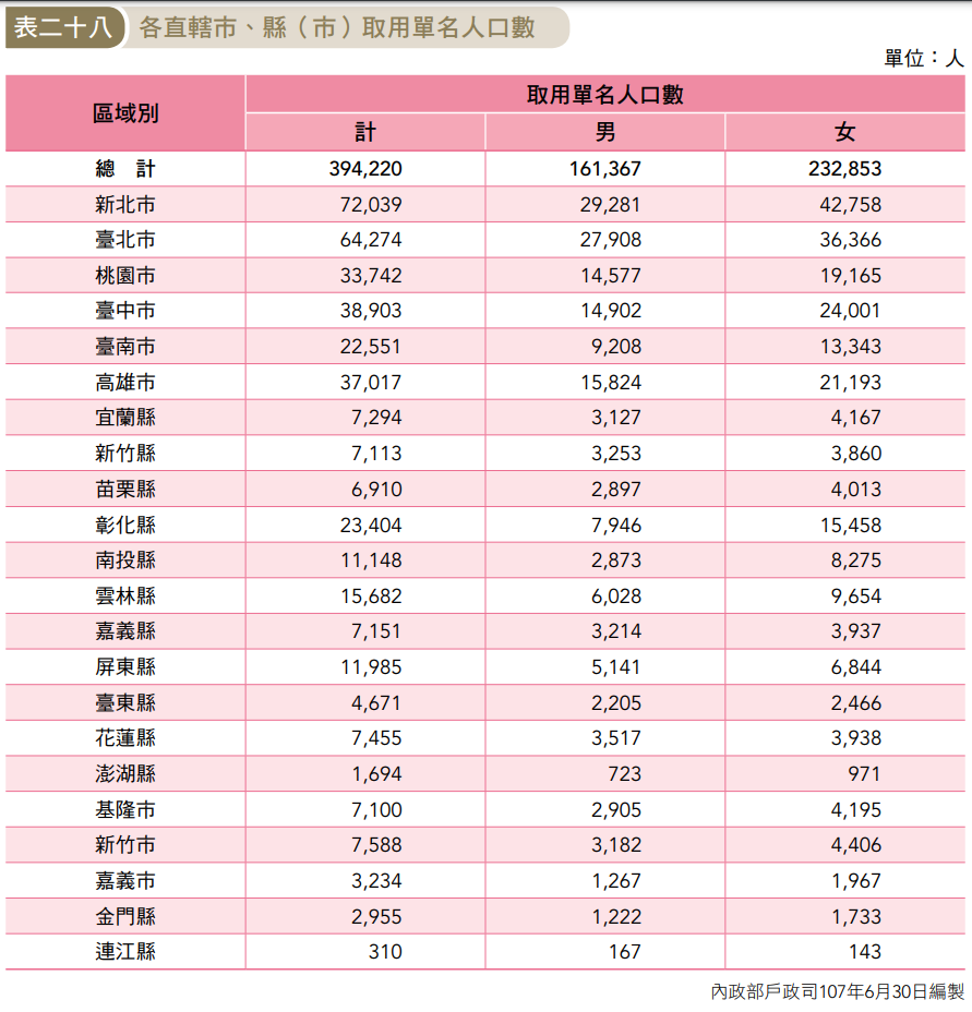
Popularity of single-syllable names (male and female given separately) in different locations throughout Taiwan
(Alas, the people compiling the statistics didn’t show the numbers as a percentage of the population of the areas in question. And I’m not feeling motivated to run the numbers myself; but it appears that such names are more popular per capita in the north than the south.)