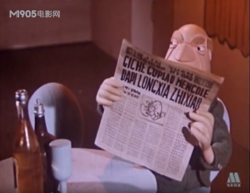
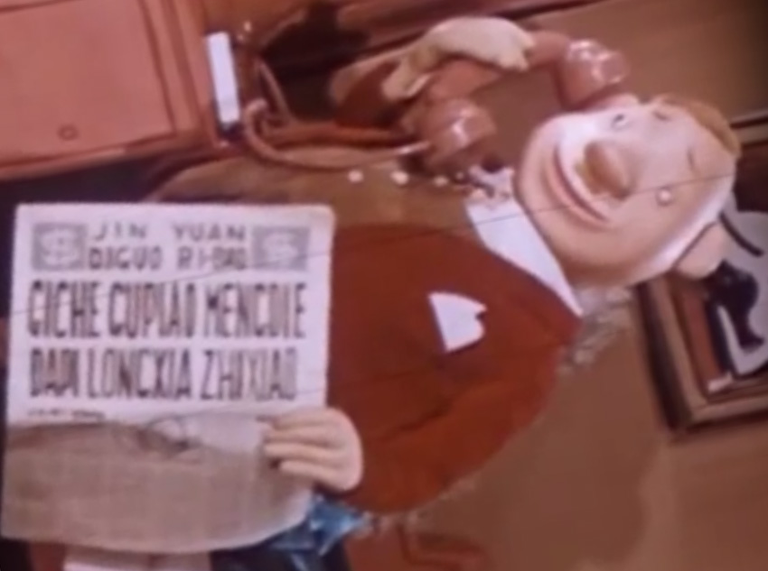
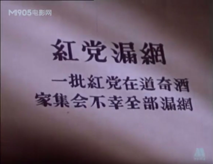
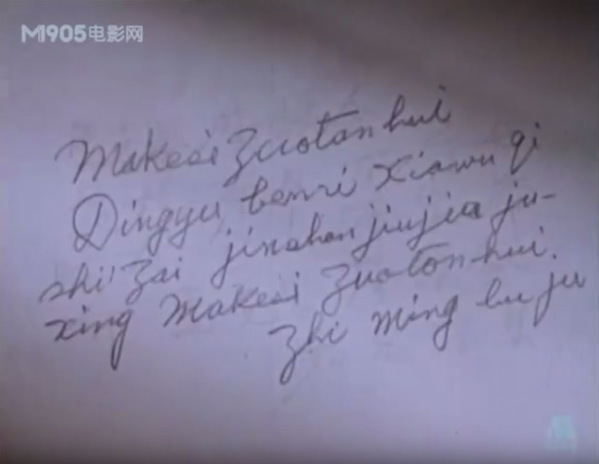
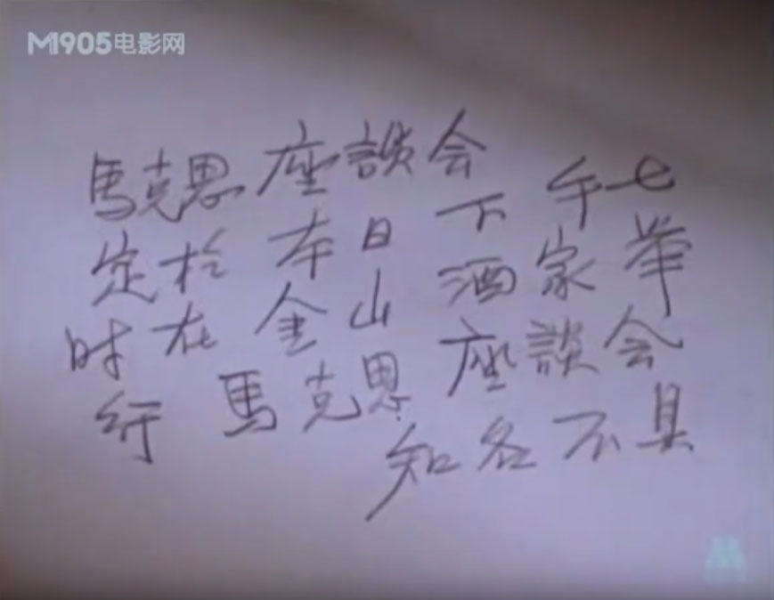
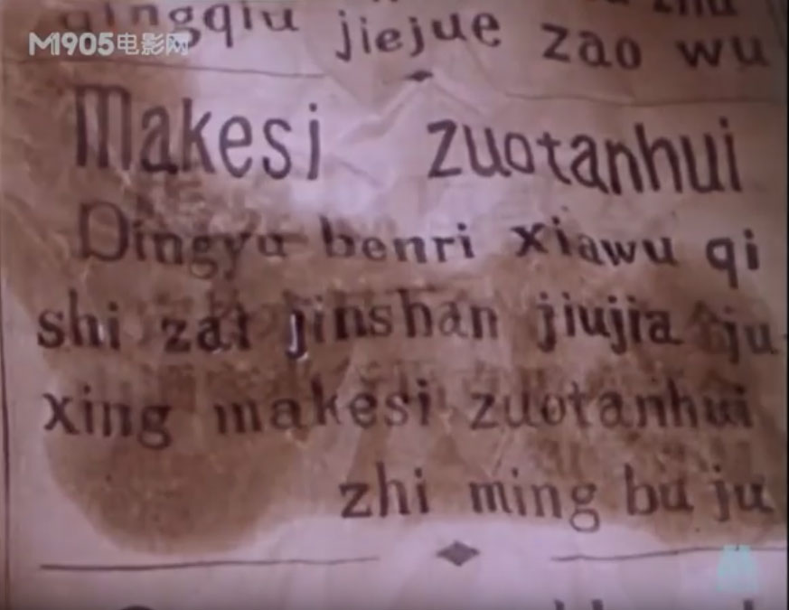
“He’s much too unreasonable,” interrupted the Mathemagician again. “Why, just last month I sent him a very friendly letter, which he never had the courtesy to answer. See for yourself.”
He handed Milo a copy of the letter, which read:
4738 1919,
667 394017 5841 62589
85371 14 39588 7190434 203
27689 57131 481206.5864 98053,
62179875073“But maybe he doesn’t understand numbers,” said Milo, who found it a little difficult to read himself.
“NONSENSE!” bellowed the Mathemagician. “Everyone understands numbers….”
— from The Phantom Tollbooth, by Norton Juster
The Taipei MRT system has announced that it may be adopting a nicknumbering system for stations within the system.
Bad idea.
And, really, it should be obvious even to city officials what a bad idea this is, given what a complete failure the city’s previous attempt at a nicknumbering system was. (The old attempt, from 2000, had Ma Ying-jeou adding things such as “4th Blvd” to road signs rather than simply fix the signs to use correct Hanyu Pinyin. But the MRT system has used Hanyu Pinyin for years, so foreigners aren’t complaining about a lack of that in 2015.)
I have, however, been complaining for many years about mistakes in the names of some MRT stations and how the MRT system has chosen some bad names. To no avail. But when a politician with no particular history that I’ve seen of giving a damn about what foreigners in Taiwan want decides to grandstand his half-cocked notion, the authorities behind the MRT system jump to implement it, no matter what the supposed beneficiaries might want. Shame on them.
Indeed, this particular politician’s history is of opposition to what foreigners want in terms of signage, as shown by his partisan remarks in favor of Tongyong Pinyin (which is widely despised by Taiwan’s foreign population) and against Hanyu Pinyin (which is almost universally preferred). So I see ample reason to question his motives here.
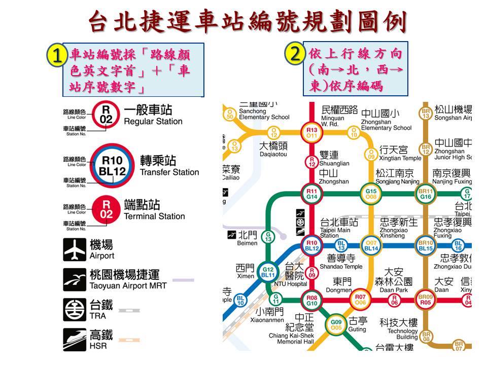
This new nicknumbering system, by which MRT stations will be assigned additional names (e.g., “R13” and “O11”, for one particular station) is being touted as something aimed at helping foreigners. But I know of no foreigners who have needed any great help on the MRT system — at least not since the city finally implemented Hanyu Pinyin many years ago. Certainly there has been no great outcry from foreigners for any change of this sort. Instead, the nicknumbering system is simply a bad idea that will make things worse, not better. And it will be expensive to implement — money down the drain.
Let’s look at the fragment of the nicknumbering map that the Taipei City Government included with its post.
Try to ignore the horrific clutter for the moment.
Note the red line (which also has a line number … that no one uses except for the MRT system itself in its announcements, something implemented in the previous bad idea from the MRT system). Anyway, along the red line, Da’an Park (which the MRT system wrongly labels “Daan Park”) is nicknumbered “R06,” Da’an as R05, and Xinyi Anhe as R04. That would make Taipei 101 / World Trade Center station R03; and Xiangshan, which is presently the terminus, would be R02. The problem here is that at least two more stations are already planned for that end of the line: Songde (松德) and Zhongpo (中坡); that would mean the final(?) station would need to be oddly nicknumbered R00, though there are no other zero stations given elsewhere. And if any stations are added after that, either the whole system would need to be renumbered or the numbers would need to head into negatives. Absurd! Such is likely also the case with other lines.
This is the sort of thing that strongly indicates that the authorities haven’t really thought this through. They’re just going forward anyway, which is foolish.
For that matter, why are there zeros marked in the numbers below ten? (For example, why “R04” rather than “R4”?) Putting zeroes next to the capital letter O (for the orange line) is certainly not going to help clarity either. For example, are people going to get “O05” right at a glance? I doubt it.
Let’s get back to the matter of clutter. This is a real problem. The more information crammed into a map, the less clear the individual elements are.
And unlike distinct station names, nicknumbers are not easy to remember. If any foreign tourist asks someone how to get to BL13, for example, people likely won’t know how to answer them. Nicknumbering is thus the opposite of helpful, which is likely part of why almost no subway system in the world uses this, other than Tokyo, whose system is much larger than Taipei’s.
Also, I can’t help but wonder how they are planning on handling this in the announcements within the cars. Those announcements are in four languages (Mandarin, Taiwanese, Hakka, and English), which takes some time to get through. Adding nicknumbers in all of those languages is going to make for never-ending talking on the announcement system — and that’s without even figuring in the nicknumbers of transfer stations as well.
I note that, to date, the comments in English to the city’s Facebook post on this are more than twenty to one in opposition to the new system. Is anyone in the city government paying attention? I hope that readers here will add their own comments to the city’s Facebook page on this. (I’m not on Facebook myself.)
The last time the city of Taipei implemented nicknumbering for anything, this was met with near-universal derision from those it was supposedly designed to help. Most people in Taiwan’s foreign community quickly recognized it was a terrible idea — really, really terrible — which unfortunately didn’t stop Taipei from cluttering up the city’s signage with largely useless information. I would have thought that the city would have learned its lesson by now.
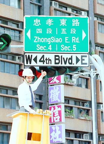
This photo from 2000 shows an almost perfect storm of bad ideas supposedly meant to help foreigners. Ma Ying-jeou, during his days as mayor of Taipei, gives a thumbs-up to a road sign with his new nicknumbering system. And above the sign for 4th Blvd is a street sign from Chen Shui-bian’s tenure as mayor. It’s in the much-hated Tongyong Pinyin romanization system — or what was Tongyong Pinyin until the designers of Tongyong Pinyin changed the system (e.g., zh –> jh) and made a lot of their own signs wrong. And to top it off, it employs InTerCaPiTaLiZaTion, another annoying bad idea that still infects the street signs of Taipei.
Here, Taipei City Government officials, is what most foreigners need and want: correct Hanyu Pinyin. For the most part, that’s what the MRT system already has. Don’t screw it up.
sources:
- Táiběi jiéyùn chēzhàn zhàn míng zēngjiā「chēzhàn biānhào」 (臺北捷運車站站名增加「車站編號」), Taipei City Government Facebook page (開放台北 – 北市府網路市政論壇), November 29, 2015
- Taipei plans to introduce coding system for metro stations, CNA, November 29, 2015
- 中文講完換英文!北捷報站順序將洗牌, TVBS, October 25, 2015
- 北捷不國際化! 議員「數字編碼取代翻譯站名」, TVBS, November 17, 2015
- 民政局長非拍『馬』屁不可嗎?, press release by Taipei City Councilor Li Chien-chang (李建昌), February 7, 2000

