Pinyin font: the Brill

Some of the Pinyin-friendly font families I provide examples of on this blog are fun but not exactly the sort of thing you’d want to use in a book or other serious project. Others, though, are solid examples of the subtle and exacting art of type design. Today’s entry belongs in the latter group.

Brill — a Leiden-based publisher of work in the humanities, social sciences, law, and science — has released “the Brill,” a new font family designed to support the Latin and Greek scripts “to the fullest extent possible.” IPA and the Slavic parts of the Cyrillic range are also covered. This can handle the needs of just about any romanized script, including Hanyu Pinyin.

As someone with Brill explained to me:

Instead of limiting the fonts’ character set to known characters and character-plus-diacritic combinations, we chose a dynamic model in which, using OpenType GPOS features, any base character can carry any diacritic above or below it, and in which diacritics can be stacked as well—not forgetting all the precomposed characters that are already present in the Unicode Standard, of course. Finally, a huge assortment of punctuation marks, editorial marks, and other symbols known to occur in Brill publications were added to the spec.

In total, the Brill contains more than 5,100 characters. And that already immense range can be extended through combining diacritics, as noted above.

Even better, the Brill is free for non-commercial use. You can download it after agreeing to the End User License Agreement license. (See the bottom of that page and then the bottom of the page that follows.)

The Brill is available now in roman and italic styles. Bold and bold italic versions will be released later this year, probably before July.

The Brill is considerably different than Brill Online, which has been available for some time and was aimed at helping users of Brill’s online reference works. Brill Online is based on v. 1.00 of the Gentium family of fonts. The glyph set was extended to support some very rare characters, such as Aegean numbers. “In essence it became a hybrid Latin-Greek-Cyrillic-IPA and ‘pi’ font family.”

Thanks to Lin Ai of Zhongweb.net for the heads up that this had been released, and to Dominique de Roo and Pim Rietbroek of Brill for patiently helping me with my questions.

Pinyin font: Linux Biolinum

The highly useful and Pinyin-friendly Linux Libertine has a companion font family: Linux Biolinum.

Biolinum is designed for emphasis, e.g. of titles. You can also use it for short passages of text. For longer texts a serif font such as the Libertine should be used for readability. The Biolinum has the same vertical metrics and visual weight as the Libertine, so that it fits perfectly to the Libertine and can be also used for emphasizing within the body text.

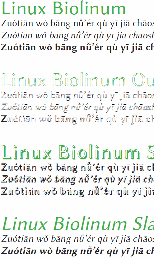
Linux Biolinum Capitals and Linux Biolinum Keyboard don’t presently work with Pinyin. But the other styles do, as this sample of Linux Biolinum with Pinyin text shows.

Pinyin Dongwuyuan: an illustrated Pinyin alphabet

Here’s a new book I made for fun: Pīnyīn Dòngwùyuán (4.3 MB PDF).

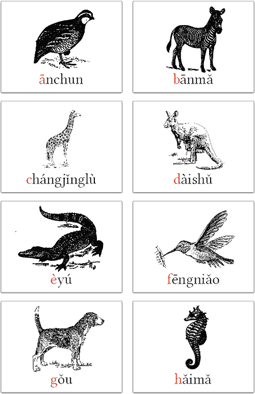
It goes through the letters of the alphabet: A is for ānchun, B is for bānmǎ, C is for chángjǐnglù, etc., all the way through Z, which is for zhāngyú.

But X is not for xióngmāo. I’m sick of pandas. Let’s let some other animals have some time in the spotlight.

Although technically speaking the Pinyin alphabet is the same as that for English, I prefer to go with A–Z, minus V but plus Ü.

O and R were the tricky ones to find animals for.

Perhaps some teachers will print this out and hang it up in their classrooms. Or kids could use it as a coloring book. You have my permission to do just about anything you like with this — other than sell it or add Chinese characters. (The world already has plenty of material in Hanzi, but not nearly enough in Pinyin.)

I made sure to include multiples of some common morphemes (e.g., bān, hǎi, and ; è and zhāng; hǎimǎ and hǎi’ōu; niú, wōniú, and xīniú), which I hope will be useful.

For fonts, I used the Linux Libertine family.

This took me far longer to make than I thought it would, so I hope some people enjoy it or at least find it interesting.

Pinyin font: Linux Libertine

Linux Libertine in Wikipedia logoLinux Libertine is perhaps most familiar as the font used in the Wikipedia logo. This surprisingly large font family also works well with Hanyu Pinyin, though a few adjustments need to be made before all of the fonts in this family work as they should with Pinyin texts.

Here’s how those working on Linux Libertine describe it:

We work on a versatile font family. It is designed to give you an alternative for fonts like T*mes New Roman. We’re creating free software and publish our fonts under terms of the GPL and OFL. Please have a look at the paragraph concerning the license.

It is our aim to support the many western languages and provide many special characters. Our fonts cover the codepages of Western Latin, Greek, Cyrillic (with their specific enhancements), Hebrew, IPA and many more. Furthermore, typographical features such as ligatures, small capitals, different number styles, scientific symbols, etc. are implemented in this font. Linux Libertine thus contains more than 2000 characters.

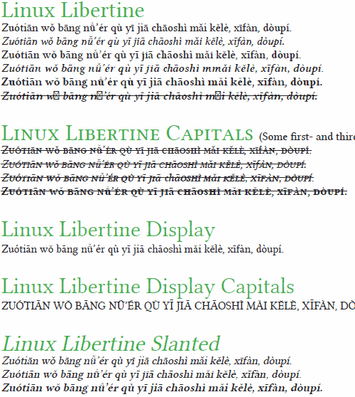
Here’s what it looks like with Pinyin. (Click to view a PDF, which is much clearer.)
screenshot of Linux Libertine in action on Pinyin text

image of a rhinocerous (xiniu) and the word 'xiniu' in Linux Libertine

All in all: Not bad.

Some fonts *not* to use for Pinyin

One of the traditions in advance of Chinese New Year is housecleaning — something not among my favorite activities. But I thought I’d do a bit of housecleaning of half-finished posts and get at least one up before the new year (tomorrow). So here it is.

Although I occasionally bemoan the fact that relatively few font families are made such that they can handle Hanyu Pinyin with tone marks (at least not right out of the box), it’s worth noting that some of the commonly found fonts that do cover all of the letters and diacritics really suck at it and should be avoided when writing in Pinyin.

Typically, such fonts were designed mainly with Hanzi in mind.

Here’s one example:
screenshot of a Pinyin text set in Adobe Ming -- and, boy oh boy, is it ever hideous

Hideous.

That was Adobe Ming. Yes, Adobe.

I’ll go ahead and point out the obvious problems:

And I’m not so sure about the consistency of the x-height either. Those stubby little descenders are puzzling, too, but are not necessarily wrong.

Perhaps the designers intended these letters for use in vertically aligned text — though I don’t think these forms would work well even then. Perhaps there’s some context in which these might make sense, though I’m inclined to doubt this. Perhaps the designers have an irrational hatred of romanization and wanted to make Pinyin look as ugly as possible. Whatever the reason, even though this and the other Unicode-compliant fonts below have all of the letters with diacritics that Pinyin requires, using them for Pinyin texts would be a very bad idea.

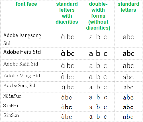
Since there is apparently still some confusion about why the “?” form (in contrast to the normal “a” form) is incorrect, see the chart below.

table showing that the fonts discussed in this post that use the rounded style for the letter 'a' do so only with diacritics, not elsewhere. This is wrong. The rounded a's should not be used at all.

Note how the odd form of the letter a does not appear in regular text or even in double-width forms; instead, it’s seen only when accompanied by a tone mark. In other words, even within individual fonts the ? form is treated not as a normal “a” that happens to look that way but as something specifically for Pinyin, which is flat-out wrong. Other than the addition of diacritics themselves, there is no reason to alter letter shapes in any way for Pinyin.

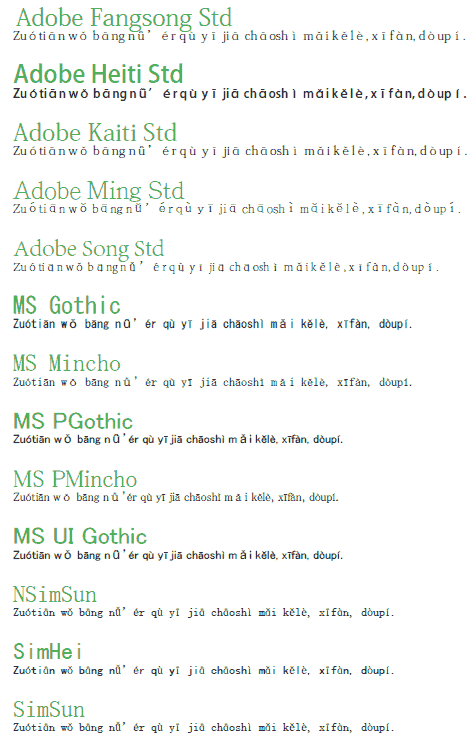
Let’s get back to the broader issue. Here are some more examples of fonts that render Pinyin in ugly ways. (Click image to view PDF.)

click to view PDF with much larger and clearer text

To aid Web searches, here’s a text list of the fonts above, none of which should be used for Hanyu Pinyin:

  • Adobe Fangsong Std
  • Adobe Heiti Std
  • Adobe Kaiti Std
  • Adobe Ming Std
  • Adobe Song Std
  • MS Gothic
  • MS Mincho
  • MS PGothic
  • MS PMincho
  • MS UI Gothic
  • NSimSun
  • SimHei
  • SimSun

SimSun is probably the least awful of the bunch. But even so, there’s no good reason to use it instead of something else that would do the job much better, such as Gentium:
screenshot of the same Pinyin text, but this one is set in Gentium -- and it looks great

Generally speaking, if you wouldn’t want to use a font for English, French, Italian, etc., then don’t use it for Hanyu Pinyin.

Say no to making Pinyin ugly!

I wish you all a happy and Pīnyīn-rich year of the dragon.

Pinyin font: Noticia Text

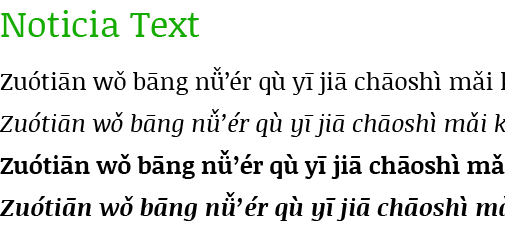
Since my last examination of the selection at Google Web Fonts the number of font families for Latin Extended has reached 98 [edit: May 31, 2012: 188], with one new face capable of rendering Hanyu Pinyin with tone marks: Noticia Text.

image showing the font Noticia Text in action on a Hanyu Pinyin sample text

Here are the Pinyin-friendly font faces at Google Web Fonts.

Serif

  • EB Garamond
  • Gentium Basic
  • Gentium Book Basic
  • Neuton
  • Noticia Text

Sans Serif

  • Andika
  • Ubuntu
  • Ubuntu Condensed
  • Ubuntu Mono

For future reference, the font most recently added to the Latin Extended group is Ruda [edit in May 2012: Chau Philomene One], which doesn’t support Pinyin with diacritics (except, perhaps, through combining diacritics).

See also

Pinyin font: Flexion Pro

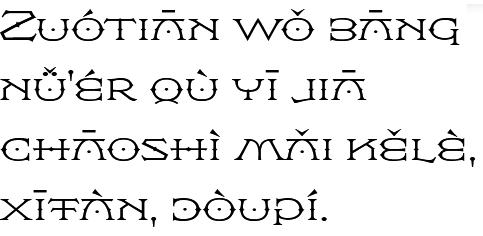
Today I’d like to introduce a highly individualistic font family that supports Hanyu Pinyin: Flexion Pro. This one, however, isn’t free.

sample of the Flexion Pro font being used for text in Hanyu Pinyin

Flexion was originally designed for the movie The DaVinci Code, which is apt, given how the main character, Robert Langdon, was named after Flexion’s designer (and ambigram specialist) John Langdon. Hal Taylor completed the font.

Here’s part of Taylor’s description:

Flexion is possibly the only symmetrical type design currently available. In keeping with John’s well-know propensity for ambigrams, many of the characters are mirrored to become other characters; the B is a reversed E, the C is reversed to become a D, G is a mirrored P, the K is a reversed N, and so on.

Of course, some of the tone marks will complicate making this work for ambigrams. But since Chinese-English bilingual ambigrams are possible, making Pinyin ambigrams, even with tone marks, shouldn’t be out of the question.

Flexion comes in four weights.