Year of the Tiger puns, part 1

This is a cute ad for a bakery in Banqiao, Taiwan. The text in Chinese characters reads “虎年送吼禮” (Hǔnián sòng hǒu lǐ).

What’s odd about this is the character 吼, which is the character used to write the Mandarin word “hǒu” (howl, roar). So the text in English reads something like “[In the] Year of the Tiger, give roar gifts.”

This only makes proper sense when one knows that here “hǒu” is standing in for the Taiwanese word for “good” (in Mandarin: hǎo/好).

image with two cute cartoon tigers, one of which is baying. The speech bubble for that is the Chinese character 吼

Old Taipei street sign

Pinyin News reader Channing Bartlett passed along this photo he took c. 1980 in Taipei at the corner of Jianguo North Road section 1 and Chang’an East Road section 2. As you can see, inconsistencies on Taiwan street signs weren’t restricted to matters of romanization. Here we have 建國北路一段 (Jiànguó Běi Lù yī duàn) and 長安東路二段 (Cháng’ān Dōng Lù èr duàn) — or rather “段二路東安長.”

One sign is written left to right, the other right to left.

Also, if you look closely at the characters for lu and duan, you can see that the fonts are different, likely indicating the signs are of different ages. But if one sign was replaced, why not the other? Mysterious are the ways of Taiwan street signs.

Bartlett described the experience of trying to read street signs quickly back then:

As I was on a bus barreling by, I had just a quick moment to read one. But often it took up my quick moment just to see whether it was written L to R or vice versa. The practice was inconsistent, as you can see in this photo.

Follow me

I ran into a reader of Pinyin.info the other day, which has had me feeling guilty for not posting anything in recent months. So here’s something I wrote nearly a year ago but never posted. The sign is now long gone, but the linguistic points remain the same.

Near the Banqiao train station is this sign, which advertises small apartments. (At just 13 or 14 ping, counting the shares of all of the “public” spaces, they are basically tiny.) It has a lot of points of note for so little text:

  • Chinese characters are used to write an English word: 發樓 (fālóu) = follow.
  • English (“Follow me”) is used as well as Mandarin.
  • Numbers are used to write a Mandarin word: 94, i.e., jiǔ sì (九四) = jiùshì (就是). Note also that this works despite the tones being different.

發樓ME (with the English “Follow me” there for clarity as well)
13坪.14坪
收租人生94爽
告別租隊友 live your life

image of the large billboard discussed in this post

Unnecessarily wordy sign

Directional road sign high on post. It reads (in Chinese characters) 'Caizhengbu, Nanqu Guoshuiju, Taidong Fenju' and (in English) 'Taitung Branch, National Taxation Bureau of the Southern Area, Ministry of Finance', as discussed in the post itself.

Above is a directional road sign at an intersection in Taitung (Taidong), Taiwan. It reads:

財政部
南區國稅局
臺東分局

[Cáizhèngbù
Nánqū Guóshuìjú
Táidōng Fēnjú]

Taitung Branch, National Taxation
Bureau of the Southern Area,
Ministry of Finance

Although Taiwan has a lot of this sort of directional signage, I don’t think I’ve written before about why I think so many examples of it are downright awful.

Not only is the sign unnecessarily wordy, the part that receives the greatest emphasis (by appearing in large characters) is the least useful: 臺東分局. Taidong Fenju means simply “Taitung branch office.” But since the sign is in Taitung itself, mention of an office being in Taitung provides zero useful information. (It’s a safe bet that drivers will already know which part of the country they’re in and that they aren’t driving around that neighborhood looking for the Taipei office.) The same thing goes for mention of this being the office for the Nanqu (“Southern Area”).

Nor do motorists care in the least what ministry the National Taxation Bureau belongs to. They simply need to be able to comprehend quickly and easily the main point of the sign. Too much information becomes clutter, a fatal problem on signs that drivers need to be able to read and comprehend quickly and easily.

A fundamental of good signage is to keep it simple.

The sign would be much better if it read simply “國稅局 Tax Office” and had an arrow. (Also, though this would be a moot point if the line were deleted, I’d prefer 台稅局 over 臺稅局. We have Ma Ying-jeou to thank for the prevalence of 臺.)

My private word for unnecessarily wordy signs in Taiwan is “signese,” which should not be confused with the good kind of Signese.

Sorry about the poor quality of the photo. I had to quickly use a cell phone camera on zoom through a taxi windshield — not ideal.

China attracting fewer and fewer U.S. study-abroad students

China is continuing to decline as a destination for U.S. study-abroad students, slipping from fifth place to sixth (behind Britain, Spain, Italy, France, and Germany; with Ireland, Australia, Costa Rica, and Japan completing the top ten).

This likely indicates that the craze for learning Mandarin has already peaked. Greater awareness of the unhealthy levels of pollution in China may also be a factor.

chart showing how US enrollments in study-abroad programs in China were low in the 1990s (about 2000 students), grew sharply in the 2000s (to almost 15000 in 2011), and have been declining ever since
Note: The dip in the 2002–2003 school year was a result of worries about the outbreak of SARS.

Meanwhile, almost all other parts of East Asia saw increases in 2015–2016 over 2014–2015:

Destination Students in 2014-15 Students in 2015-16 % Change
China 12,790 11,688 -8.6
Hong Kong 1,508 1,612 6.9
Japan 6,053 7,145 18.0
Macau 3 4 33.3
Mongolia 71 71 0.0
South Korea 3,520 3,622 2.9
Taiwan 880 980 11.4

sources:

Additional reading:

Guabao

guabao

Today I’d like to talk about a sign at a stand that sells guabao, a quintessential Taiwanese snack.

I took my own photo, but it didn’t make the guabao look particularly appetizing, so I’m using a public-domain image instead so you can see what one looks like if you don’t already know. But when I buy one I have them leave off the cilantro/xiāngcài. I hate that stuff.
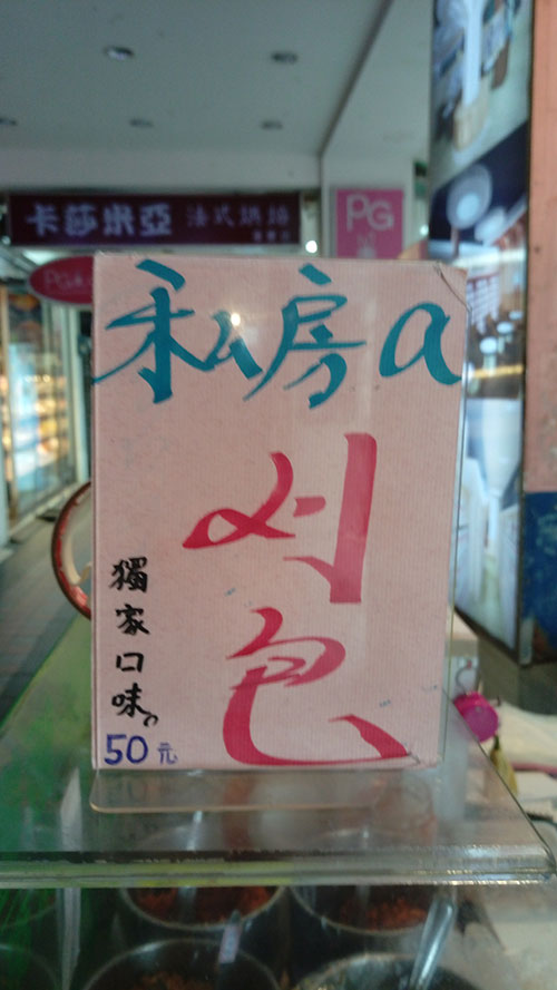
Here’s the sign.

guabao sign, as described below

私房a
刈包

獨家口味
50元

(NT$50 is about US$1.50.)

The sign uses some Taiwanese, specifically “a刈包.” If the whole thing were in romanized Taiwanese, it would be

Su-pâng ê
koah-pau

To̍k-ka kháu-bī
50 îⁿ

But parts of that are unidiomatic, as Taiwanese expert Michael Cannings informs me. (Alas, my Taiwanese sucks.) So this is a sign in both Taiwanese and Mandarin, which isn’t particularly surprising given that guabao is a Taiwanese food but most people in northern Taiwan use Mandarin most of the time. (I’m using the spelling “guabao” rather than “koah-pau” in most of this post because this is a Pinyin site.)

Something about this sign did surprise me a lot. Can you guess?

  • It’s not the use of a Roman letter — I should probably say “English letter” in this case, since here the letter is meant to be pronounced much like the “A” in “ABC” — though regular readers know that’s certainly more than enough to get me interested.
  • It’s not that the sign has “刈包” rather than “割包” for guabao. In searches restricted to .tw domains, Google returns 181,000 results for “刈包” and just 41,900 results for “割包”, even though Taiwan’s Ministry of Education prefers the latter form. Even on government Web pages “刈包” beats “割包” by a ratio of more than two to one.
  • It’s not the style in which “刈包” is written by hand, though I kinda like that.
  • And it’s not even that “a” was used instead of a different Roman letter: “ê”.

What seems to me most distinctive about this sign is that the Roman letter appears in lowercase rather than as “A”.

A single letter being used to represent a Sinitic morpheme in a text otherwise in Chinese characters is almost always written in upper case, e.g., A菜, 宮保G丁, K書. (Oh, that reminds me: I really need to answer that e-mail message about K. Sorry, Steven.)

In other words, if a sign is going to have the Roman letter “a” stand in for the Taiwanese possessive particle (the equivalent of Mandarin’s de/的), I would expect in this particular case for the sign to have “私房A” rather than “私房a”. I’m pleased by the use of lowercase; capital letters should be mainly for proper nouns and the beginnings of sentences.

It’s probably a one-off. But just in case I’ll be on the lookout to see if there’s a trend toward greater use of lowercase.

The text also presents a challenge: How should this be written in Pinyin? The last part (獨家口味 / 50元) is easy, because it’s just straight modern standard Mandarin:

dújiā kǒuwèi
50 yuán

But what to do with this?

私房a
刈包

Probably this:

Sīfáng ê
guabao

Most Common Taiwanese Given Names

Below are the most common given names for Taiwanese, as of June 2016. For the numbers of people with any of these given names, see the graph below. Note that there are more Taiwanese with even the tenth-most-popular name for girls than the most popular name for boys.

If you would like a chart of such names for Taiwanese in their twenties and thirties (specifically, those born 1976–1994), see Common Taiwanese given names. For the most common family names in Taiwan, see Taiwan personal names: a frequency list.

For the most likely spelling, bastardized Wade-Giles is given.

Most popular given names for Taiwanese males

No. Hanzi Pinyin Spelling Likely Used by Someone with This Name
1 家豪 Jiāháo Chia-hao
2 志明 Zhìmíng Chih-ming
3 俊傑 Jùnjié Chun-chieh
4 建宏 Jiànhóng Chien-hung
5 俊宏 Jùnhóng Chun-hung
6 志豪 Zhìháo Chih-hao
7 志偉 Zhìwěi Chih-wei
8 文雄 Wénxióng Wen-hsiung
9 金龍 Jīnlóng Chin-lung
10 志強 Zhìqiáng Chih-chiang

Most popular given names for Taiwanese females

No. Hanzi Pinyin Spelling Likely Used by Someone with This Name
1 淑芬 Shūfēn Shu-fen
2 淑惠 Shūhuì Shu-hui
3 美玲 Měilíng Mei-ling
4 雅婷 Yǎtíng Ya-ting
5 美惠 Měihuì Mei-hua
6 麗華 Lìhuá Li-hua
7 淑娟 Shūjuān Shu-chuan
8 淑貞 Shūzhēn Shu-chen
9 怡君 Yíjūn Yi-chun
10 淑華 Shūhuá Shu-hua

Graph, in Mandarin, of the most common male and female names in Taiwan

Note: Although I refer to these as “Taiwanese” names, I give the Mandarin forms (since Hanyu Pinyin is a system for writing Mandarin), not names in Hoklo/Hokkien (the language often referred to as Taiwanese).

Source: ROC Ministry of the Interior.

Tai vs Tai

Taipei’s MRT system, wonderful though it is, continues to find new ways to irritate me. Today I present the case of

台 vs. 臺

Semantically, there is no difference between these two characters. They both represent the tái in Taipei/Taibei and Taiwan. But the 台 form is more common in Taiwan, where it is seen as a variant form and thus not as one of the “simplified” characters used in China.

So why is the MRT’s new airport line using a huge “臺” on its signs when a normal “台” would do just as well? In fact, the regular 台 form is found six times on the same sign, with the fourteen-stroke “臺” seen just once.

To show that this isn’t just a one-off, I’m providing photos of a few more signs in a station along the “purple” (airport) line.

So, in the first sign alone, we have:

  • 臺北 (×1),
  • 台北 (×4),
  • 月台 (yuetai, platform), and
  • 台鐵 (×1), for Tai-Tie, Taiwan’s railroad company, and thus any ordinary train line.

I blame Ma Ying-jeou.