Pinyin font: Linux Libertine

Linux Libertine in Wikipedia logoLinux Libertine is perhaps most familiar as the font used in the Wikipedia logo. This surprisingly large font family also works well with Hanyu Pinyin, though a few adjustments need to be made before all of the fonts in this family work as they should with Pinyin texts.
Here’s how those working on Linux Libertine describe it:

We work on a versatile font family. It is designed to give you an alternative for fonts like T*mes New Roman. We’re creating free software and publish our fonts under terms of the GPL and OFL. Please have a look at the paragraph concerning the license.

It is our aim to support the many western languages and provide many special characters. Our fonts cover the codepages of Western Latin, Greek, Cyrillic (with their specific enhancements), Hebrew, IPA and many more. Furthermore, typographical features such as ligatures, small capitals, different number styles, scientific symbols, etc. are implemented in this font. Linux Libertine thus contains more than 2000 characters.

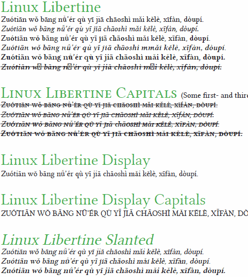
Here’s what it looks like with Pinyin. (Click to view a PDF, which is much clearer.)
screenshot of Linux Libertine in action on Pinyin text

image of a rhinocerous (xiniu) and the word 'xiniu' in Linux Libertine

All in all: Not bad.

Some fonts *not* to use for Pinyin

One of the traditions in advance of Chinese New Year is housecleaning — something not among my favorite activities. But I thought I’d do a bit of housecleaning of half-finished posts and get at least one up before the new year (tomorrow). So here it is.

Although I occasionally bemoan the fact that relatively few font families are made such that they can handle Hanyu Pinyin with tone marks (at least not right out of the box), it’s worth noting that some of the commonly found fonts that do cover all of the letters and diacritics really suck at it and should be avoided when writing in Pinyin.

Typically, such fonts were designed mainly with Hanzi in mind.

Here’s one example:
screenshot of a Pinyin text set in Adobe Ming -- and, boy oh boy, is it ever hideous

Hideous.

That was Adobe Ming. Yes, Adobe.

I’ll go ahead and point out the obvious problems:

And I’m not so sure about the consistency of the x-height either. Those stubby little descenders are puzzling, too, but are not necessarily wrong.

Perhaps the designers intended these letters for use in vertically aligned text — though I don’t think these forms would work well even then. Perhaps there’s some context in which these might make sense, though I’m inclined to doubt this. Perhaps the designers have an irrational hatred of romanization and wanted to make Pinyin look as ugly as possible. Whatever the reason, even though this and the other Unicode-compliant fonts below have all of the letters with diacritics that Pinyin requires, using them for Pinyin texts would be a very bad idea.

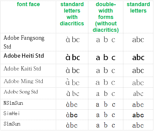
Since there is apparently still some confusion about why the “?” form (in contrast to the normal “a” form) is incorrect, see the chart below.

table showing that the fonts discussed in this post that use the rounded style for the letter 'a' do so only with diacritics, not elsewhere. This is wrong. The rounded a's should not be used at all.

Note how the odd form of the letter a does not appear in regular text or even in double-width forms; instead, it’s seen only when accompanied by a tone mark. In other words, even within individual fonts the ? form is treated not as a normal “a” that happens to look that way but as something specifically for Pinyin, which is flat-out wrong. Other than the addition of diacritics themselves, there is no reason to alter letter shapes in any way for Pinyin.

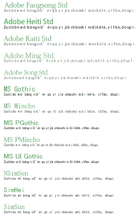
Let’s get back to the broader issue. Here are some more examples of fonts that render Pinyin in ugly ways. (Click image to view PDF.)

click to view PDF with much larger and clearer text

To aid Web searches, here’s a text list of the fonts above, none of which should be used for Hanyu Pinyin:

  • Adobe Fangsong Std
  • Adobe Heiti Std
  • Adobe Kaiti Std
  • Adobe Ming Std
  • Adobe Song Std
  • MS Gothic
  • MS Mincho
  • MS PGothic
  • MS PMincho
  • MS UI Gothic
  • NSimSun
  • SimHei
  • SimSun

SimSun is probably the least awful of the bunch. But even so, there’s no good reason to use it instead of something else that would do the job much better, such as Gentium:
screenshot of the same Pinyin text, but this one is set in Gentium -- and it looks great

Generally speaking, if you wouldn’t want to use a font for English, French, Italian, etc., then don’t use it for Hanyu Pinyin.

Say no to making Pinyin ugly!

I wish you all a happy and Pīnyīn-rich year of the dragon.

Pinyin font: Noticia Text

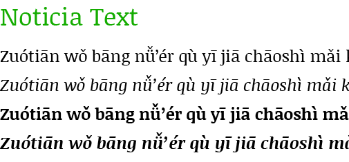
Since my last examination of the selection at Google Web Fonts the number of font families for Latin Extended has reached 98 [edit: May 31, 2012: 188], with one new face capable of rendering Hanyu Pinyin with tone marks: Noticia Text.

image showing the font Noticia Text in action on a Hanyu Pinyin sample text

Here are the Pinyin-friendly font faces at Google Web Fonts.

Serif

  • EB Garamond
  • Gentium Basic
  • Gentium Book Basic
  • Neuton
  • Noticia Text

Sans Serif

  • Andika
  • Ubuntu
  • Ubuntu Condensed
  • Ubuntu Mono

For future reference, the font most recently added to the Latin Extended group is Ruda [edit in May 2012: Chau Philomene One], which doesn’t support Pinyin with diacritics (except, perhaps, through combining diacritics).

See also

Pinyin font: Flexion Pro

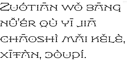
Today I’d like to introduce a highly individualistic font family that supports Hanyu Pinyin: Flexion Pro. This one, however, isn’t free.

sample of the Flexion Pro font being used for text in Hanyu Pinyin

Flexion was originally designed for the movie The DaVinci Code, which is apt, given how the main character, Robert Langdon, was named after Flexion’s designer (and ambigram specialist) John Langdon. Hal Taylor completed the font.

Here’s part of Taylor’s description:

Flexion is possibly the only symmetrical type design currently available. In keeping with John’s well-know propensity for ambigrams, many of the characters are mirrored to become other characters; the B is a reversed E, the C is reversed to become a D, G is a mirrored P, the K is a reversed N, and so on.

Of course, some of the tone marks will complicate making this work for ambigrams. But since Chinese-English bilingual ambigrams are possible, making Pinyin ambigrams, even with tone marks, shouldn’t be out of the question.

Flexion comes in four weights.

Pinyin fonts at the Open Font Library

A search for Pinyin fonts at the Open Font Library currently yields 15 font families.

Not all of those, however, really do support Hanyu Pinyin with tone marks. Here are the ones that work, though not always without problems:

And here’s a PDF of all of those Unicode Pinyin font families in action.

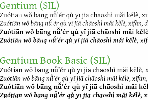
I’ve previously mentioned more than one of these: Pecita and the various Gentium faces. I’ll write more about the latter in another post on the work coming out of SIL.

Serif

screenshot of the serif font 'crimson' in action on a sample Pinyin text

screenshot of the serif fonts 'Gentium' and 'Gentium Book' in action on a sample Pinyin text

screenshot of the serif font 'Judson' in action on a sample Pinyin text

screenshot of the serif font 'Libertinage' in action on a sample Pinyin text

screenshot of the serif font 'Wirewyrm' in action on a sample Pinyin text

Sans Serif

screenshot of the sans-serif font 'Designosaur' in action on a sample Pinyin text

screenshot of the sans-serif font 'News Cycle' in action on a sample Pinyin text

screenshot of the sans-serif  font 'Pfennig' in action on a sample Pinyin text

Monospace

screenshot of the monospace sans-serif font 'Consola Mono' in action on a sample Pinyin text

Script

screenshot of the script font 'Pecita' in action on a sample Pinyin text

Full list (including fails), for future reference:

  1. Anahi/Abbey
  2. Consola Mono
  3. Crimson
  4. Designosaur
  5. Douar Outline
  6. Futhark Adapted
  7. Gentium
  8. Judson
  9. Libertinage
  10. Logisoso
  11. News Cycle
  12. Pecita
  13. Pfennig
  14. Vegesignes
  15. WireWyrm

Google Web fonts and Pinyin — December 2011 update

When I put up my first post on Google Web fonts (Google Web fonts and Hanyu Pinyin), that site offered 252 font families, 29 of which cover at least parts of Latin Extended. Now, some three months later, the total has grown to 342 font families, with 70 of those covering at least parts of Latin Extended.

Only two of the new families, however, support Hanyu Pinyin with tone marks: Ubuntu Condensed and Ubuntu Mono. That brings the total to eight Google Web fonts that support Hanyu Pinyin: four serifs and four sans serifs.

Serif

  • EB Garamond
  • Gentium Basic
  • Gentium Book Basic
  • Neuton

Sans Serif

  • Andika
  • Ubuntu
  • Ubuntu Condensed
  • Ubuntu Mono

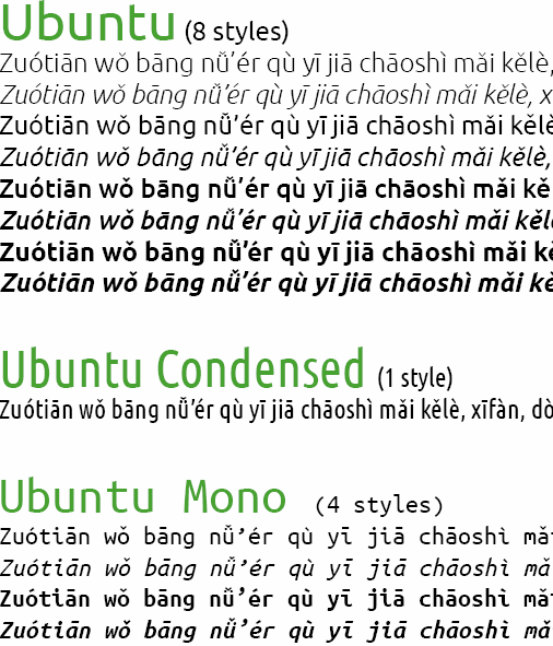
Here’s what the two new families, Ubuntu Condensed and Ubuntu Mono, look like next to the earlier Ubuntu.

example of Ubuntu, Ubuntu Condensed, and Ubuntu Mono in action on Hanyu Pinyin

For reference, here’s the total list of Latin Extended, with Pinyin-compliant fonts in bold.

Serif Faces

  1. Bitter
  2. Cardo
  3. Caudex
  4. EB Garamond
  5. Enriqueta
  6. Gentium Basic
  7. Gentium Book Basic
  8. Neuton
  9. Playfair Display
  10. Radley
  11. Sorts Mill Goudy

Sans Serif Faces

  1. Andika
  2. Anonymous Pro
  3. Anton
  4. Chango
  5. Didact Gothic
  6. Francois One
  7. Fresca
  8. Istok Web
  9. Jockey One
  10. Jura
  11. Marmelad
  12. Open Sans Condensed
  13. Open Sans
  14. Play
  15. Signika Negative
  16. Signika
  17. Tenor Sans
  18. Ubuntu
  19. Ubuntu Condensed
  20. Ubuntu Mono
  21. Varela
  22. Viga

Display Faces (all fail)

  1. Abril Fatface
  2. Arbutus
  3. Bubblegum Sans
  4. Butcherman Caps
  5. Chicle
  6. Eater Caps
  7. Forum
  8. Kelly Slab
  9. Knewave
  10. Lobster
  11. MedievalSharp
  12. Modern Antiqua
  13. Nosifer Caps
  14. Piedra
  15. Passion One
  16. Plaster
  17. Rammetto One
  18. Ribeye Marrow
  19. Ribeye
  20. Righteous
  21. Ruslan Display
  22. Stint Ultra Condensed

Handwriting Faces (all fail)

  1. Aguafina Script
  2. Aladin
  3. Devonshire
  4. Dr Sugiyama
  5. Fondamento
  6. Herr Von Muellerhoff
  7. Marck Script
  8. Miss Fajardos
  9. Miss Saint Delafield
  10. Monsieur La Doulaise
  11. Mr Bedford
  12. Mr Dafoe
  13. Mr De Haviland
  14. Mrs Sheppards
  15. Niconne
  16. Patrick Hand

Script font for Pinyin

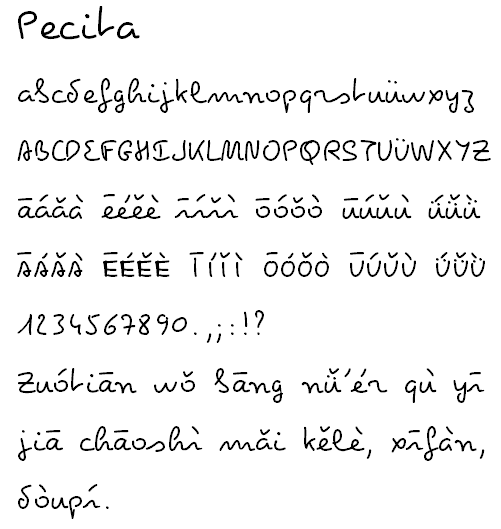
Unfortunately, relatively few fonts support Hanyu Pinyin (with tone marks, that is). So I was surprised to come across Pecita, by Philippe Cochy. This is the first script typeface I recall seeing that covers Pinyin … and a lot more.

It might be too individualistic for much Pinyin use. But I’m very glad to know it exists and hope to see many more creations like it.

GIF of Pecita in action: A-Z, a-z, plus the diacritics used in Pinyin and a pinyin pangram

Pecita is licensed under the SIL Open Font License, Version 1.1.

Additional links:

Pinyin’s never-used letter?

As most people reading this blog know, Mandarin has about 1,300 syllables (interjections and loan words complicate the count a little). If tones — a basic part of the language — are disregarded, the number of drops to 400 and something syllables.

Given 410 or so basic syllables and 4 tones — one of these days I need to write something more on the wrongful neglect of the so-called neutral tone — some people might expect there to be more like 1,640 syllables instead of about 1,300. The reason for the lower number is that not all syllables exist in all four tones. For example, quite clearly the official language of Zhōngguó does not lack zhōng … or zhǒng or zhòng. But zhóng is another matter.

So not all possible tonal variations of those 400-something syllables appear in modern standard Mandarin. But what about letters?

If you look at the official alphabet for Hanyu Pinyin, it’s exactly the same as that for English (other than in pronunciation, of course), which is a bit odd, especially considering that Pinyin doesn’t use the letter v (or at least isn’t supposed to for Mandarin words).

So in this case, I’m excluding v but otherwise being expansionist about the glyphs I’m calling letters. To be specific: I’m referring to a-z, minus v, but including ā, á, ǎ, à, ē, é, ě, è, ī, í, ǐ, ì, ō, ó, ǒ, ò, ū, ú, ǔ, ù, ü, ǖ, ǘ, ǚ, and ǜ. (Even though Ī, Í, Ǐ, Ì, Ū, Ú, Ǔ, Ù, Ü, Ǖ, Ǘ, Ǚ, and Ǜ never come at the beginning of a word, let’s not automatically eliminate them, because there is an occasional need for ALL CAPS.)

Are there any of those possible glyphs that don’t appear at all — at least as given in the large ABC Comprehensive Chinese-English Dictionary?

The answer, perhaps surprisingly, is yes.

Which letter is it?

a. ǖ b. ǘ c. ǚ d. ǜ

Have you made your choice?

It doesn’t take much thought to eliminate C as the answer. “Nǚ” (woman) is one of those first-couple-of-Mandarin-lessons vocabulary terms. And the word for green (lǜsè) is hardly obscure either. It might be harder to think of a word with the letter ǘ; but there are some. Donkey () is probably the most common. So the answer is A: ǖ.

It’s important to note that the lack of ǖ is in appearance only. The sound ǖ occurs in plenty of Mandarin words; it’s just that Pinyin’s simplified orthography calls for writing “u” instead where ǖ follows j, q, x, or y.

But even though I didn’t find an example of ǖ, I’d encourage font designers not to scratch it from their list of must-have glyphs for Pinyin faces, especially since teachers will no doubt want to continue giving tone-pattern drills based on four tones for all vowels, regardless. Also, someone with a searchable edition of the Hanyu Da Cidian or maybe the new Oxford online edition is probably about to use the comments to point me to some obscure entry there….