Recently, Victor Mair posted an image from Taichung of an apostrophe r representing “Mr.” (Alphabetic “Mr.” and “Mrs. / Ms.” in Chinese)
Here’s a companion image for a Ms. Huang.

Recently, Victor Mair posted an image from Taichung of an apostrophe r representing “Mr.” (Alphabetic “Mr.” and “Mrs. / Ms.” in Chinese)
Here’s a companion image for a Ms. Huang.
Last week Taiwan’s legislature passed an amendment stating that members of Taiwan’s tribes will no longer be forced to adopt names written in Chinese characters. Instead, their names can be presented solely in romanization if so desired. Thus, at least in this specialized category, Chinese characters have been stripped of their primacy and romanization is officially allowed to stand on its own (not appear only in conjunction with Chinese characters).
Source: Lìyuàn tōngguò: yuánzhùmín shēnfen zhèngjiàn — kě zhǐ xiě pīnyīn zúmíng (立院通過:原住民身分證件 可只寫拼音族名), United Daily News, May 15, 2024
Further reading:
Xu Xudong (徐旭東/徐旭东), a member of the Chinese People’s Political Consultative Conference and a professor at Central China Normal University in Wuhan, is advocating that public schools in China allocate substantially more time to the teaching of Hanyu Pinyin.
“Gōnglì yòu’éryuán bù jiāo Hànyǔ Pīnyīn, ér xiǎoxué yī-niánjí Hànyǔ Pīnyīn zhī jiāo yī dào yī gè bànyuè, háizi nányǐ gēnshang. Zhè yī wèntí pǔbiàn cúnzài, fǎnyìng qiángliè,” he said.
(“Public kindergartens don’t teach Hanyu Pinyin, and the first grade of primary school teaches Hanyu Pinyin for only one to one and a half months, making it difficult for children to keep up. The problem is widespread and the repercussions are strong.”)
The article does not mention this being in part a class problem, probably because the PRC supposedly does not have such things. But what has been happening is that parents with money tend to send their kids to private preschools where they learn Pinyin and otherwise get a head start on the school curriculum. Or the parents simply teach their youngsters themselves.
Students who don’t get this early boost often fall behind, which is a real problem for something so fundamental. As a result, Xu is proposing that schools spend a semester or even longer teaching Pinyin. The article, which is from a CCP mouthpiece and so should be regarded as representing an official position by at least some influential figures, calls this an easily overlooked but very important issue in basic education.
Intriguingly, Xu also mentions interspersing the teaching of Pinyin with “texts” (kèwén jiàoxué jiāochā jìnxíng / 課文教學交叉進行). The greater use of Pinyin texts in schools — if that’s indeed what is meant — could be a great boon to Pinyin education.
source:
Xú Xùdōng wěiyuán: jiànlì gèng fúhé értóng tèdiǎn de Pīnyīn jiàoxué móshì (徐旭東委員:建立更符合兒童特點的拼音教學模式), People’s Daily, March 5, 2024.
Japanese newspapers are reporting that Japan will officially switch from Kunrei-shiki romanization to Hepburn romanization.
In a front-page column last week, the Asahi Shimbun said, “A draft report recently published by the Council of Cultural Affairs pointed out that the Hepburn system is more widely used than the Kunrei system, and it is expected that the notation will be adjusted to reflect this. It is surprising because the writing system has not changed for about 70 years, but if confusion can be avoided, the change is to be welcomed.”
Some examples of differences:
| Kunrei | Hepburn |
|---|---|
| Aiti | Aichi |
| Atugi | Atsugi |
| Gihu | Gifu |
| Hukusima | Fukushima |
| Sinzyuku | Shinjuku |
| Titibu | Chichibu |
| Tukizi | Tsukiji |
sources:
The University of Hawai’i Press is having a sale, with deep discounts on many titles, including three great books from Pinyin.info’s list of recommended readings.

[Thanks to Victor H. Mair]
Tomorrow, February 7, 2024, Mark O’Neill will give an online talk on “The Father of China’s Pinyin System: Zhou Youguang.” David Moser will moderate. The talk is sponsored by the Royal Asiatic Society, Beijing.
General admission is 100 RMB.
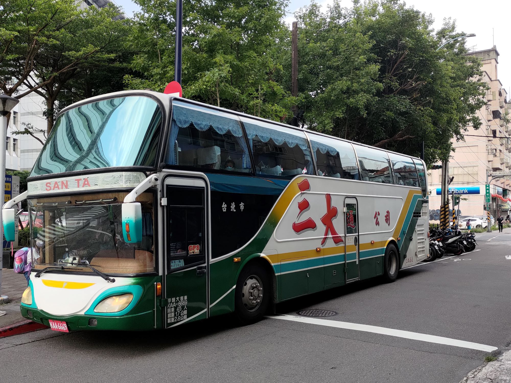
Santa’s in his bus and all’s right with the world.
Although coach buses in Taiwan often use the Gwoyeu Romatzyh romanization system, this bus uses “SAN TA” for “三大”, which is Wade-Giles.
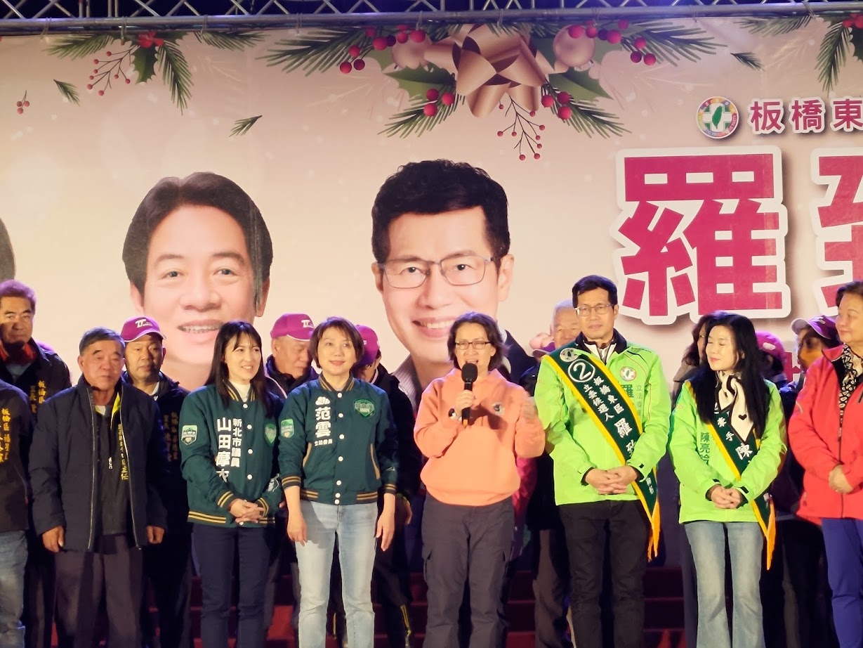
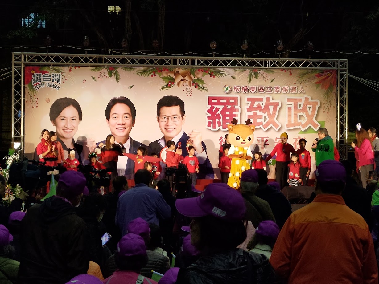
Earlier this evening I went to a rally for Hsiao Bi-khim, the Democratic Progressive Party’s candidate for vice president of Taiwan.
Most of the speakers at the rally, including Hsiao, spoke in Taiwanese, or in fluent code switching between Taiwanese and Mandarin. Hsiao, who spoke mainly in Taiwanese with some Mandarin mixed in, is more of a policy wonk than a tub-thumper. Although she struck me as better at campaign rallies than Tsai Ing-wen was earlier in her career, her remarks did include coverage of some things, important though they are, that aren’t typically used to boost crowd enthusiasm, such as working toward a tax treaty with the United States. But I was happy to hear her mention the importance of learning not just English but also keeping Taiwanese (Hoklo) and the languages of Taiwan’s indigenous peoples alive.
Part of the rally was in support of this, with a children’s group organized to help promote the speaking of Taiwanese among young people performing a skit in Taiwanese and then a rousing version of “Jingle Bells” in that language.
Hsiao is also a native speaker of English. I heard her speak (in English) about ten years ago and was impressed with her intelligence and thoughtfulness.