Back in the last century, getting Web browsers to correctly display Pinyin was such a troublesome task that I remember once even employing GIFs of first- and third-tone letters to get those to look right. So there were a whole lotta IMG tags in my text. Sure, I put the necessary info in ALT tags (e.g., “alt=’a3′”), just in case. But, still, I shudder to recall having to resort to that particular hack.
Things are better now, though still far from ideal. Something that promises to considerably improve the situation of website viewers not all having the same font you may wish to use is CSS3’s @font-face, which allows those creating Web pages to employ fonts that are provided online. Google is helping with this through its Google Web Fonts. (Current count: 252 font families.)
But is anything in Google’s collection capable of dealing with Hanyu Pinyin? Armed with a handy-dandy Pinyin pangram, I had a look at what Google has made available.
Not surprisingly, most of the 29 font families marked as offering the “Latin Extended” character set failed to handle the entire Hanyu Pinyin set. The ??? group is the most likely to be unsupported at present, with third-tone vowels also frequently missing.
Here are the Google Web fonts that do support Hanyu Pinyin with tone marks:
Serifs
- EB Garamond (227 KB)
- Gentium Basic (263 KB — and about the same for each of the three accompanying styles: italic, bold, bold italic)
- Gentium Book Basic (267 KB — and about the same for each of the three accompanying styles: italic, bold, bold italic)
- Neuton (56 KB — and about the same for each of the five accompanying styles: italic, bold, light, extra light, extra bold)
Note:
- Neuton has relatively weak tone marks, so I wouldn’t recommend it for Web pages aimed at beginning students of Mandarin.
Sans Serifs
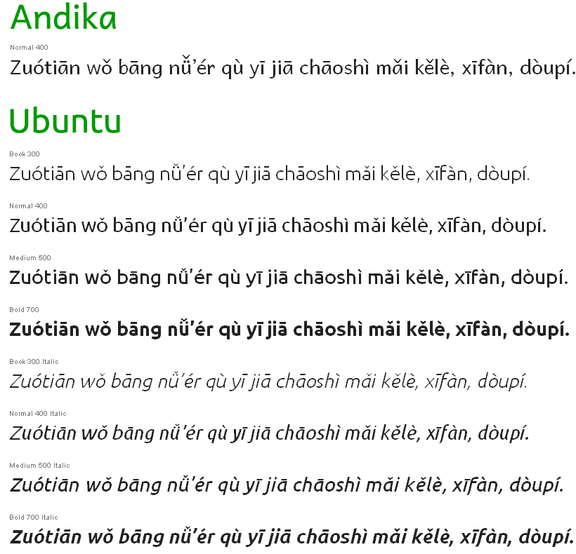
- Andika (1.4 MB)
- Ubuntu (350 KB) — available in eight styles
Some Ubuntu sample PDFs: Ubuntu regular, Ubuntu italic, Ubuntu bold, Ubuntu bold italic, Ubuntu light, Ubuntu light italic, Ubuntu medium, Ubuntu medium italic.
Note:
- Andika’s relatively large size (1.4 MB) makes it unsuitable for @font-face use because of download time. (Its license, however, would permit someone with the time and energy to crack it open and remove lots of the glyphs not needed for Pinyin, thus reducing the size.) More fundamentally, though, I don’t much like the look of it; but YMMV.
Since Google is likely to expand the number of fonts it offers, I’m including the list of all 29 faces I tried for this experiment, which should make it easier for those wanting to test only new fonts. (It is possible, however, that Pinyin support will be added later to some fonts that fail in this area now. If anyone hears of any such changes, please let me know.) Use of bold indicates Pinyin support; everything else failed.
Display Faces with Latin Extended (all fail)
- Abril Fatface
- Forum
- Kelly Slab
- Lobster
- MedievalSharp
- Modern Antiqua
- Ruslan Display
- Tenor Sans
Handwriting Faces with Latin Extended (all fail)
- Patrick Hand
Serif Faces with Latin Extended
- Cardo
- Caudex
- EB Garamond
- Gentium Basic
- Gentium Book Basic
- Neuton
- Playfair Display
- Sorts Mill Goudy
Sans Serif Faces with Latin Extended
- Andika
- Anonymous Pro
- Anton
- Didact Gothic
- Francois One
- Istok Web
- Jura
- Open Sans
- Open Sans Condensed
- Play
- Ubuntu
- Varela
Additional resource: SIL Fonts for downloading (including the full versions of Andika and Gentium).


