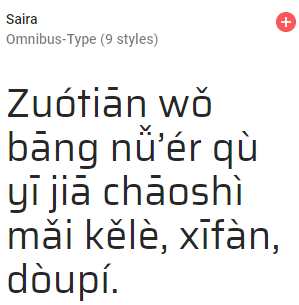
As of January 9, 2018, Google Fonts had 848 font families, 80 of which are handwriting faces. Of those, just 3 can handle Hanyu Pinyin with tone marks.
Pinyin-friendly handwriting faces at Google Fonts
Reply

As of January 9, 2018, Google Fonts had 848 font families, 80 of which are handwriting faces. Of those, just 3 can handle Hanyu Pinyin with tone marks.
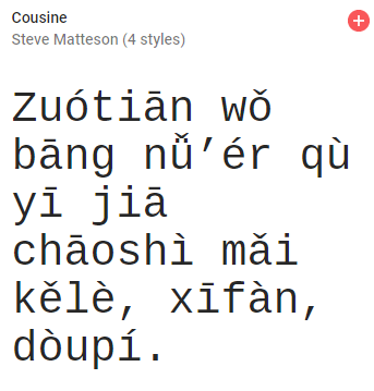
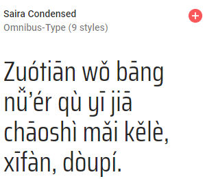
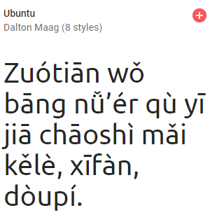
As of January 9, 2018, Google Fonts had 848 font families, 7 of which are monospace faces. Of those, 4 can handle Hanyu Pinyin with tone marks.
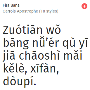
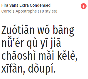
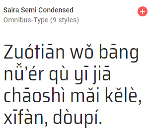
As of January 9, 2018, Google Fonts had 848 font families, 134 of which are sans serif faces. Of those, 22 can handle Hanyu Pinyin with tone marks.
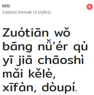
As of January 9, 2018, Google Fonts had 848 font families, 114 of which are serif faces. Of those, the following 22 can handle Hanyu Pinyin with tone marks.


There are plenty of ways to type Hanyu Pinyin with tone marks. These usually involve typing the tone number after the vowel in question or entering a series of special keystrokes to produce the tone mark.
But some consider that too much mafan, or perhaps are unsure of which tones are correct. (Heads up, students learning Mandarin! This post will be useful.) So occasionally I’m asked this question:
Is there a way to type in Hanyu Pinyin and have the correct tone marks appear automatically — even without typing tone numbers or pressing additional keys? Oh, and for free too, please.
The answer is a qualified yes.
Google Translate’s Pinyin function has come a long way since its inauspicious beginning about eight years ago. For quite some time it has even offered a way to add tone marks automatically, though few people know of this function, which could still use a great deal of improvement.
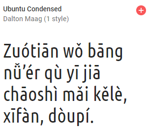
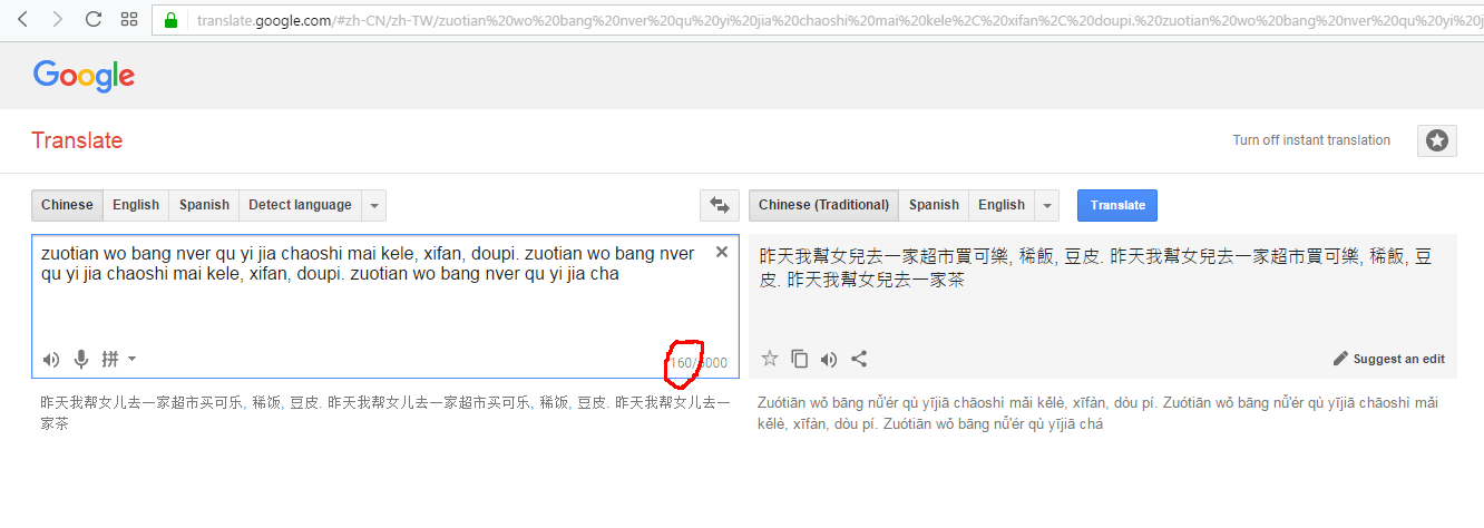
To get Google Translate to produce Pinyin with tone marks as you enter text in toneless Pinyin, first you need to set the system to translate from “Chinese” to “Chinese (Traditional)” or from “Chinese” to “Chinese (Simplified)”.
Enter your text in the box and Pinyin with tone marks will appear below the box on the right.
(Click any image to enlarge it.)
![]()
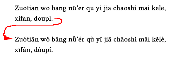
Alas, there are some problems with the system.
A lot of perfectly normal things that are essential to proper writing in Hanyu Pinyin will cause Google Translate to break. So when adding your text, do not use any of the following:
![]()
The following are optional in terms of getting Google Translate to give you good results, though they are not optional in properly written Pinyin:
A second significant problem is that the system doesn’t deal well with proper nouns, failing both word parsing and capitalization, though at least it seems to recognize that proper nouns are units, even if Google Translate doesn’t write them correctly. 
So although Google Translate won’t handle everything for you, it can nevertheless be a useful tool for including tone marks in Hanyu Pinyin.

Today I’d like to talk about a sign at a stand that sells guabao, a quintessential Taiwanese snack.
I took my own photo, but it didn’t make the guabao look particularly appetizing, so I’m using a public-domain image instead so you can see what one looks like if you don’t already know. But when I buy one I have them leave off the cilantro/xiāngcài. I hate that stuff.
Here’s the sign.
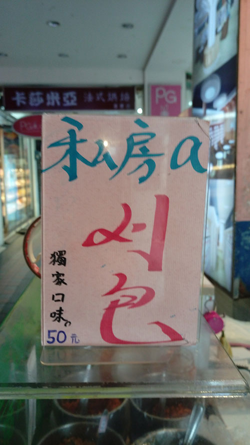
獨家口味
50元
(NT$50 is about US$1.50.)
The sign uses some Taiwanese, specifically “a刈包.” If the whole thing were in romanized Taiwanese, it would be
To̍k-ka kháu-bī
50 îⁿ
But parts of that are unidiomatic, as Taiwanese expert Michael Cannings informs me. (Alas, my Taiwanese sucks.) So this is a sign in both Taiwanese and Mandarin, which isn’t particularly surprising given that guabao is a Taiwanese food but most people in northern Taiwan use Mandarin most of the time. (I’m using the spelling “guabao” rather than “koah-pau” in most of this post because this is a Pinyin site.)
Something about this sign did surprise me a lot. Can you guess?
What seems to me most distinctive about this sign is that the Roman letter appears in lowercase rather than as “A”.
A single letter being used to represent a Sinitic morpheme in a text otherwise in Chinese characters is almost always written in upper case, e.g., A菜, 宮保G丁, K書. (Oh, that reminds me: I really need to answer that e-mail message about K. Sorry, Steven.)
In other words, if a sign is going to have the Roman letter “a” stand in for the Taiwanese possessive particle (the equivalent of Mandarin’s de/的), I would expect in this particular case for the sign to have “私房A” rather than “私房a”. I’m pleased by the use of lowercase; capital letters should be mainly for proper nouns and the beginnings of sentences.
It’s probably a one-off. But just in case I’ll be on the lookout to see if there’s a trend toward greater use of lowercase.
The text also presents a challenge: How should this be written in Pinyin? The last part (獨家口味 / 50元) is easy, because it’s just straight modern standard Mandarin:
But what to do with this?
Probably this:
Although Gwoyeu Romatzyh was technically the ROC’s official romanization system for most of the twentieth century (through 1986), it’s very seldom seen in Taiwan. The most common place for it to appear is on the side of coach buses. But here’s an example of Guoyeu Romatzyh on a shipping box for thousand-year-old eggs:
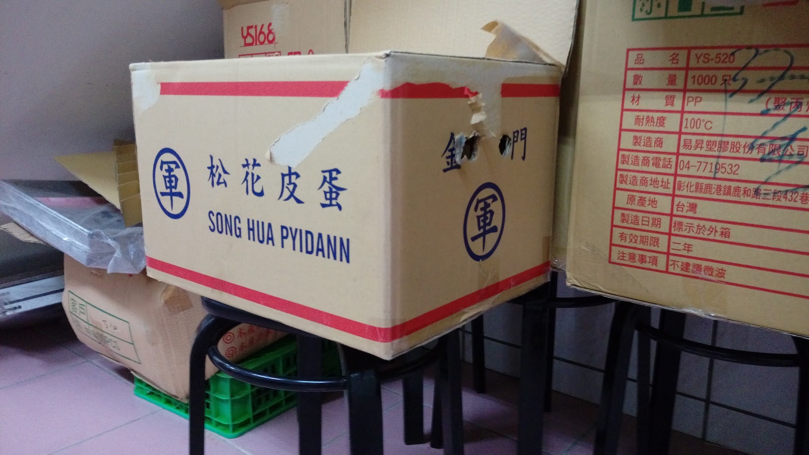
SONG HUA PYIDANN
Guoyeu Romatzyh is often most easily identified by the doubled vowel in most (but not all) third-tone syllables. But this example doesn’t have any of those. The y indicates second tone (except when it doesn’t). And the doubled final n is a marker of fourth tone. (Have I ever mentioned that Gwoyeu Romatzyh often reminds me of “The Name Game“?)
In Hanyu Pinyin, songhua pyidann is sōnghuā pídàn.
Another technical point, this photo wasn’t taken in Taiwan proper but rather on Kinmen (金門), which provides an example of a romanization system older than Gwoyeu Romatzyh, older than Wade-Giles even. It’s postal romanization, which I regard as too mixed up to properly be called a system. In Hanyu Pinyin, Kinmen is Jinmen. The island is also known as Quemoy.
Taipei’s MRT system, wonderful though it is, continues to find new ways to irritate me. Today I present the case of
台 vs. 臺
Semantically, there is no difference between these two characters. They both represent the tái in Taipei/Taibei and Taiwan. But the 台 form is more common in Taiwan, where it is seen as a variant form and thus not as one of the “simplified” characters used in China.
So why is the MRT’s new airport line using a huge “臺” on its signs when a normal “台” would do just as well? In fact, the regular 台 form is found six times on the same sign, with the fourteen-stroke “臺” seen just once.
To show that this isn’t just a one-off, I’m providing photos of a few more signs in a station along the “purple” (airport) line.


So, in the first sign alone, we have: