the brain & reading Chinese characters

An article in Science News on hyperlexia has a discussion of some recent research on reading, the brain, and Chinese characters.
The author of the article is to be commended for managing to summarize more or less accurately an important conclusion of the research: the notion that Chinese characters are ideographic and not tied to sound is, as observant Western analysts have been saying for nearly 200 years, a myth. (Asian analysts of language weren’t originally afflicted with the ideographic myth but acquired it from the West about 100 years ago. For more on this, see the book Ideogram: Chinese Characters and the Myth of Disembodied Meaning.)

Recent investigations of Chinese readers suggest that people everywhere invoke core neural responses in order to read, but other types of brain activity are necessary to attain mastery of alphabetic or non-alphabetic writing systems, psycholinguist Charles A. Perfetti of the University of Pittsburgh explained last February in Washington, D.C., at the annual meeting of the American Association for the Advancement of Science.

Many investigators have assumed that, unlike alphabetic systems, written Chinese employs drawings that symbolize whole words.

Even if that were the case with ancient Chinese pictographic symbols, those characters have transformed into much more abstract shapes that induce sounds of spoken syllables in modern readers’ minds, Perfetti says. Chinese characters thus represent bigger chunks of spoken words than alphabetic letters do.

“All writing systems represent spoken language, but they have different design principles,” Perfetti asserts.

Consider Mandarin Chinese. It currently includes 420 syllables. These syllables correspond to nearly 4,600 written characters, so an average of about 11 characters share a single pronunciation, which can be modified by using any of four tones.

In spoken Chinese, the meaning of the many different words that sound alike becomes apparent only in the context of conversation. People listening to English sometimes discern word meanings in this way—consider the words guise and guys—but need to do so much less often than Chinese listeners do.

Many Mandarin Chinese words consist of only one syllable, Perfetti adds. That has encouraged the false impression, at least among Westerners, that the language’s written characters represent only words, he says.

Actually, only about 2 percent of Mandarin words are monosyllabic. But those that are tend to be used frequently. (But this is also the case in English. For some tangential remarks, see Taipei street names and the monosyllabic myth.) The monosyllabic myth is fed in part by confusion about morphemes and Chinese characters. (For remarks on this, see Chinese Writing.)

Experiments show that Mandarin Chinese characters correspond to spoken Chinese rather than to the idea that the word represents, Perfetti says. For instance, if shown the written character for the word red printed in blue ink, volunteers name the ink color more slowly than if the same character is printed in red ink. Analogous results have been noted among English readers, whose writing system inarguably represents spoken sounds.

Response times for Chinese readers turn almost as sluggish if a different character with the same pronunciation and tone as red, such as the character for flood, appears in blue ink. This effect indicates that written characters correspond to sounds in spoken Chinese, not to specific words. The pronunciation of flood calls to mind red and slows naming of the clashing ink color, Perfetti says. If the characters represented specific words, instead of sounds, this delay would not occur.

A smaller but still notable slowdown occurs when a character with the same pronunciation as red but a different vocal tone, such as the character for boom, appears in blue ink. Again, the common pronunciation calls to mind red, causing readers to take a little longer to identify the different ink color.

A little later is the statement that “Right brain regions involved in vision also contribute to reading Chinese but not to reading English.” This is the sort of thing that causes lots of people to forget everything that came before (such as how Chinese characters are tied to sound) and go back down the path of erroneous preconceptions about Chinese characters being ideographs.

German paper on Chinese language reform

Another paper I’ve come across in my Web surfing: Ideen zur Sprachreform in China ab den ersten phonetischen Transkribtionssystemen unter besonderer Berücksichtigung des Schriftstellers Lu Xun (“Thoughts on language reform in China, starting from the first phonetic transcription and with special consideration of the writer Lu Xun”).

I don’t read German, so I can’t vouch for the correctness of the paper. Actually, from what little I can read, it seems that the author has a few all-too-common notions about “dialects”, etc. But the paper might be worthwhile anyway.

script reform in the Qing era

I recently came across W.K. Cheng’s “Enlightenment and Unity: Language Reformism in Late Qing China,” an interesting article from 2001 that covers much of the same ground as Victor Mair’s “Sound and Meaning in the History of Characters: Views of China’s Earliest Script Reformers,” but from a wider, social perspective.

new Taiwan ID cards

Nèizhèngbù guānyuán zhǐchū, bǐjiào xīn-jiù shì shēnfenzhèng shèjì de chābié, xīnshì shēnfenzhèng jiāng zàochéng shǐyòng xíguàn de gǎibiàn, qízhōng bāokuò xìngmíng lán zuìduō kě tiánrù 22 ge zì, fāngbiàn yuánzhùmín tóngshí biāozhù Hànzì yǔ Luómǎ pīnyīn xìngmíng; tóupiào shí bùbì yú shēnfenzhèng shàng gàizhāng, jǐn jìnxíng shēnfen biànshí, héduì míngcè, tóupiào tōngzhīdān děng dòngzuò; qiānyí hùjí jiùděi chóngxīn huàn fā; shēnfenzhèng bùzài yǒu xìngbié de yánsè qūgé.

內政部官員指出,比較新舊式身分證設計的差別,新式身分證將造成使用習慣的改變,其中包括姓名欄最多可填入廿二個字,方便原住民同時標註漢字與羅馬拼音姓名;投票時不必於身分證上蓋章,僅進行身分辨識、核對名冊、投票通知單等動作;遷移戶籍就得重新換發;身分證不再有性別的顏色區隔。

Spaces for 22 zì on the new Taiwan ID cards. I wonder if that means Hanzi, because my complete name (first, middle, and last, along with my three-character “Chinese name”) is longer than 22 letters.
If a proportional font is used, more than 22 alphabetic letters should fit within the space for 22 Hanzi. But if 22 zì does mean alphabetic letters, then there’s going to be a problem.

sign of ignorance

I came across an article today about some sign designers working in China. The title alone, “Graphics That Bridge a Linguistic Divide”, was enough to raise a red flag (pun not intended), because for many it will evoke the widespread myth that Chinese characters transcend languages.

The designers were describing the making of a large sign for the “Suzhou International Exposition Centre” (苏州国际博览中心 Sūzhōu guójì bólǎn zhōngxīn).

Here’s a good example of the problems with their remarks:

“The last two characters for Centre–it’s interesting they went with the British spelling–are actually redundant,” Calori says. “Often you see the seventh character–it means ‘middle’–for center. But the client also added the eighth character, which is the symbol of ‘heart.’ The heart is the middle, so they reinforce each other. This was a total embellishment.” Adds Vanden-Eynden: “They wanted the warm, fuzzy heart center, as opposed to the cold, hard center of hell.”

This is so wrongheaded and absurd it’s hard to know whether to laugh or cry. The client didn’t add the eighth character (心). It’s used in writing the word for “center,” which is zhōngxīn (中心). The only thing “fuzzy” here is the thinking behind this nonsense. It’s possible, though, that the designers aren’t responsible for this way of thinking; few Chinese people are aware of how their own writing system works and thus tend to believe such crap.

Colors: … “There are certain colors, you don’t use. White, for instance, is the color of death. It’s like directing people to a funeral.”

Well, yes, white can have that connotation. But white is the background color of the sign! Are the designers saying they wanted to direct people to a funeral? Of course not. The reality is that white has that connotation only in certain contexts. So what’s all this talk about leading people to a funeral? Sheesh.

Letters vs. Characters: … “Each character is really an idea,” Calori says.

Wrong.

“They’re called ideograms.”

Although some people, through ignorance or force of habit, might use this unfortunate term, the fact remains that Chinese characters aren’t ideograms.

The pullbox giving “character dissection” is also an embarrassment. Almost everything there is wrong or at least misleading. They couldn’t even get many of the tones right.
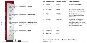
But the article isn’t a total washout. A few points are of interest.

Sizing: English characters tend to be heavy compositionally, while Chinese is complex and delicate. “So we always size Chinese twenty percent taller to give it balance,” Vanden-Eynden says.

Type Position: The Chinese characters appear here in the “superior” position, on the left side. “In Hong Kong, before the handover, English always appeared first,” Vanden-Eynden says. “On the mainland today, Chinese is always in the superior position, but the Chinese still want English on all their signs, even if there are no tourists around, because to them it makes it look like [they are part of] the 21st century.”

Fonts: Due to the seemingly infinite nature of Chinese, there are a limited amount of usable fonts. “Unlike here, you don’t have 10,000 readable options,” Vanden-Eynden says. “You have what they call the big five type faces.”

Chengdu signage

地名标志只能汉拼双写
http://www.sina.com.cn 2005年04月13日03:33 四川在线-天府早报

  早报讯(记者侯林利)针对目前不断有市民来信建议城区街路牌应“中英文双语对照”的问题,昨(12)日,成都市民政局区域地名处就此表示,地名标志只有采用“汉字及汉语拼音书写”才符合国际通行惯例和国家相关法律政策。

  据介绍,根据相关规定,城镇街(路、巷)名标志的设置禁止使用外国文字标志,不是采用汉拼双语的路牌标志都应该是违规路牌。成都市民政局借此提醒广大市民,路牌标志的书写事关国家的主权和尊严,必须规范书写形式,“中英文双语对照”的书写方式有悖国家相关法律。

signage in Guangzhou

广州拟投资355万元设立新型国际化路标
http://www.sina.com.cn 2005年04月06日01:11 信息时报

  时报讯 (记者 高江虹 通讯员 穗规宣) 记者昨日从广州市规划局获悉,为解决目前指路标志存在交通指示不足、信息表现形式不一、交通信息连贯性差、牌面视认性较差、部分指路标志过期使用及引导信息过时等等问题。广州将借助“申亚”成功的契机,着手进行一系列指路标志系统改造,使整个指路标志系统更加规范化、国际化。目前包括投资355万元让重点部门、大型公建及旅游景点都设立新型国际化路标。

  旧路标信息指示不足

  据介绍,随着广州市城市布局的拓展和城市道路网络的发展,广州市指路标志系统的建设逐渐得到完善。但是现有指路标志系统存在重点部门、大型公建及旅游景点等指示信息的严重缺乏、整体布局缺乏足够的系统性、交通指示信息的连贯性较差等不足之处,大大影响了整个指路标志系统的交通指导效率。

  经有关部门调查发现,广州市区现有指路标志系统交通信息指示不足的现象比较普遍,不仅严重缺乏重点部门、大型公建及旅游景点等信息的指示,路标提供的信息量也明显不足,这对市民出行、城市公共服务设施的使用造成了一定的影响。

  调查还发现,部分指路标志存在过期及不规范使用的现象,如沙和路已经更名,指路标志的牌面信息却没有更新,过时的信息给人们带来了不便。还有一些指路牌虽然提供了相应的道路信息,但实际上该路段是不允许车辆进入的,这种禁令标志与指路标志分开设置的情况,非常容易引起误导。

  而现有路牌牌面规格和信息表现形式都存在问题,如通名译写形式混合使用汉语拼音和英文两种方式,不利于外来人员阅读和识别,容易混淆信息含义。还有不少路标被绿化和道路附属设施遮挡,使驾驶员无法及时辨认指路信息。

  拟投资355万让路标变脸

  为此,广州市市委、市政府于去年7月份,正式委托广州市交通规划研究所、广州市公安交警支队和广州至信交通顾问公司负责开展“广州市区道路交通指路标志系统改善方案研究”系列专题研究工作。据悉,目前“广州市道路交通管理设施设计施工指南”和“重点部门、大型公建及旅游景点指路标志系统布局方案研究”已经完成,正准备开始实施。据有关部门透露,这项广州市道路指示标志系统“大变脸”拟投资355万元,于亚运前完成。

  公园前区域将示范新路标

  规划局方面透露,指路标志系统的“变脸前奏”将选择在公园前地区做示范改善区域,完善区域现有指路标志系统指示信息的不足,及时更新区域过期及不规范使用的路标,为全市区域指路标志系统的改善研究提供借鉴。

  按照有关规范要求,各类指路标志将采用不同的牌面形式。如重要政府机关单位、医院、学校、文体设施、交通枢纽及展览会议中心等指路牌均采用一般道路指路标志形式,牌面颜色为蓝底白图案;具有旅游特色底商业中心及商业步行街、旅游景点采用旅游区指引标志形式,牌面颜色为棕底白图案。

  同时,将会统一中英文对照形式,以及增设必要信息指路标志。如增设省政府、市委、市人大、中山纪念堂、北京路步行街等指路标志。