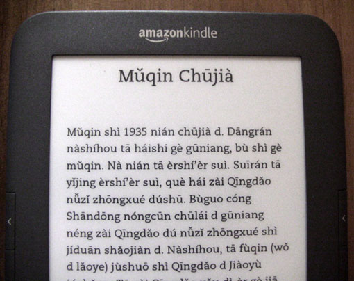
Sure, Amazon Kindles can store thousands of books, play mp3 files, provide Web access, and allow one to spend money on books with alarming ease. But can they handle Pinyin?

Yes!
This test was made on a Kindle 3 purchased at a U.S. retail store. All three typefaces — regular, condensed, and sans serif — worked well.
Yes, Kindles can display Hanzi as well — though there may be some problems with those appearing correctly in book titles in the device’s index.
Below are links to my files, in case you want to test this yourself. I’d appreciate hearing about how Nook and other devices handle this. Thanks.

What is the format of your document?
My Kindle DX 2 does not handle much but non-diacritic English.
But I know that CJK languages became supported in Kindle 3.
So that surely includes several Unicode fonts.
That said, PDFs can embed used fonts so that they are able to display regardless of the fonts on a local system.
The original InDesign file was exported as an ePub file, which was then converted to the Kindle’s mobi format using Calibre.
I have been using my Kindle for a couple of years and have loaded PDF files with Pinyin and Hanzi with no problems. Works well for me.
I’ve edited the post to add links to the files I used.
I curious about all the ‘de’ which are displayed as ‘d’.
Is this a feature of your original text, or something the kindle is doing?
What’s with the “d” as in “Wo d laoye” and “Qingdao d jiaoyu”? Are they supposed to be de?
I really want to have a Kindle or similar ebook, but what I am really afraid of is that hundreds of years of typographic expertise will be replaced by ugly automatic text generation – the text seems to look like a webpage (e.g. no justified text etc).
The “d” is according to the author’s wishes; it’s not a technical glitch. In her writing she used it to distinguish between homophones: “In Pinyin, ‘d’ and ‘de’ are pronounced the same. However, ‘d’ stands for an adjective, adjectival phrase, possessive, and so forth, while ‘de’ stands for an adverb, adverbial phrase, complement, and so on.”
The entire book is available for free on this site … but not yet in a Kindle edition.
@Robert:
It’s good that Kindles can display PDFs. But those are a different sort of creature than native MOBI files. PDFs can have embedded fonts, which means that they can display just about anything, from Pinyin texts to Klingon en face translations of Linear B poetry. The drawback is that the lines are of fixed length, which means that lines won’t rewrap and at some magnifications it will be necessary to scroll from side to side.
But MOBI files — which cannot embed fonts — can wrap the text at various magnifications.
@Gerrit:
I know what you mean. I greatly value the attention put into well-designed books. (The book currently on the top of the pile on my desk is Robert Bringhurst’s The Elements of Typographic Style, which I love.) And I sometimes get annoyed with the typographic awkwardness of the free versions of public-domain books, with their straight quotation marks, non-indented paragraphs, and extra spacing. But they don’t have to be that way. For example, “Muqin Chujia,” shown above, has indented paragraphs (other than the initial one), proper quotation marks and apostrophes (e.g., “ershi’er sui” in the third and fourth lines), and no double returns between paragraphs — though most of that you can’t see in the photo above. Of course, there’s much more to do when designing a book; but it’s a start.
And although you probably know this already, I’ll go ahead and note for the record that Web pages can be justified. For example “The Ideographic Myth.” And texts in Kindles can be justified as well. But I chose ragged right for Pinyin Riji Duanwen on purpose: I think that in this case it looks better that way. YMMV.
Wouldn’t the meaning be clearer if “d” was used as a contraction after nouns like English “s”? For example, “T?’d”, “T?men‘d”.
I think that t?’d and t?men‘d (or for hat matter t?d and t?mend) are a lot less ugly than the author’s choice which I find really off putting.
“T?d” and “t?mend” were evidently standard at one point. I like GummyWorm’s idea too.
@Pinyin Info
Yes, some of the small details you mentioned are no problem (quotation marks, apostrophes etc) – _if_ you take care of them (which is usually not done).
But I think justification is really a problem: Although I guess that ordinary book design (the usual novel) is completely automated (just load the text into InDesign and be done with it), the justification is still at least checked (at least I hope). For web pages, the problem is the hyphenation: Justification without hyphenation is not worth anything, imho (then you can stay with rugged text). But hyphenation either has to be done with a decent dictionary (or some similar algorithm), or specified manually. At least manual specification is possible with web browser, although I guess this is too cumbersome to be of real value. Why modern web browsers don’t have a nice hyphenation dictionary which will be enabled by the “lang” tag, I don’t know. Maybe because nobody cares about good web typography.