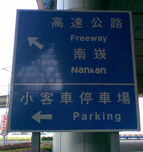
The sign in the photo below has been up for years; but only recently did I finally get a chance to take a halfway decent photo of it. It’s just outside the second terminal of Taiwan’s main international airport and thus is the first example of road signage that many visitors to Taiwan see.
The atrocious typography displayed in how “Nankan” (南崁/Nánkàn) is written is certainly a good introduction to the chabuduo world of Taiwan’s signage.
Truly nánkàn (ugly)!


?an?an
Haha, good one! :)
Seriously though, I don’t understand how things like this can even happen in the first place. You would think it takes extra work to change the font rather than keeping it consistent…
Just be happy they didn’t go whole hog “ParKing”, “FreeWay”, “Par-King”, “Free-Way”…
“ParKing”, “FreeWay”….
ToiLets, TaiPei RaiLway StaTion….
By the way, how’s this on your eyes?
Xuan Jhuo
http://www.facebook.com/MOJOJO999
Yes, here we see living too close to the “Tongyong Pinyin” nuclear
reactor had disfigured her family name permanently. Fortunately at
least after that radioactive spill’s half-life had diminished, the new
growth given name was unaffected.