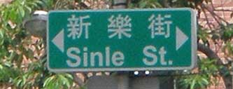
 During an extremely brief trip a few weeks ago to Gāoxióng, Taiwan’s second-largest city, I was able to grab a few photos of signage there. Most of these were taken from a moving taxi; thus the poor quality and lack of much diversity. But these are the best I could do under the circumstances.
First, a few basic points:
- they’re in Tongyong Pinyin (bleah — but at least they’re consistent)
- they don’t use InTerCaPiTaLiZaTion (This lack is, of course, a good thing. If only Taipei hadn’t screwed this up!)
- in most cases the text in romanization is large enough to read even at a distance (Very good — unlike all too many relatively recent signs elsewhere, such as Taipei County.)
In short, other than the choice of romanization most of these signs aren’t all that bad. They’re certainly much better (and more consistent) than the ones that Taipei County put up in Tongyong Pinyin a few years ago. (Although Taipei County’s current magistrate said more than two years ago that he was in favor of switching to Hanyu Pinyin, as far as I can see he has done absolutely nothing about this. Of course, some might say that he’s done absolutely nothing about anything; but I’ll leave discussion of that to the political blogs.)
Here’s another Gāoxióng sign with romanization that isn’t too small.
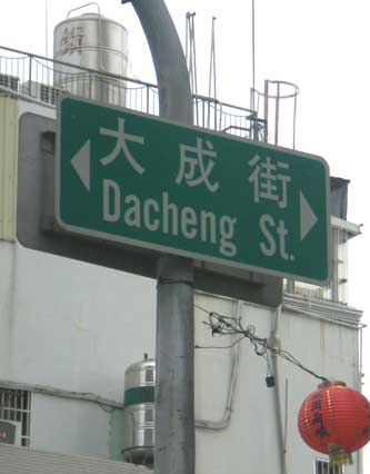
I’m not a fan of the practice of force-justifying the Chinese characters and romanization/English to the same width. This style can be seen in many of these signs. Sometimes this results in the romanized/English words being spaced too far apart; more often, though, the Chinese characters are left with lots of space between them — so much space that it would be easy to have spaces indicate word divisions for the texts in Hanzi (something Y.R. Chao recommended nearly a century ago), which might be an interesting thing to try on signs. I wonder if anyone has ever performed any experiments on this.

The full Mandarin name of the school indicated by the blue sign on the left is rather long:
Gāoxióng shìlì Gāoxióng nǚzǐ gāojí zhōngxué
(高雄市立高雄女子高級中學)
Whoever made the sign wisely desided to cut that down to 高雄女中 (Gāoxióng nǚ zhōng). If only someone had realized that it would have been better to use something shorter than the full English name, too. “Kaohsiung Municipal Girls’ Senior High School” is a lot to fit on one small sign. “Kaohsiung Girls’ High School”, “Girls’ Municipal High School”, or something even shorter would have been much better.
Here are some more signs.
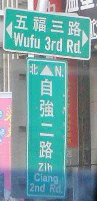
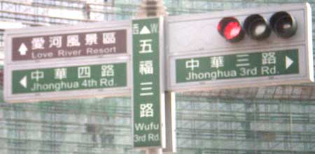
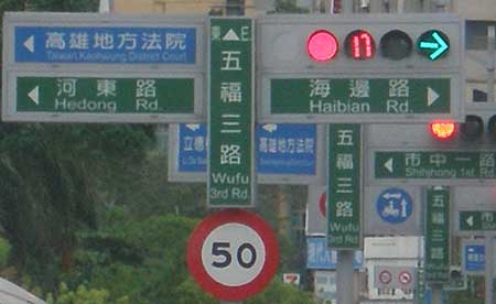
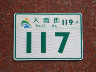
And finally an address plate on a building. This style could certainly be better.

I see that on the sign with the long school name, that the character ? is romanized as “siung” in the name of the school, but as “syong” on the sign on the right. So tongyong for everything but the name of the city?
Pingback: Links 9 June 2008 - David on Formosa
The intercapitalization you’re talking about is known as camel caps.
What’s so bleah about 通用拼音?
通用拼音? — Use the world standard instead. More about this on my website.