One of the traditions in advance of Chinese New Year is housecleaning — something not among my favorite activities. But I thought I’d do a bit of housecleaning of half-finished posts and get at least one up before the new year (tomorrow). So here it is.
Although I occasionally bemoan the fact that relatively few font families are made such that they can handle Hanyu Pinyin with tone marks (at least not right out of the box), it’s worth noting that some of the commonly found fonts that do cover all of the letters and diacritics really suck at it and should be avoided when writing in Pinyin.
Typically, such fonts were designed mainly with Hanzi in mind.
Here’s one example:

Hideous.
That was Adobe Ming. Yes, Adobe.
I’ll go ahead and point out the obvious problems:
- inconsistent spacing between letters
- inconsistent spacing between words
- inconsistent baseline
- wrong spacing around apostrophes
- wrong style for the letter “a”
And I’m not so sure about the consistency of the x-height either. Those stubby little descenders are puzzling, too, but are not necessarily wrong.
Perhaps the designers intended these letters for use in vertically aligned text — though I don’t think these forms would work well even then. Perhaps there’s some context in which these might make sense, though I’m inclined to doubt this. Perhaps the designers have an irrational hatred of romanization and wanted to make Pinyin look as ugly as possible. Whatever the reason, even though this and the other Unicode-compliant fonts below have all of the letters with diacritics that Pinyin requires, using them for Pinyin texts would be a very bad idea.
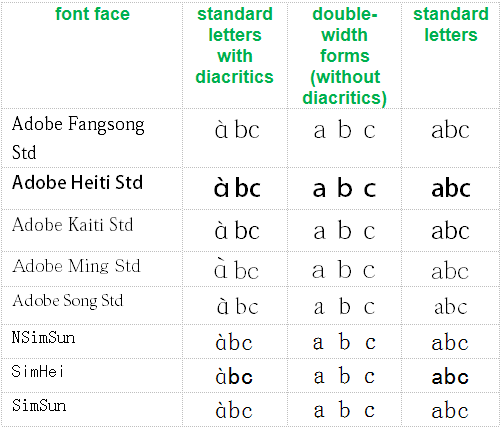
Since there is apparently still some confusion about why the “?” form (in contrast to the normal “a” form) is incorrect, see the chart below.

Note how the odd form of the letter a does not appear in regular text or even in double-width forms; instead, it’s seen only when accompanied by a tone mark. In other words, even within individual fonts the ? form is treated not as a normal “a” that happens to look that way but as something specifically for Pinyin, which is flat-out wrong. Other than the addition of diacritics themselves, there is no reason to alter letter shapes in any way for Pinyin.
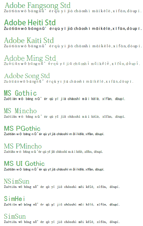
Let’s get back to the broader issue. Here are some more examples of fonts that render Pinyin in ugly ways. (Click image to view PDF.)
To aid Web searches, here’s a text list of the fonts above, none of which should be used for Hanyu Pinyin:
- Adobe Fangsong Std
- Adobe Heiti Std
- Adobe Kaiti Std
- Adobe Ming Std
- Adobe Song Std
- MS Gothic
- MS Mincho
- MS PGothic
- MS PMincho
- MS UI Gothic
- NSimSun
- SimHei
- SimSun
SimSun is probably the least awful of the bunch. But even so, there’s no good reason to use it instead of something else that would do the job much better, such as Gentium:

Generally speaking, if you wouldn’t want to use a font for English, French, Italian, etc., then don’t use it for Hanyu Pinyin.
Say no to making Pinyin ugly!
I wish you all a happy and Pīnyīn-rich year of the dragon.


Pingback: Pinyin News » New database of cross-strait differences in Mandarin goes online
By the way, have you checked the Android fonts for Pinyin support?
The standard font is nice, but I sometimes stumble that the bold styles do not support third tone in some letters.
From what I’ve seen, the Droid font family cannot handle Pinyin, which is especially disappointing given that Droid Sans does support Hanzi and many other scripts.
I think the normal style supports Pinyin, at least it is displayed without looking somewhat different. But the bold styles do not seem to support it.
By the way, it is quite sad that it only supports Mainland chinese characters. They look really ugly when used for Japanese…
I’ve been loving this series. As someone who is making websites for people studying Chinese, I take this very seriously. I’m have a couple of questions:
1) Are there any standard fonts on mac os x /windows XP/Vista/7 that present pinyin well? Most of your posts seem to be about web fonts, which unfortunately, don’t always perform well, or are about non-standard font (which a website’s users are unlikely to have installed). Any suggestions?
I don’t know about Macs. I’ll do a proper post on Windows ones later — once I get this @#$%! hacked site fixed. (Sorry for the problems, everyone!) But, for now, on Windows systems try Arial, Arial Unicode MS, Microsoft Sans Serif, and Segoe UI (sans serif); Courier New (monospace); and Times New Roman (serif). Alas, Georgia and Verdana aren’t up to the mark yet. Note, though, that not all early versions of those fonts cover the necessary diacritics. So a really old Arial probably won’t work. (I wish I knew the cut-off point, but I don’t.) Even an old Arial Unicode, however, will work.