
Sonarchic sent in photos of some signs in the Beijing subway system.
The typography for English and Pinyin is generally poor, as is common in China.
There are several things in general I’d like to draw attention to:
- Everything is in a boring sans-serif.
- The letters are often set too close together and occasionally too far apart.
- EVERYTHING IS IN CAPITAL LETTERS.
- The size of the English/romanization relative to the Chinese characters varies, with the English text often too small. (The latter is increasingly a problem in Taiwan.)
OK, now to the photos.

Above:
- very tight tracking between most of the Roman letters, except around the letter I
- enormous (and incorrect) space after the apostrophes in “Tian’anmen” (which is, correctly, written with an apostrophe, BTW) and “Yong’anli” (which should perhaps be written “Yong’an Li”)
- yet the apostrophes in the time-to-station markings are not followed by enormous spaces
- failure to parse many words correctly, e.g., “Lù” (“Road” / ?) should be written apart from the name of the road: G?chéng Lù (???), not GUCHENGLU, etc.
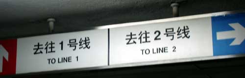
Above:
- note different word spacing between “TO” and “LINE” than between “LINE” and the number

Above:
- This should almost certainly be “Changchun Jie” (jie means “street”), not “CHANGCHUNJIE”.

Above:
- only Chinese characters identify this as the northeast exit (??? D?ngb?i k?u)
- uneven left margin for the English/romanization
- very small English in relation to the Chinese characters
- clumsy letterspacing around capital I’s
- too much space after the period in JRJ.COM
- uneven spacing, as can be seen in the two uses of the word “insurance”

further reading:
- Manual on Uniform Traffic Control Devices, U.S. Department of Transportation, Federal Highway Administration
- Traffic Stuff, at the Web site of Richard C. Moeur
I’d say that rather than an incorrect space after an apostrophe, it’s actually that they’re using a full-width CJK apostrophe instead of one for a Roman font (check out the width of the characters in the hanzi column). It’s a pretty common problem (my browser, for example, renders your page the same way).
I probably didn’t word that well. I was referring to the physical amount of space rather than a space that someone would have to type to insert. But I agree that a full-width CJK apostrophe is likely what that is. (Still, though, shouldn’t a CJK apostrophe be more centered in the space rather than on the left side?) The use of that sort of punctuation on English-language Web pages produced in Asia is a pet peeve of mine, as it can really mess with the encoding and page rendering. On signs, however, everyone sees the same result; so that amount of space shouldn’t be there, regardless of the source.
As for the problem for some browsers on some operating systems with apostrophes and quotation marks on my site, I’m aware of it. That is in part the result of an automatic feature/bug of my blogging software, WordPress. If anyone knows how to override this, please let me know.
I agree that the impression one gets looking at the Roman lettering in the first picture is that “the letters are often set too close together and occasionally too far apart”, but closer inspection reveals that this is simply a fixed-width typeface, with the letters all of the same width and all set exactly the same distance apart. The problem with a fixed-width sans-serif typeface is that there is no way to adjust the width of the letter “I” without adding white space around it. Given that most Chinese fonts are fixed-width (and this has been an integral part of the Chinese writing system for millennia), it is not surprising that a fixed-width Roman font has been chosen. It could even be part of the same overall font set as the Chinese. The fact that the apostrophes take up the same width as a single Chinese character and as two Roman letters suggests that this is the case.
In reading this post, and also looking at websites like http://www.engrish.com, initially I find it very easy to enjoy making fun of the attempts at using English in China and Japan. However, if I think about a western English-speaking country making a concerted effort to convert all signage to English and Chinese (as China is doing) as a gesture of engagement and friendship, then I anticipate that we would make our own fair share of errors and mistakes. We would certainly need to engage a large army of expert rigorous native speaking advisors across all levels of government, as we just don’t have enough native citizens with sufficient skill in hanzi to implement such a radical change.
Having been thinking on these things, while I still enjoy what we generally consider the amateur or non-professional uses of English in China, I am now more circumspect and indeed respectful of the raw effort and expense China is going to to make their cities accessible to English-speaking foreigners, and to upskill Chinese citizens in English. This for me – the big picture, rather than the nit-picky criticism, is the key message of the bad English and the bad presentation of English that we see.